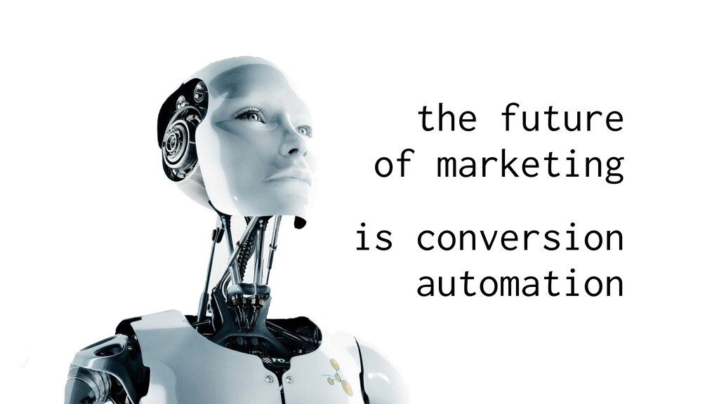
The future of conversion lies in the hands of a computer algorithm more brilliant, and artificially insightful than you or I will ever be. The future of conversion is a single conversion automation script. A script so omnipotent that it controls a million tiny tentacles, wrapping its feelers around every page, letter, number, and pixel that exists on your websites, landing pages, emails, and ads.
The future of conversion is coming, and it’s close. But it’s not here yet.
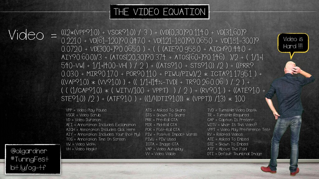
What then, if I told you that a mathematical equation already existed, an equation so complex and masterful, that it can calculate whether your marketing will work, or if it will fail?
What if I told you this equation could be understood by folks like you and I?
In this talk, I will unveil the most ridiculously complicated equation you’ve ever seen (unless you happen to the resident Unbounce data scientist Tommy Levi, who will no doubt choke on his beer at such a statement).
I’ll unpack The Conversion Equation into a sequence of tens of smaller formulae you can use to plot your place on The Master Conversion Map: a marketing ultrasound that represents your business optimization to-do list for 2016.
And I’ll make sure you have an awesome time as we explore the-almost-future of conversion optimization.
1 / 183 Use ← → to navigate
Auto-generated transcript - may contain errors.
Tap a timestamp to jump the video.
Today, I'm gonna tell you We'll take a little trip into the future. The future of marketing. Specifically, the future of conversion. This is something we're really obsessed about at Unbounce. We've created a new team, machine learning team, so we can develop an algorithm that predicts conversion.
Now, and this is all about conversion automation. The word automation tends to scare people because you think the machines are gonna take over, they're gonna make decisions for us. That's not really true. At least, that's not where we're taking it. The machines are coming, and they're gonna do certain things, but one of the great things they're gonna do is they're gonna start fixing some of the things that we're doing wrong.
Right? Because as marketers, we make mistakes. Quite a lot of mistakes often. They're gonna help us fix these. If you can get my slides back up, that would be sweet. Alright. So, what is it we're doing wrong that these machines are gonna fix?
Quite a lot of things. We test opinions instead of insights. People just say, hey, can we test that? I think it will be better. It's not the right approach. Testing the wrong things. Some things will have no impact on conversion, other things will.
We need to know what they are. Stopping tests too early. Everybody does this. I did this for years. Single AB test you run will have a spike at the beginning. You go, oh, this is so good, and you push it live, and then your business goes like this.
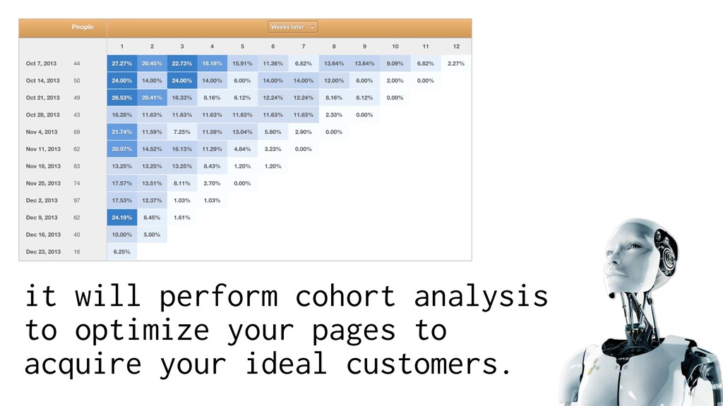
Or the opposite, you get scared. So that will remove that problem. Andy talked about some of this. We focus on the surface conversion metrics. How many leads do we get? How many new customers? That's the wrong approach. We need to look right down, like he was saying, cohort analysis to get lifetime value.
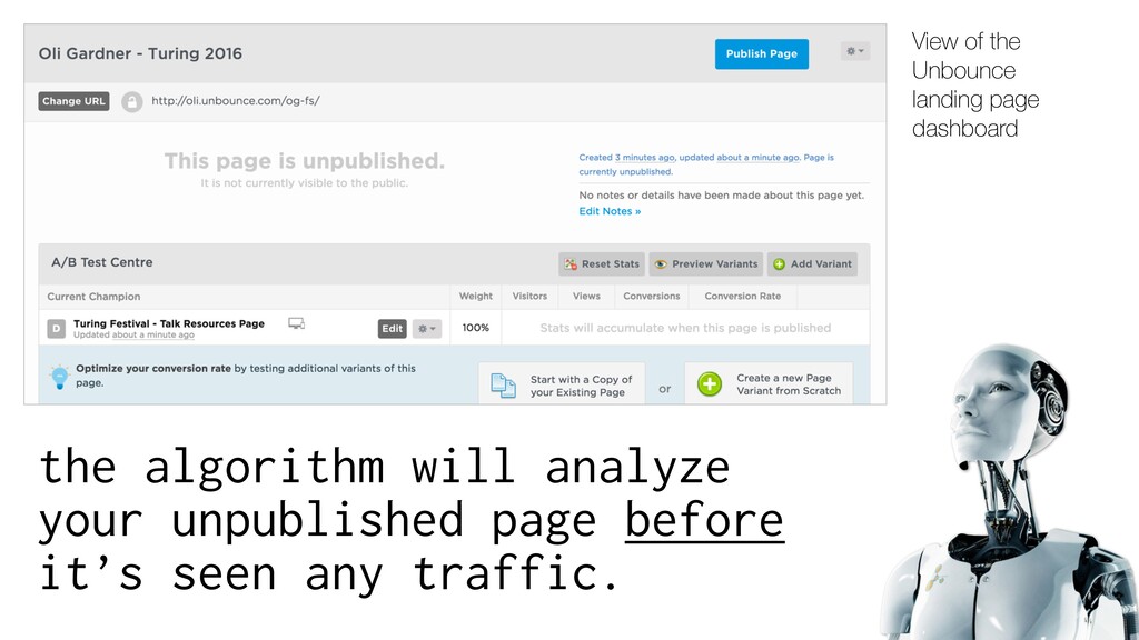
And the machine learning part of this and connected systems will do this for us because it's kinda complicated to do it yourself. So we need to make a change. So, is a little bit about what could be happening in the future. Now, this is the unbanked dashboard.
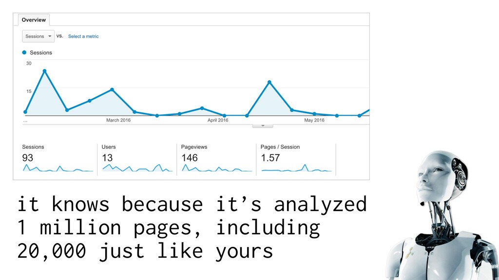
What you normally do is you make your page and then you click publish. You won't need to do that. This algorithm will have looked at millions of pages, and it will be able to predict pretty closely what the conversion rate of your page will be without having any traffic.
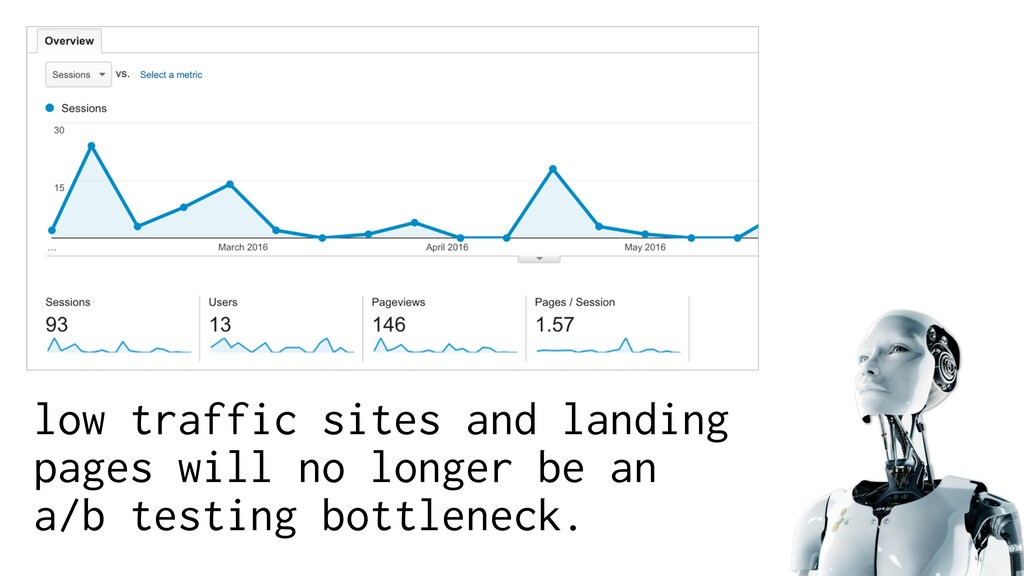
Like, no traffic sent to your page. Low traffic sites, like any small business, they have massive problems because they wanna test, they want to optimize, but they don't have enough traffic. They won't need any traffic. It will also analyze traffic behavior on-site, all of these things, but as a first step, you'll be able to make your page perform better without anyone even seeing it.
Because there'll be all these million pages, but also it'll look at, say, twenty thousand of people that are in your industry, the same use case of your page, and it will give you recommendations, sentiment analysis, word analysis, things you can do to make it perform better.
Cohort analysis. Exactly. So you can make sure you're getting your ideal customer. Maybe if you were running a test, a versus b versus c, b converts better. What do you do? You push it live. But what if c got you more of your ideal customer?
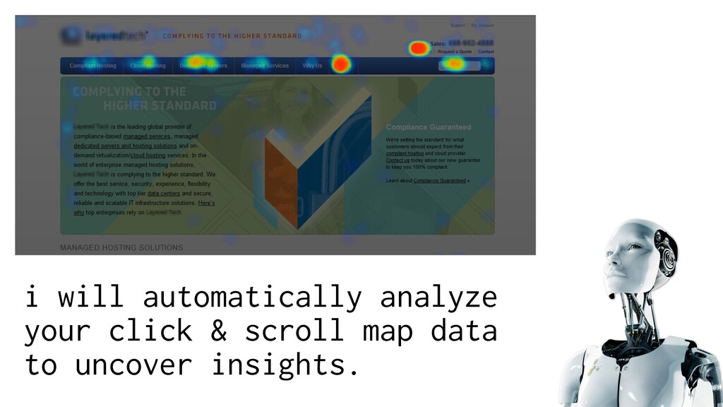
You can go through that, it's really difficult, and most of the time you just celebrate B with an automated system. It will correct that and turn on the right version. Every page will have scroll and click map analysis done automatically on your behalf, and these insights will be pushed to you.
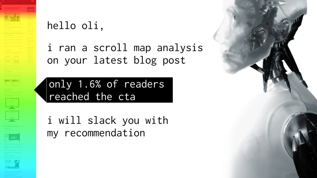
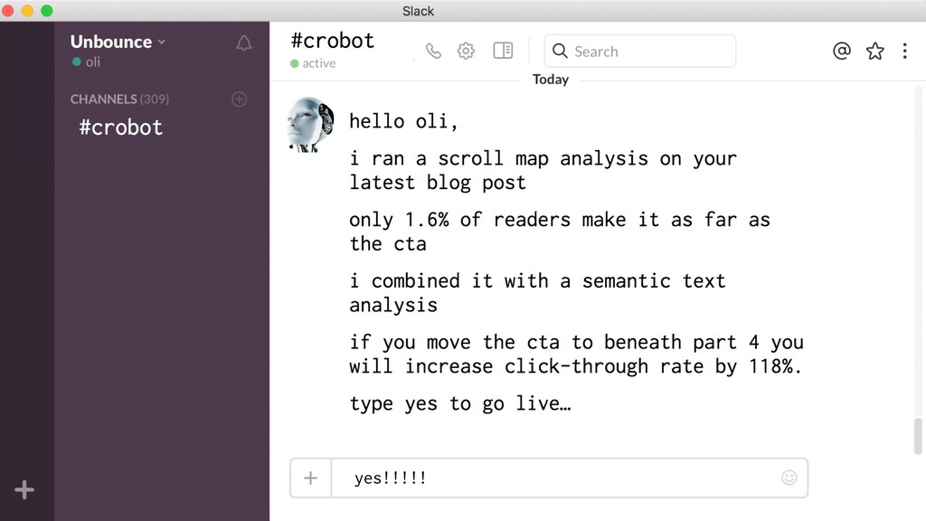
And, again, not just taken control of by evil machines. So instead of turning it on, modern interactions, you'll get a Slack message saying that nobody's getting to your CTA in your blog. If you bring it up to below the fourth paragraph, which is the hotspot of the scroll map, and it's semantically relevant to the text there, you'll get a hundred and eighteen percent lift in click through rate on that.
This story's based on us doing this, actually doing this manually, and that's the result we got. But these kind of insights, which we push to us, if you want to do this, just type yes, and I'll turn it on. This is the human side of this.
The machines give us the insights, and we decide whether we want to implement them or not. And we'll never ever have to ask this question again, which every single person asks. If you ask a CRO expert, everyone just says, what should I test?
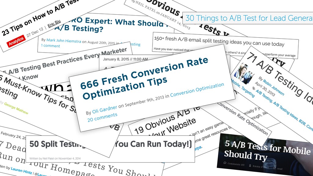
We'll never have to ask that again. And it will get rid of the need for all of these blog posts, many of which I'm to blame for. Okay. I sent out a survey last week, and tons of you replied, like a hundred and fifty, which helped shape the talk.
So, I'm gonna focus on some of the things you're interested in. But also, some of you submitted your pages, and a few of them are gonna be included in the talk. I'll try not to be mean, but we'll see how that goes. So, that's the future. We're not quite there yet.
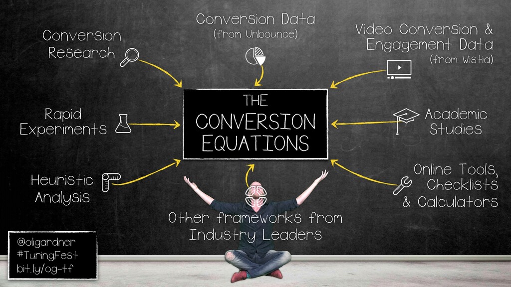
That's what's going to happen. But for the time being, I've come up with these conversion equations. This is the human part. This is what we can actually do right now. So I'm gonna walk through some of them. What is a conversion equation? Well, it's got many parts.
Heuristic analysis, rapid experimentation, I'm gonna show you how to do that. Conversion research, they're closely related. Conversion data from what we have, and also Wistia, they share a lot of amazing data with me, it's so good. Academic studies. Conversion Excel Institute's new. They have a Peplya from Conversion Excel.
They've built a lab in Austin. They're doing a lot of great work. All the tools that we hear about all the time, and some of the frameworks from other thought leaders. Because the equation gets stronger the more inputs there are, so it's not just one person's perspective.
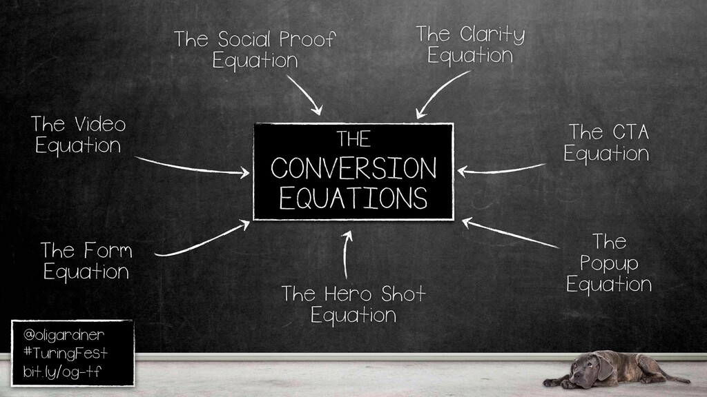
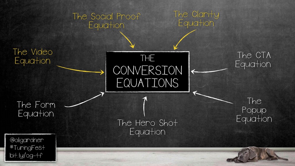
These are the seven. Based on your responses, I'll go through three of them. The first one What they do is they tell you what's wrong and what order you should optimize based on the results of these equations. What you do, basically, there's lots of exercises to plug in Actually, I'll show you one in a second. Most important one is clarity.
If you can't communicate, you can't convert, it's You have to get that right at the start. **** *** doesn't mean go away. **** *** means **** ***. Can't get more clear than that. And, that's kinda You you wanna feel that way. We want our customers to feel that way when we communicate what it is we do.
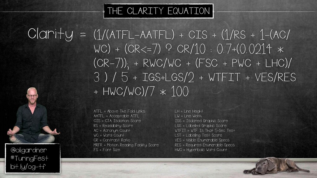
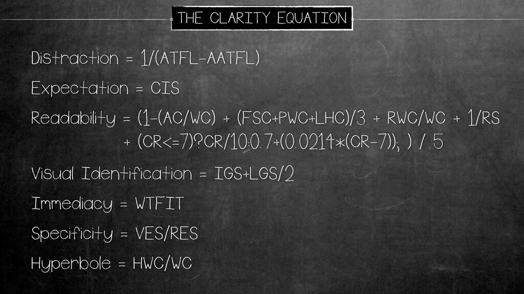
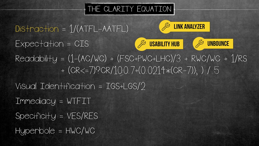
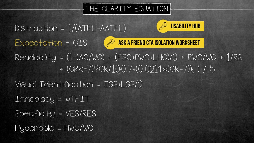
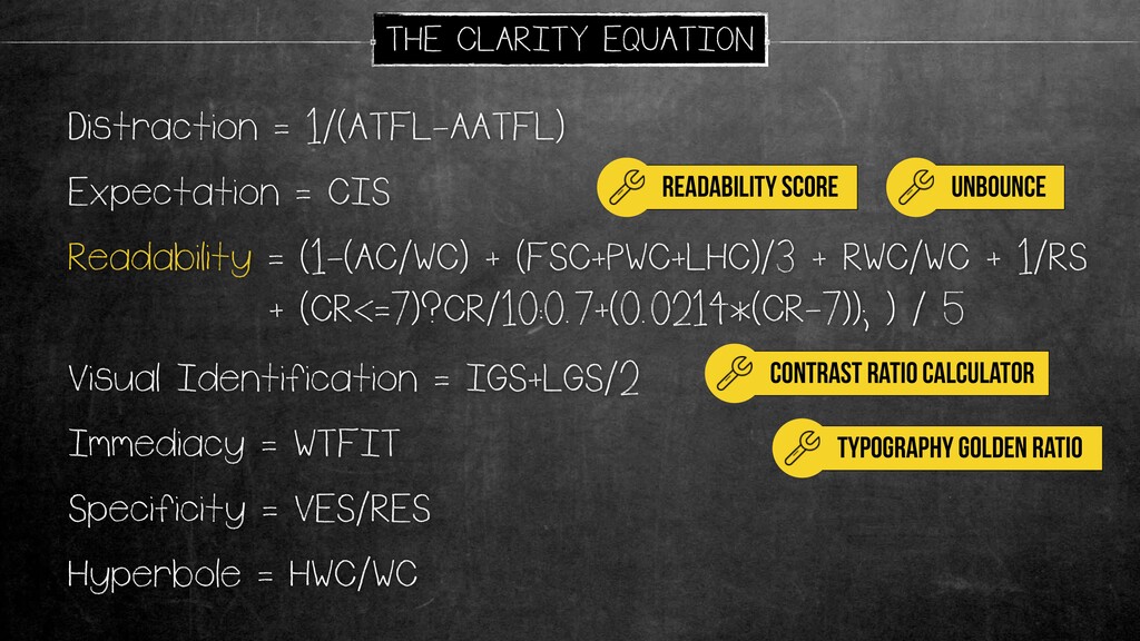
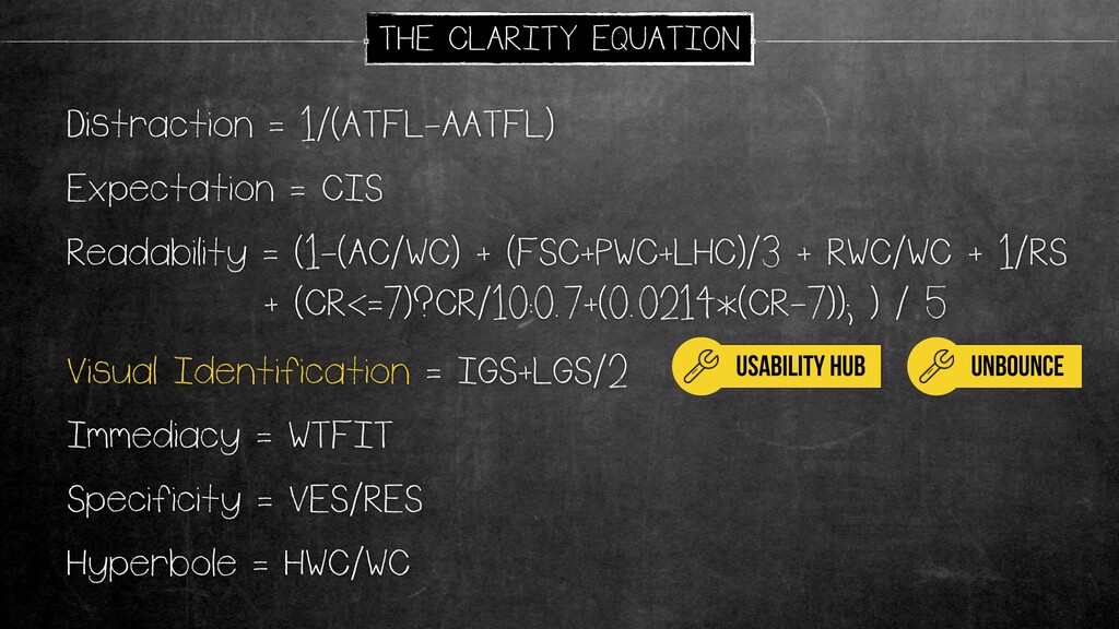
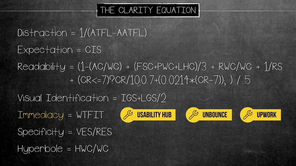
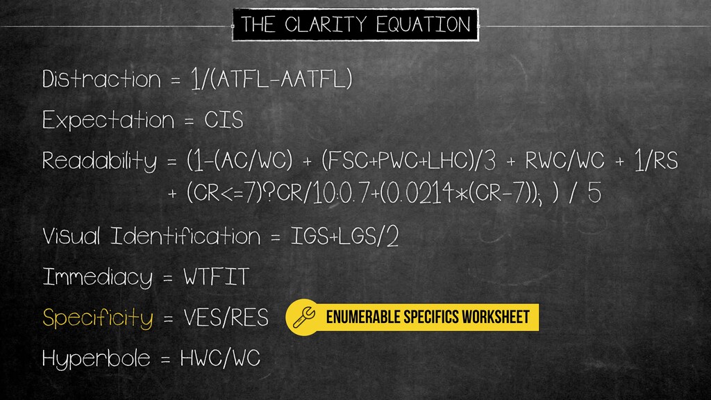
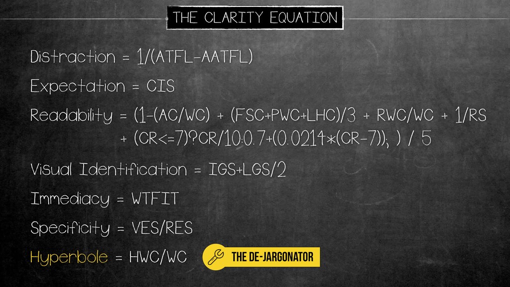
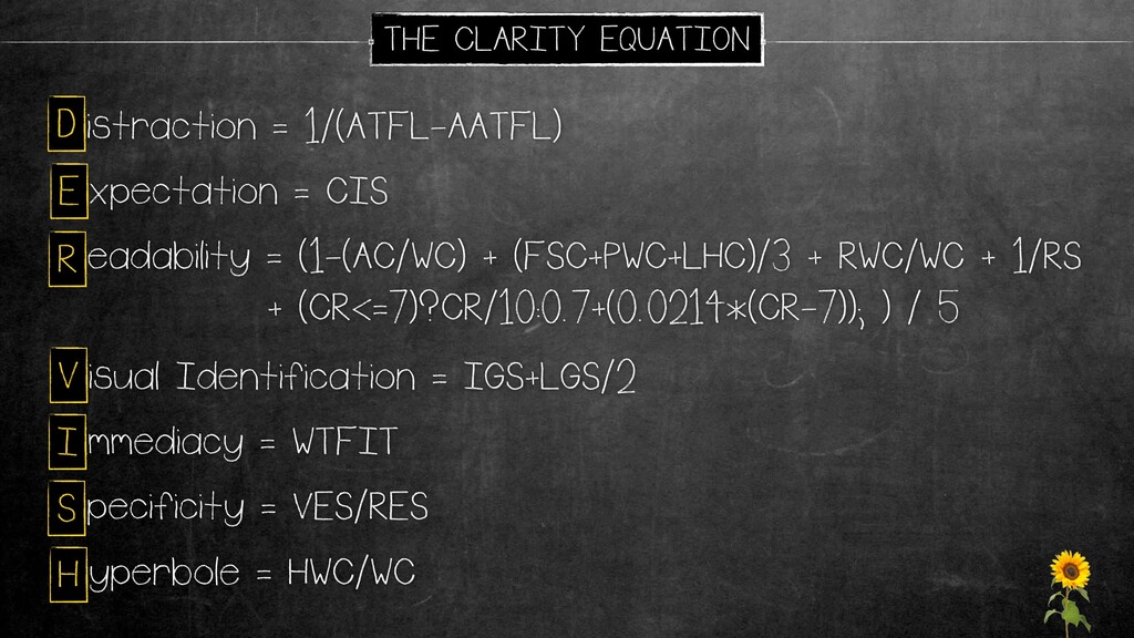
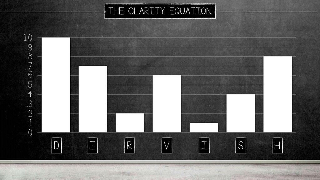
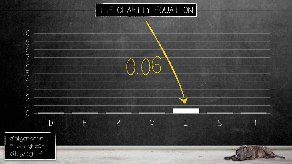
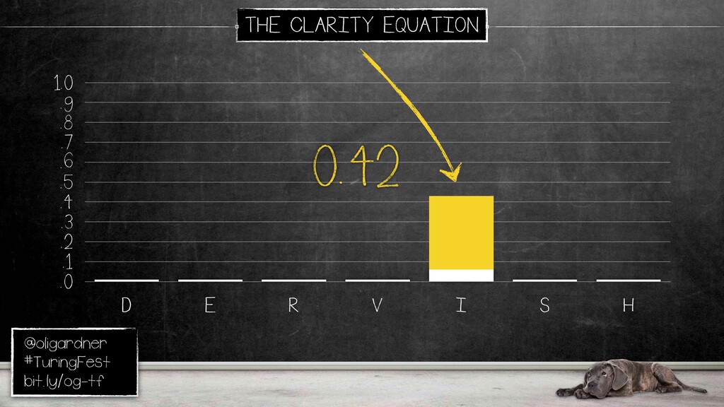
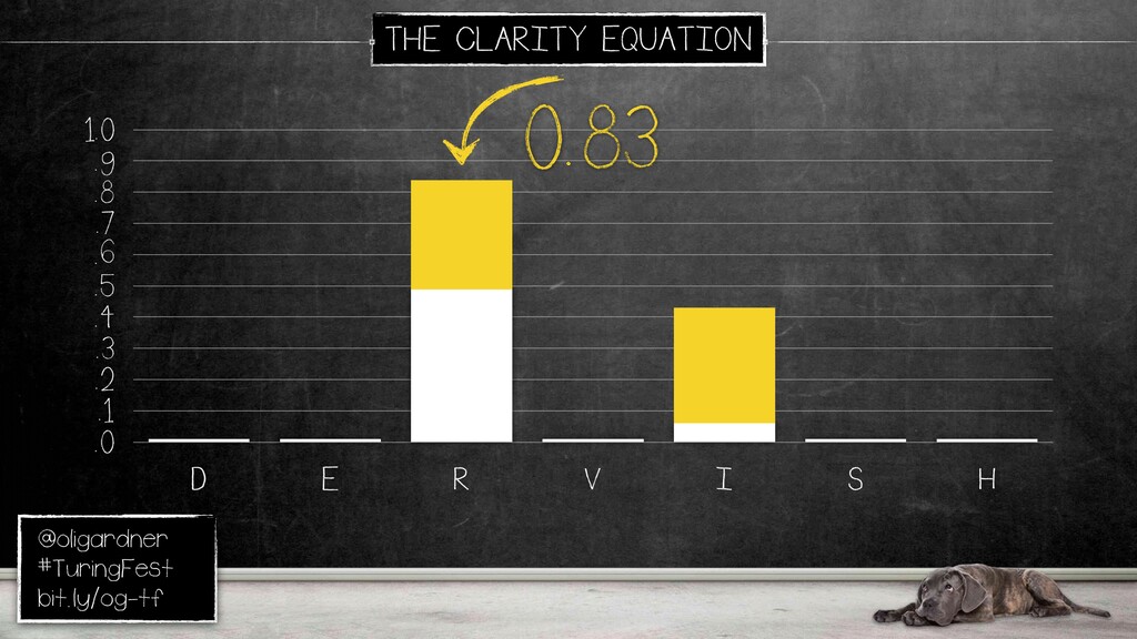
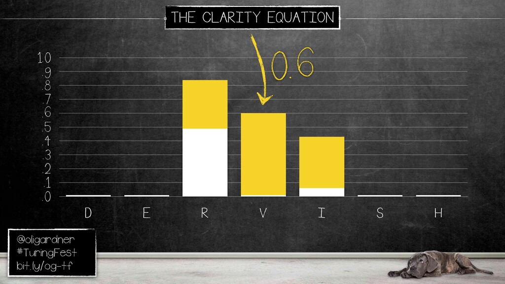
So, here's the clarity equation. Like I said, so you can do tasks to fill in all of the gaps in here, all the acronyms to give you a score. And to make it simpler, I've broken it down into seven parts. Distraction, what are all the things that are distracting someone from understanding your value proposition?
And there's lots of tools in here. So actually, on the next slide, there's a link to a landing page, which has all of the tools I mentioned, a whole bunch of links. So don't worry about taking things down now. Everything is on there.
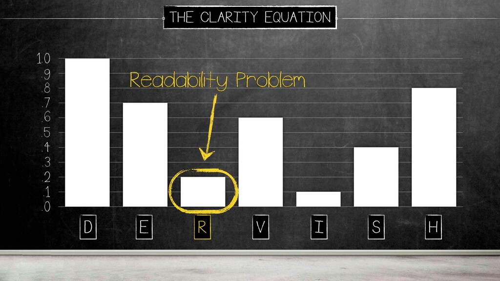
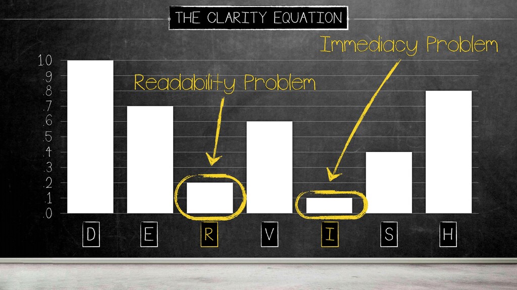
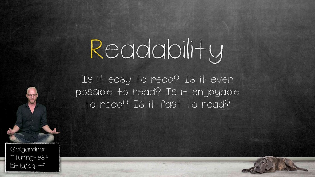
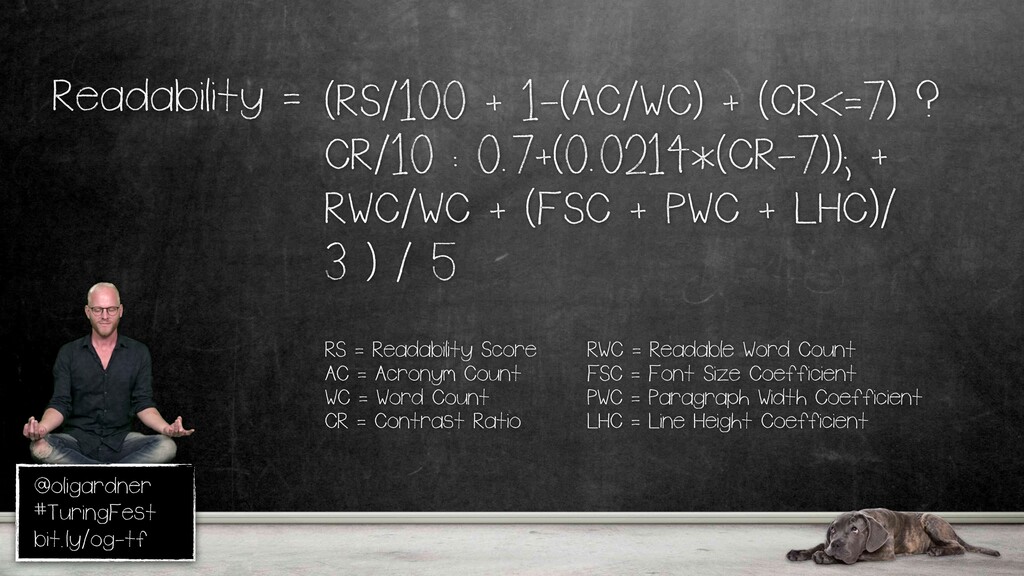
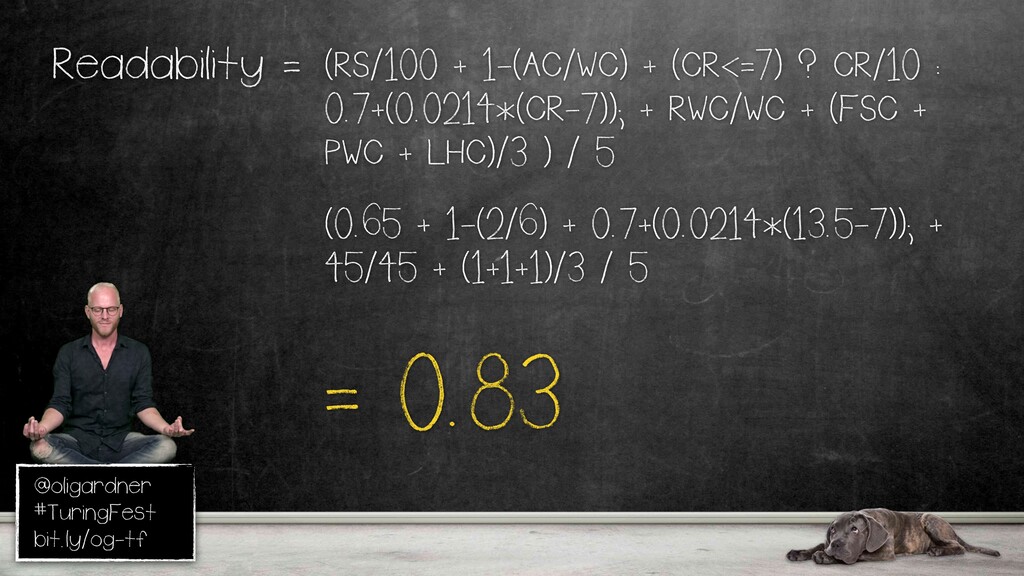
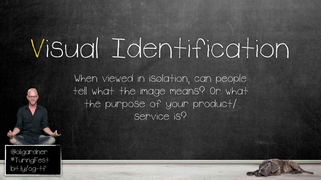
Expectation. Does your page meet the expectations set prior to the click, and does your CTA communicate what's gonna happen next? Readability. There are a lot of readability problems. This is a longer sub equation. I'll go into some of that. Visual identification. If you look at the main hero image on your page in isolation, can people understand what you do?
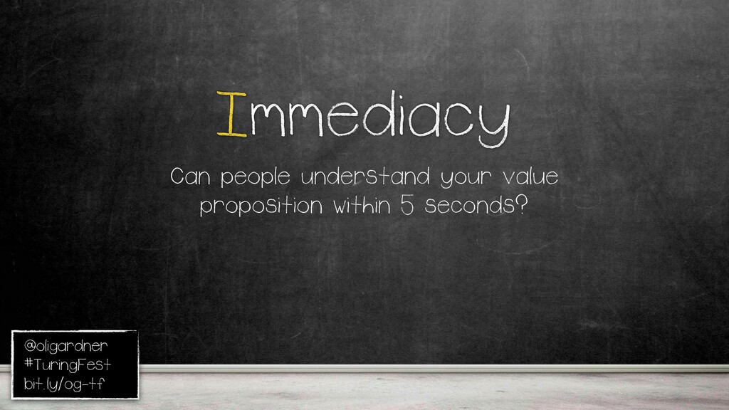
Immediately, can you do all of this in five seconds? Specificity, are the details of your offer present? Right? The things that differentiate you from someone else. Could be price, could be location, whatever it is, you need to get the details in there. And hyperbole, which is a lot of businesses just yap on about themselves.
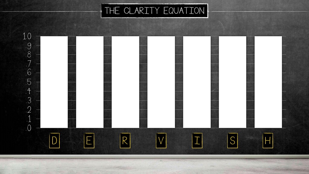
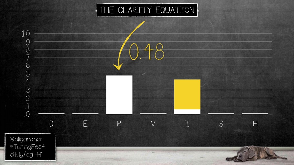
They don't really talk about the actual value. Breaks down like that. It's called dervish, which moves into a chart like this. This would be a perfect score, which is never gonna happen. This is more likely to what you'll have there. Now you know you have an readability and an immediacy problem.
You can stop trying to run tests or optimizing the rest of them, because you know where the problems lie. Now, I'll go through some examples, and I'll use different sites to go through them, but you would just use your own site or your own landing page for all of these.
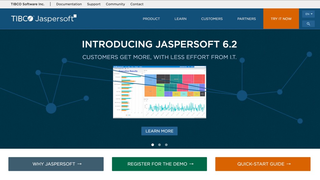
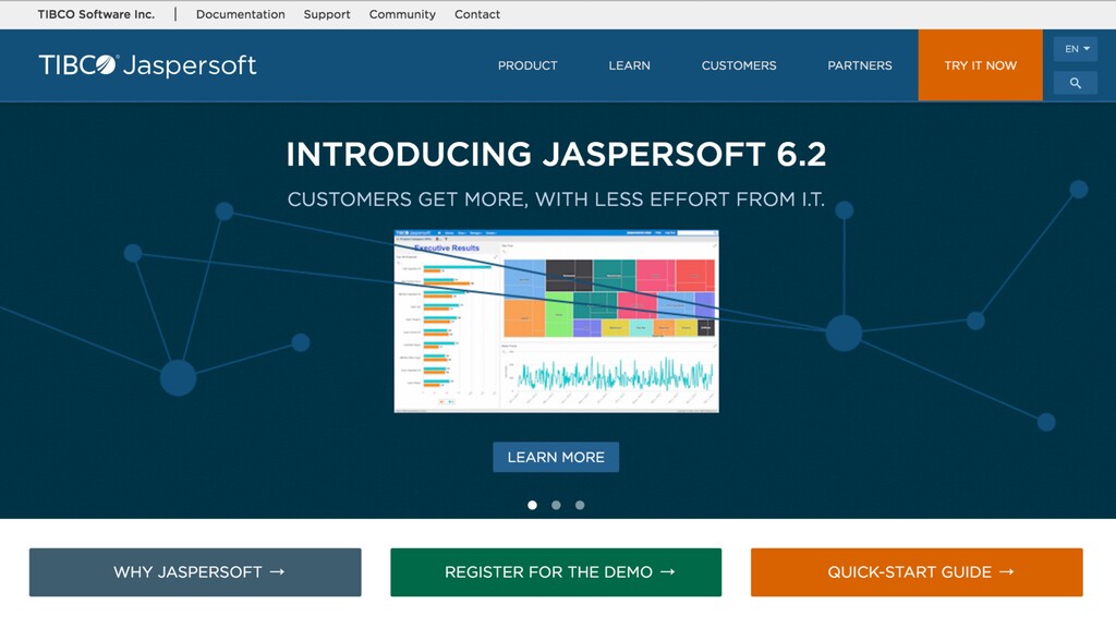
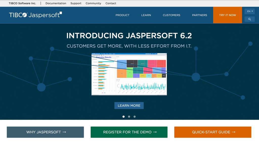
Can people understand it in five seconds? Okay. Someone shared this. Nicole, my girlfriend, shared this with me. She was looking at this software, And I thought, well, what does it actually do? You're introducing it. Thanks. That's great. But, I don't know what it does.
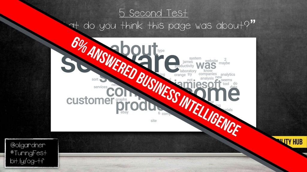
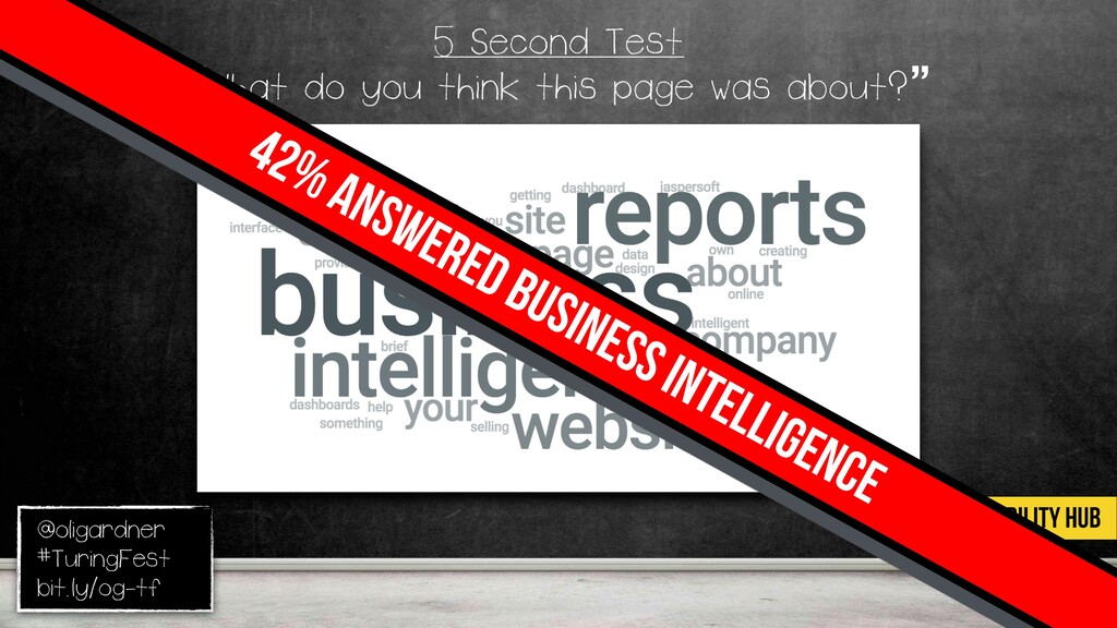
So, I ran a five second test. Usability hub, five second test. If you don't know, you show someone a screenshot. Five seconds, it goes away, you ask a question. It's great for uncovering clarity problems. It's qualitative analysis. I said, what do you think this page was about?
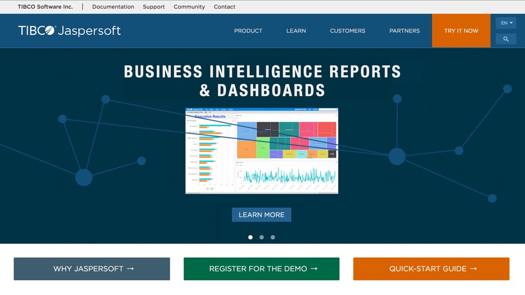
Lots of generic answers. Only six percent knew it was business intelligence software, because they don't really say that. Maybe they got that from the dashboard. So that's a terrible score. How do you fix it? Well, I looked around the site, and it took me a while.
I went to the products page to figure out what they actually do, which is that. So I just replaced it and ran it again. Now you can see what's happening. Right? Immediately, people are getting what it is you actually do, forty two percent.
And this is really, really easy, and this took me no time to do this. So now you can see you're starting to optimize this really simply. Because people don't tend to tell you what they do. I see site after site, where they congratulate themselves or talk about awards, but they don't actually explain what it is they do.
Readability. Does anyone remember Page Fights? A couple of people. It was an online show we did, me and Conversion Excel, where we would **** on landing pages, and it got quite violent. At some point, we thought, this isn't really working. We're not getting the ROI from us that we want.
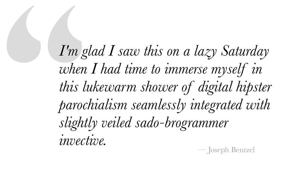
It wasn't growing, so Pep got on growthhacker dot com and asked the question, how would you grow this business? This is the first response. I'm glad I saw this on a lazy Saturday when I had time to immerse myself in this lukewarm shire of digital hipster parochialism seamlessly integrated with slightly veiled saddle programmer Invective.
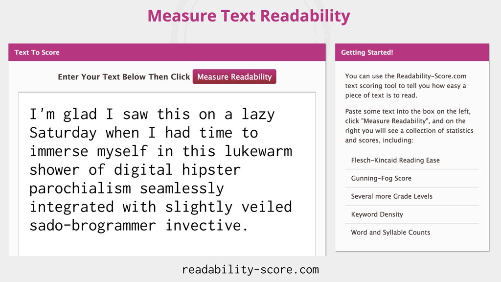
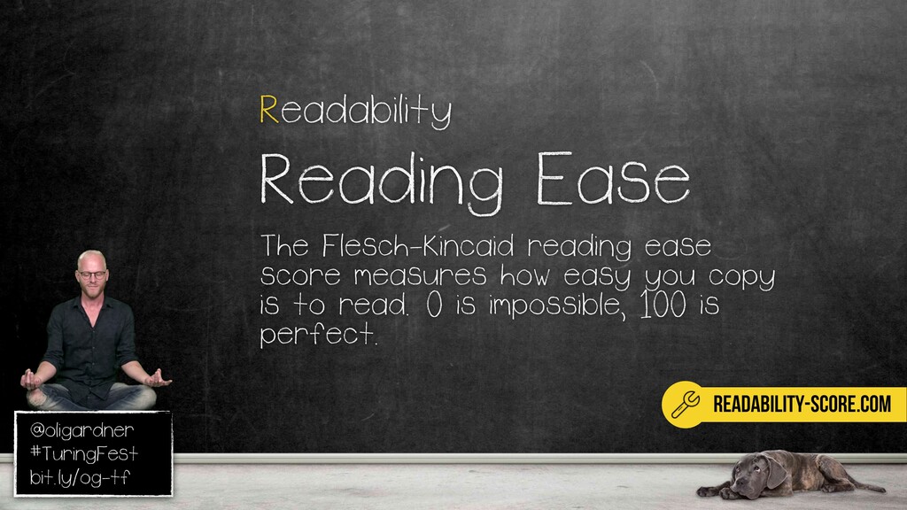
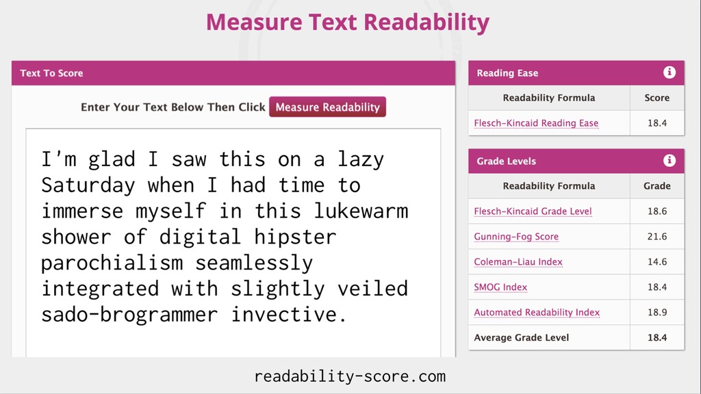
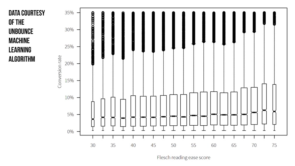
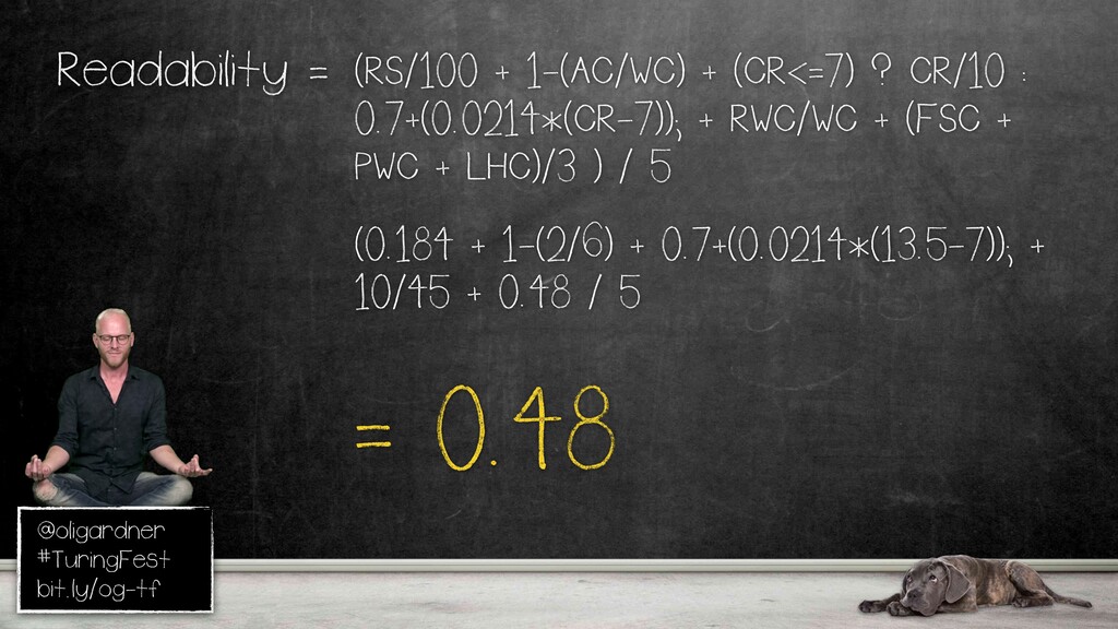
He's not a fan, clearly. So, I thought, this is a really complicated sentence, so I put it in readability score dot com, which analyzes the text based on a Flesh Kincaid reading ease score. A hundred is very, very good, which is the best, and zero is you can't read it.
Scored eighteen point four, which is really, really low. This is a great tool. Put your copy in there, and you'll get a sense. It also gives you a grade level. You have to have a master's degree to understand this guy according to this.
You wanna get a really high score there. And it's not too difficult, but it's a great way of getting a gut check, whether you're being a little too complicated. Data to back it up. So this is brand new. No one's seen this before.
This is from our We're putting it into our algorithm right now, and you can see it's not a big impact, but as the reading ease goes up, which you want, the conversion rate also goes up. You can see a slight incline there. The more of these equation parts that we actually can connect to into the algorithm, the stronger it will become.
To the ROI part. Pep made a nice observation because Page Fights is kinda the beginning of how I met Nicole. That's the ROI of Page Fights. Quite happy about that. Alright. Here's a carousel. You know these things we got on websites at the top?
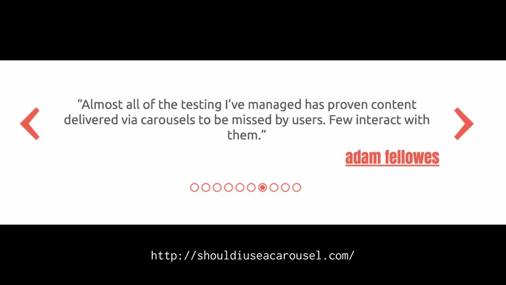
Everyone loves everyone loves to hate carousels. Well, because they suck and they're stupid, but the other time you get them is for testimonials. Super common. I'm gonna read this one. Okay. So carousels are effective at being able to tell people in Carousels pose accessibility issues for keyboard and screen.
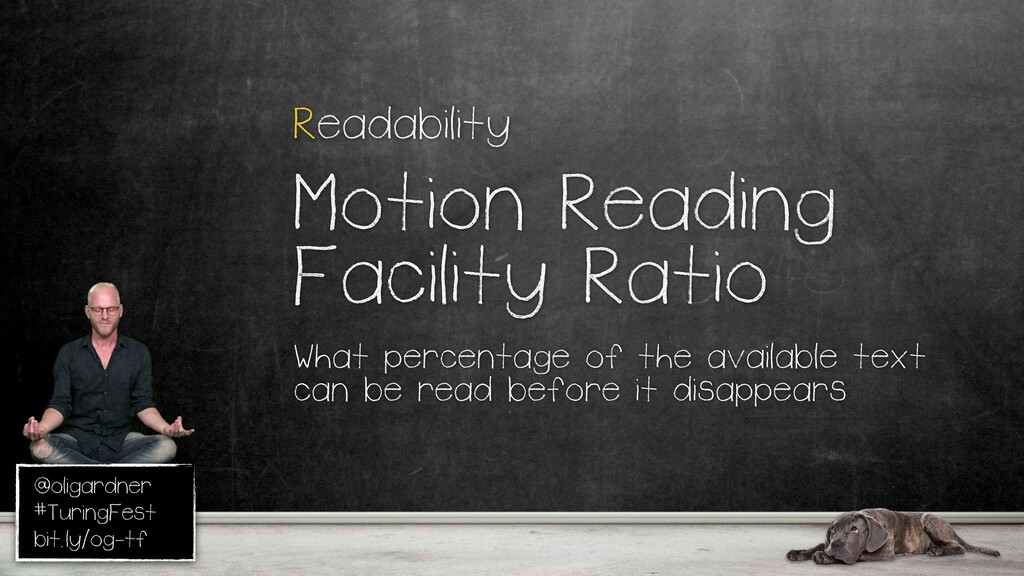
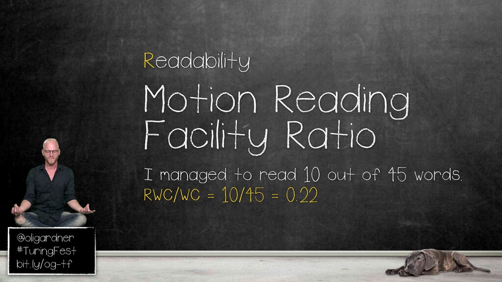
Nah, I'm really frustrated. This happens all the time, and it's so silly. People just turn it on, like, widgets from themes they buy. They think it's cool. It's not cool at all. I can hate it. This is the motion reading facility ratio. So how many of the words can you actually read before it goes away?
You have one of these? Just take it to your boss or client and say Point out how much of it you can actually read, because it's really silly. Worst case, lowest barrier, slow it down. Better yet, just extract them all out and make them better.
So, point four a. There were some more elements that I didn't have time to go through. But, on that page as well, I'm writing an instructional guide that will walk you through how to do all of this. So, put your email address in there, and I will send it to you when it's ready, hopefully next week.
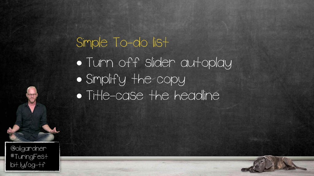
And, I will never send you another email. I'm not building a list. You'll get one email only, because I just wanna help. So, that's about in the middle. That's okay. So, turn off the autoplay, simplify a copy. It's something I took out, but you can quite easily make changes and make it better.
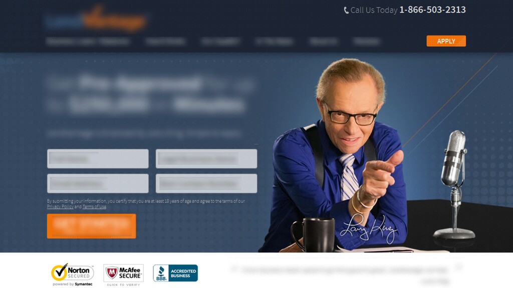
Hey, Visual ID. I saw this landing page, and I thought, why is Larry King on there? And more importantly, why is he shooting laser beams out of his thumb? It's just I don't know. I'm like, well, if I think it's weird, maybe other people think it's weird.
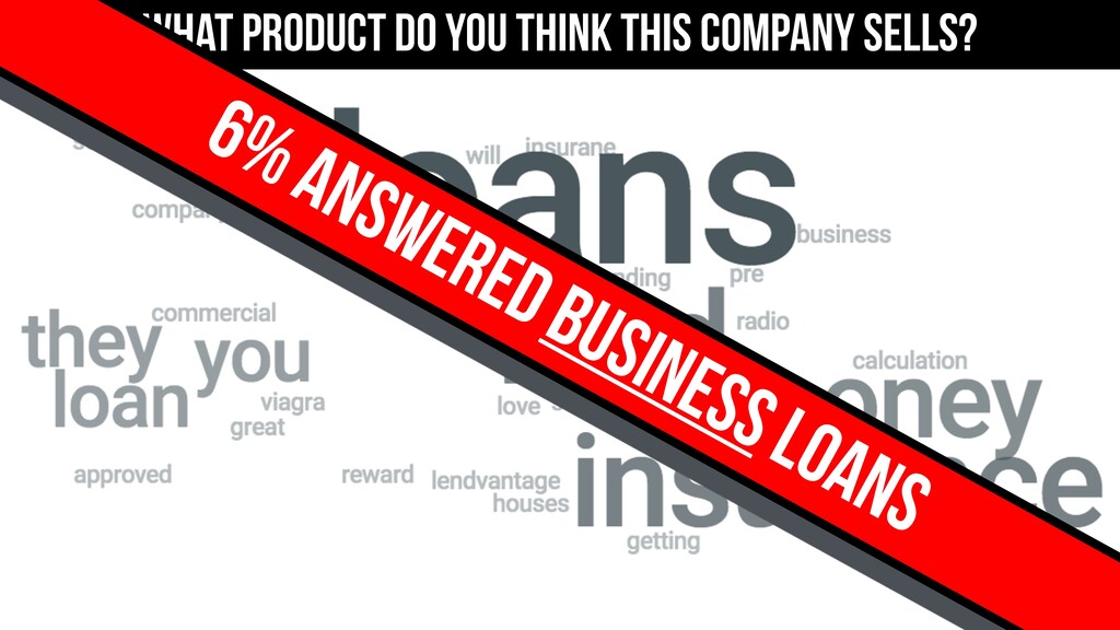
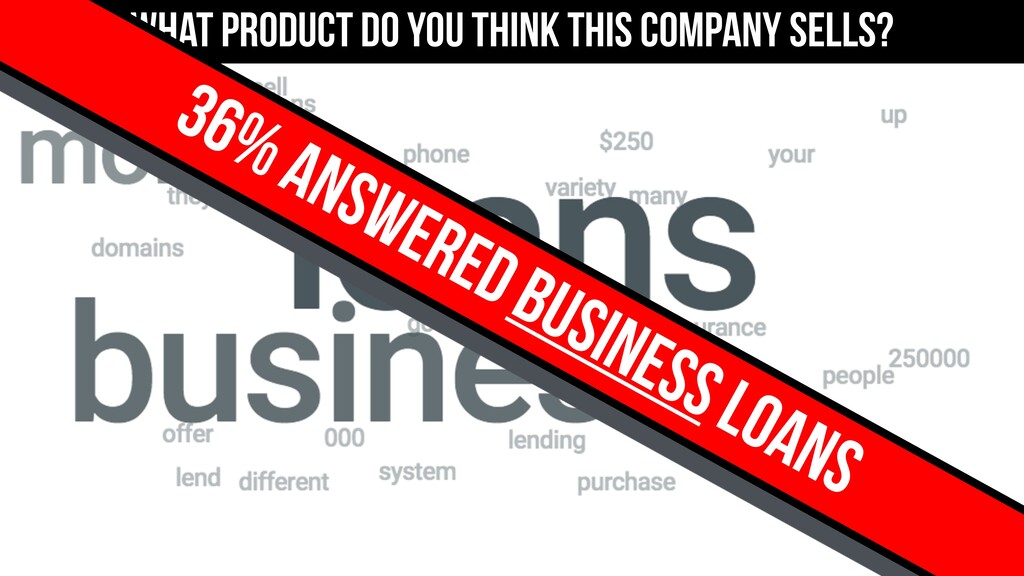
So, again, I went and did a five second test. Now, I'm not affiliated with Usability Hub. It's just a great tool for rapid experimentation. So what do you think this company sells? Loans, lending money, insurance, business loans. Hardly, they don't got it. Specificity, the word business is critical to their success.
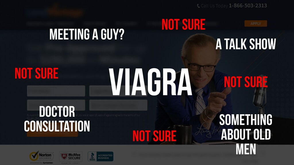
It's not a loan for anyone. It's just for businesses. So I thought, I wanna see if it's a Larry problem. So I blurred everything else out and asked, isolating the visual, what do people think it is now? Meeting a guy, a talk show, something about old men, doctor consultation, Viacra.
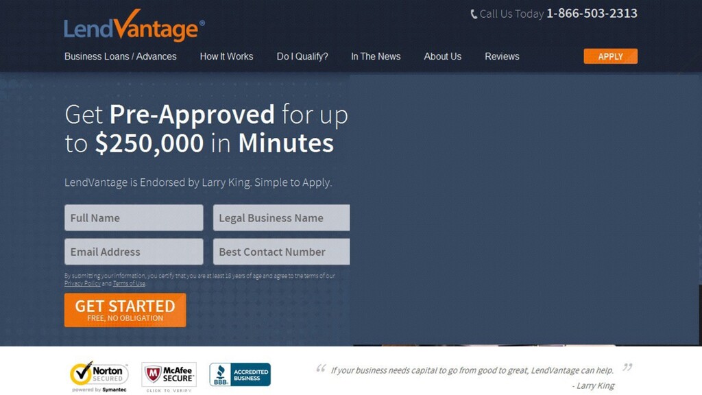
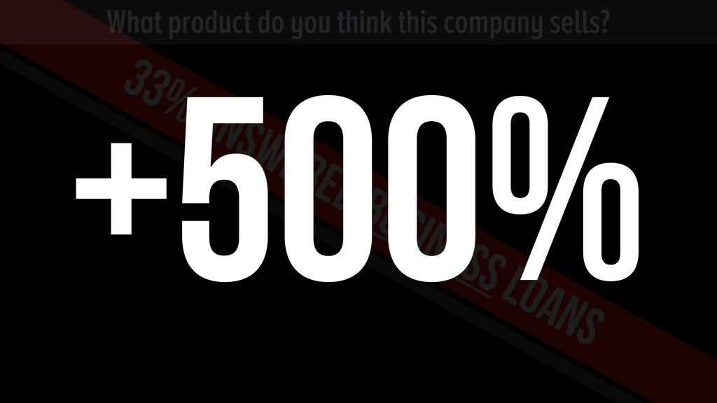
And a lot of people just didn't get it. So we definitely have a Larry problem. So I just deleted him. I got him Photoshop, and I just kicked him out of there. Ran it again. Look at that. That's exactly what they do. I mean, he's a very high priced endorsement.
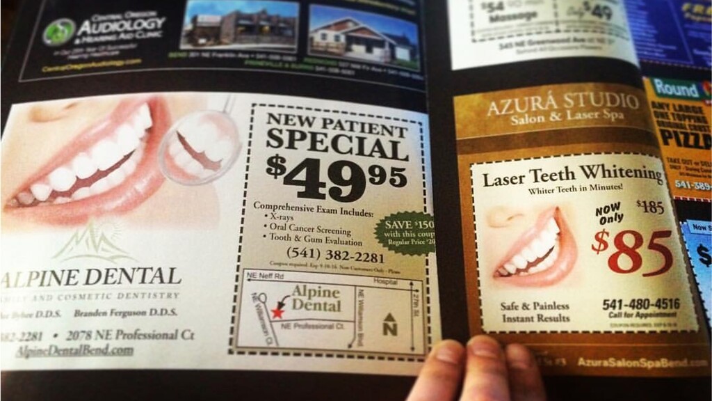
So, you know, they have to put him somewhere, but don't make him distract from what you do at the top. You know, visuals need to mean something. That's a five hundred percent increase, just by deleting him. Okay. This is a magazine. Two different dentists with the same stock photos side by side.
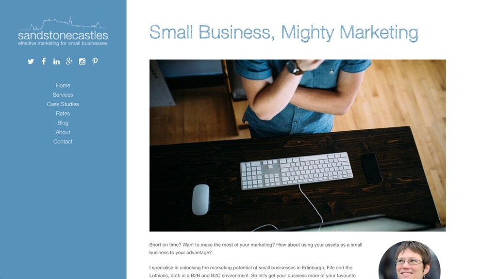
How lame is that? And this one's cheaper, so I'll just go with them, but I stopped trusting them because I'm these guys aren't professional enough to actually have real photography. Yeah? Okay. Denise? This is Sandstone Castle. It's Denise's page here. I looked at this image, and I thought, that looks that looks like stock.
I mean, it's almost as bad as the the lap the overhead view of the laptop and the coffee cup that most SaaS businesses tend to use when they first start out. So I thought, oh, well, have let's have a look at this this image.
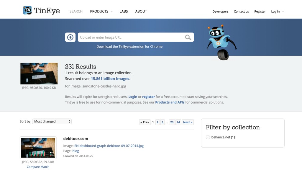
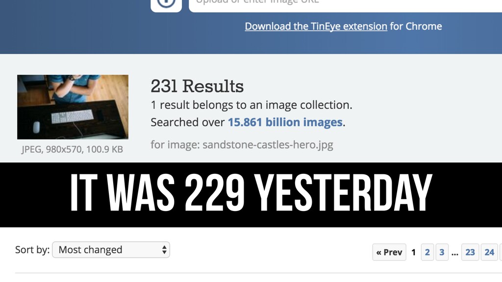
So I went to TinEye, a reverse image lookup, and there are two hundred and thirty one sites using this image, some of which you may have come across and, like, maybe you didn't like them. So then by association, like, oh, I don't really like you either.
And, it was two twenty nine yesterday, so more and more companies are using this. So, take it out. Do the Larry thing with him with that. Get your process further up the page. How do you work? And you, you're there as well, but just bring that stuff up because that's what people are gonna care about for small business marketing.
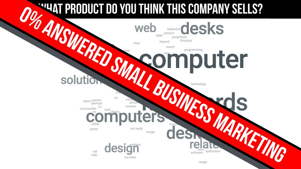
Or find a visual that represents something that you do and put that in there. But don't put an image in just because people say you need to have, you know, a hero shot. Right. That's what people thought you'd do. Computers and keyboards, and that's not what you do.
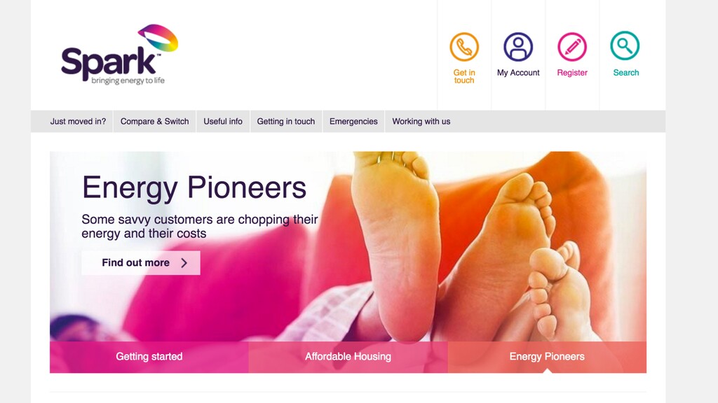
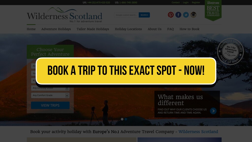
Nobody got it right. What do you think these guys do? Mattresses. Mattresses? Alright. Energy. Like electricity and ****. Okay. Don't do that. This is a lovely site. I love this. But the biggest problem I have with travel sites is you don't tell me where it is.
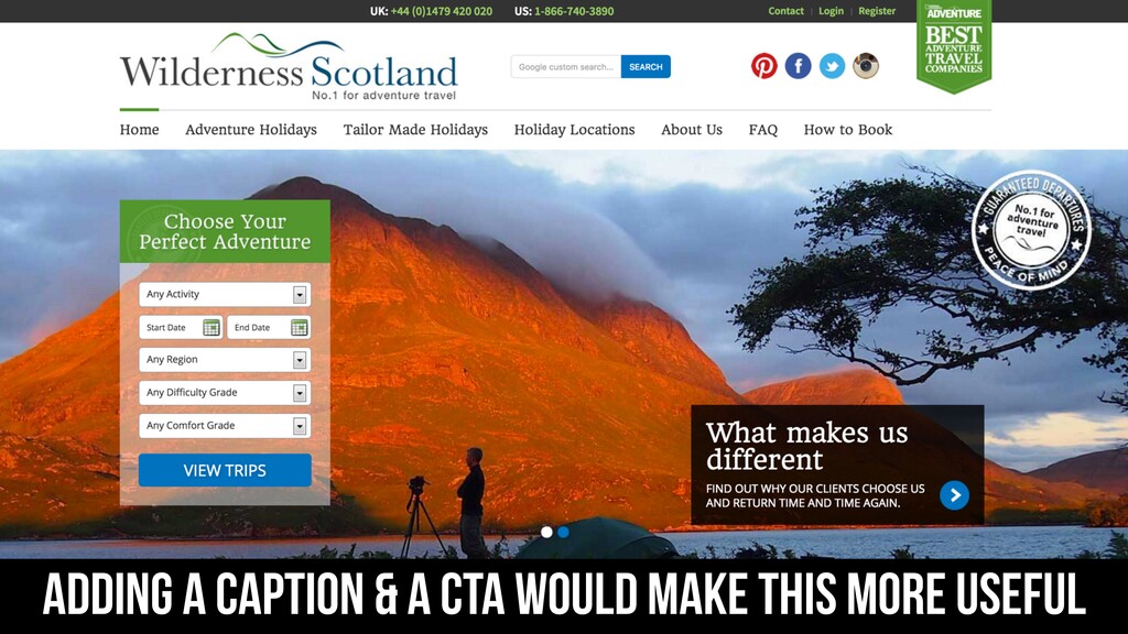
I love this, but there's nothing there. Like, I wanna go there. I wish someone would do Shazam for landscape photos. You could just like, oh, that's where it is. That'd be amazing. If someone builds that, I wanna invest. Just put captioning or maybe a CTA.
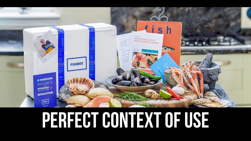
Like, book a trip to this place right now. That's that's kinda what I'd like to do. This is how you do it right. Where's fish box? Over here. This is how you do it. I look at this. This is perfect context to use.
I know it's gonna be fish with what are the what's it called? Instructions? Recipes. In a white box with blue bands around you. I know what it is. I know what to expect. It's perfect. That's what you need to be doing. I'll use that as an example.
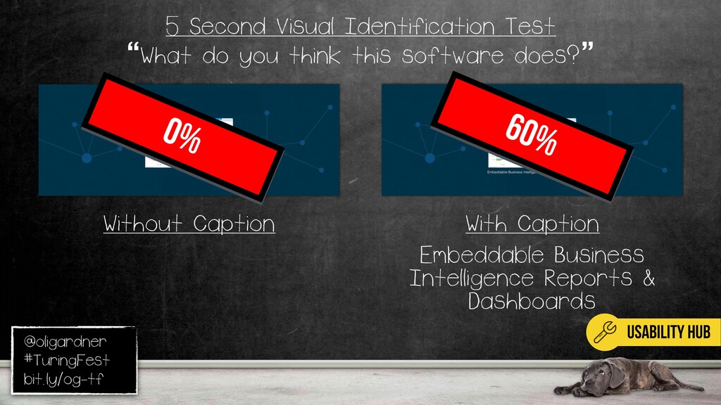
So, if you run these things and you figure out you have a visual clarity problem, how do you fix it? Well, so I took this one, because this is just about as generic as you can get for a dashboard. Test it with and without a caption. None, sixty percent.
Got it. Just because people read captions. Now, you have a design problem, so that's not solving it, it's just making it better. So you still wanna go and try and make a better graphic there. Potentially with callouts that point to the features and benefits that are actually important and make you different.
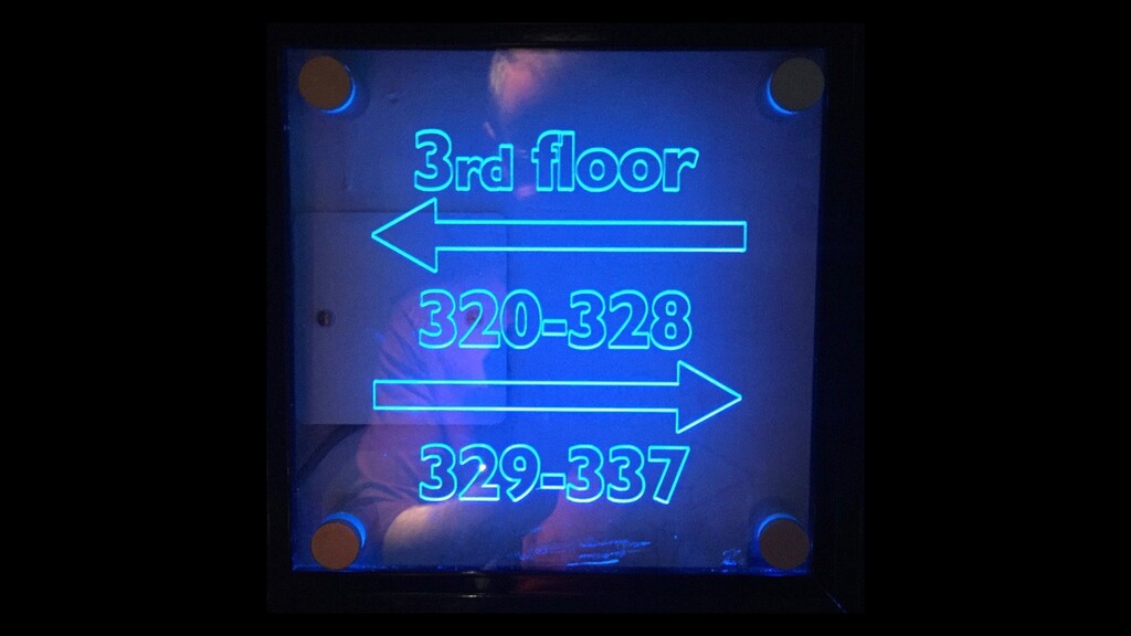
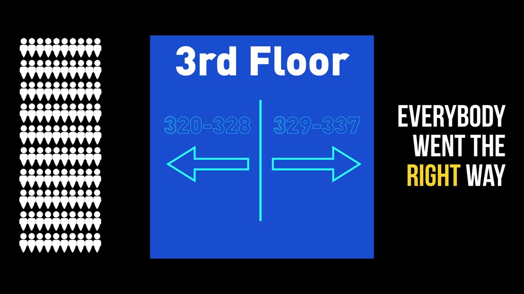
So that brought that right up. Like I said, on that page, you can get the full guide once I finish writing it, because I had to skip some of the parts there. Now, where are the guys from Dublin? So I was in Dublin speaking, and I went to I checked into my hotel, and they gave me a card, key card for room three twenty four.
So I I go down the corridor, and there's a lady waiting at the elevator. So I I wait beside her, and we chitchat. Elevator opens. I let her in first. She goes in, puts her card in, and presses the third floor. So, now I don't have to do anything, so I kinda awkwardly stand beside her.
Comes up, I let her out again first. Now, I'm following her out of the elevator. I see the sign, I go, oh yeah, I'll go this way. I'm still following her like some creepy pervert going down. And it's not until I see two doors in a row where I get like the, ****, I'm going the wrong way.
But now I've walked her right to her door. She goes in on her you know? Like, so dodgy. So I was kind of upset about that. So I went back to my room, and I'm gonna run an experiment on this. So I I described the context.
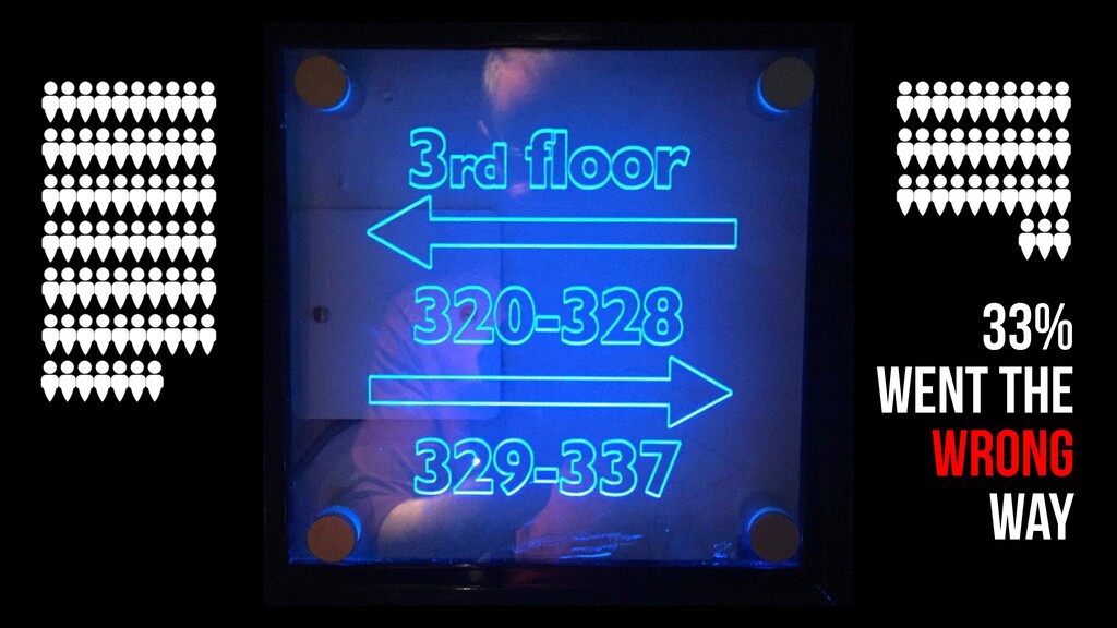
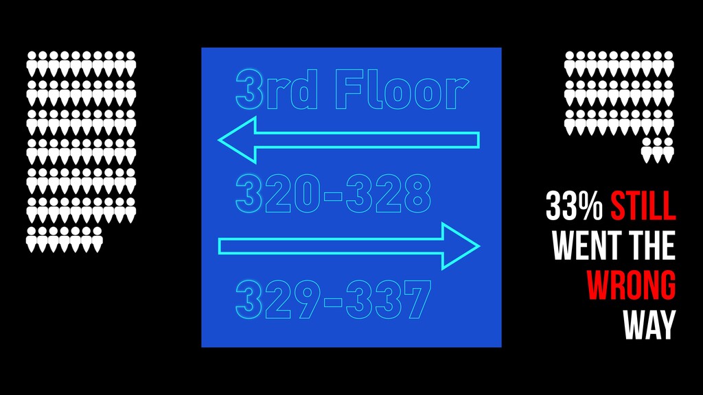
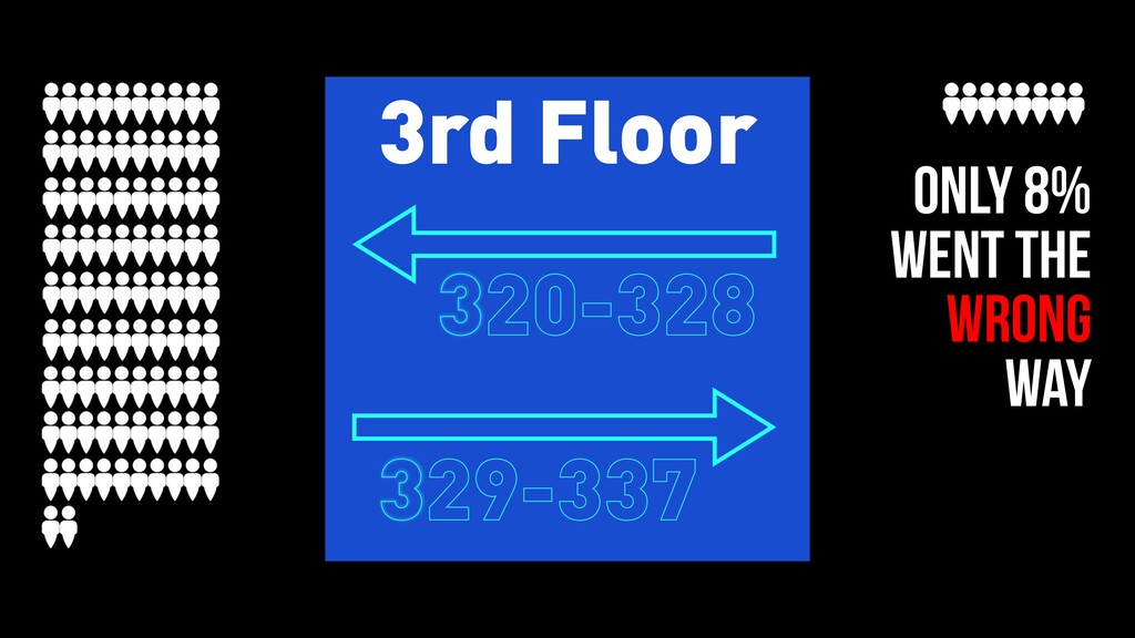
I said, you've got room three twenty four. Would you turn right or left? Thirty three percent of people went the wrong way. So we have a problem here. So I mocked it up graphically so I can change it, manipulate it, ran it again, exact same problem.
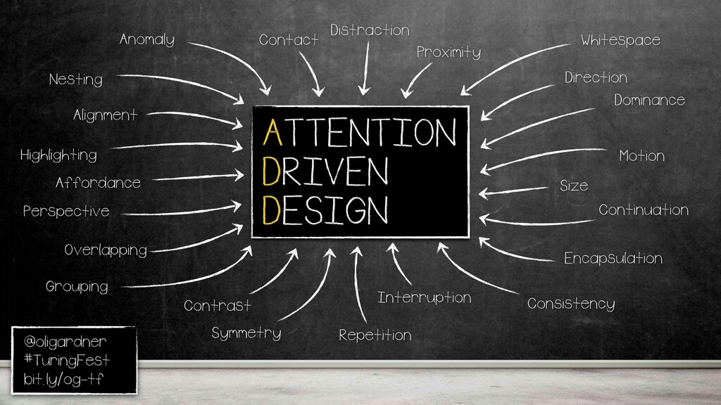
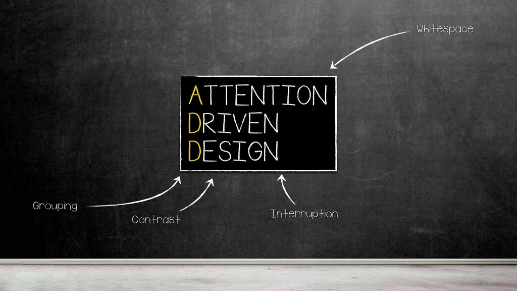
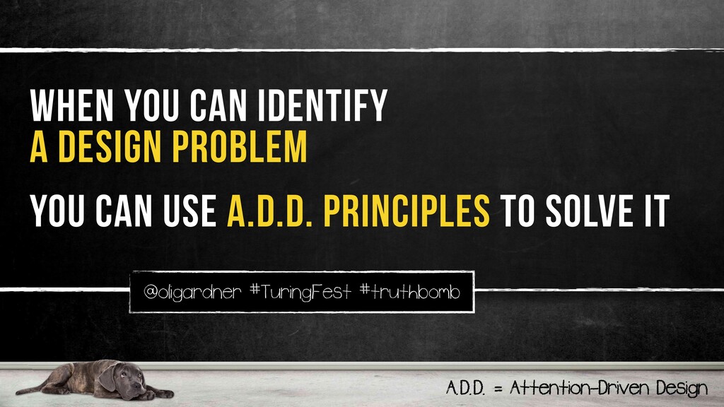
Now, I'm gonna apply So, I know I have a design problem. Right? So, when you have a design problem, you need a way to solve it. ADD, attention driven design, these are twenty three principles I have. Graphic design principles that can help you focus people on what they're supposed to be doing, or what you want them to be doing.
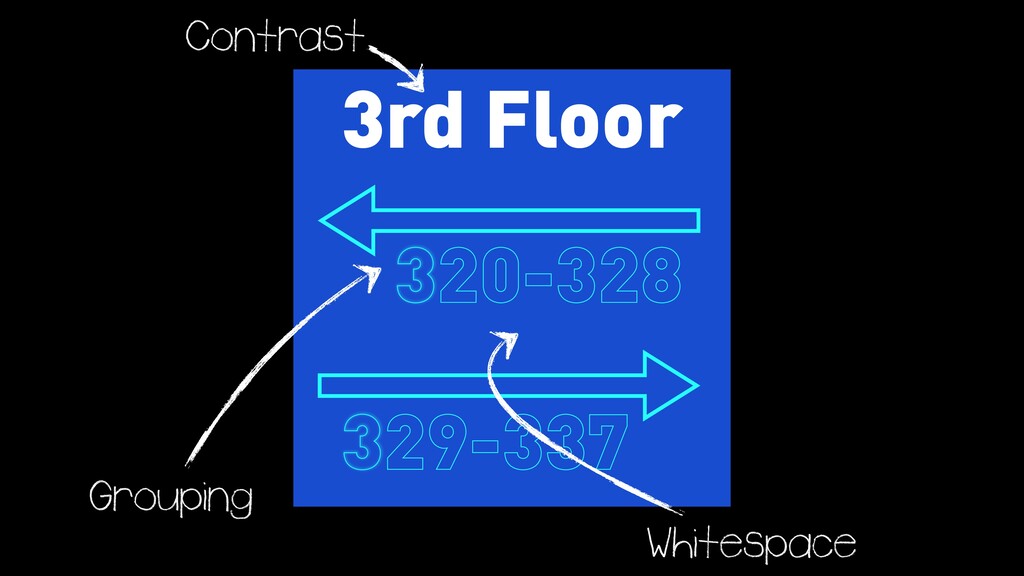
I'll use four of them to fix this design. So, first of all, contrast. I made that stand out because they're semantically different. This is where I am. This is where I'm going. This makes me relax. I'm on the right floor. And then I put these numbers with the correct arrow and a little bit of white space in the middle.
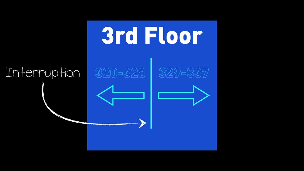
Only eight percent went their own way. Then I put some interruption. I broke them apart so it's really obvious which way to go. Everyone got it right. Way fewer perverts in the hotel. Good for everyone. K? So if you can identify a design problem, use these principles to fix it.
Because nobody's really ever been taught to design for conversion. These principles will help you do that. There's an ebook of all of that. Again, it's at that link on the landing page. Design matters. It matters a lot, much more than people give it credit.
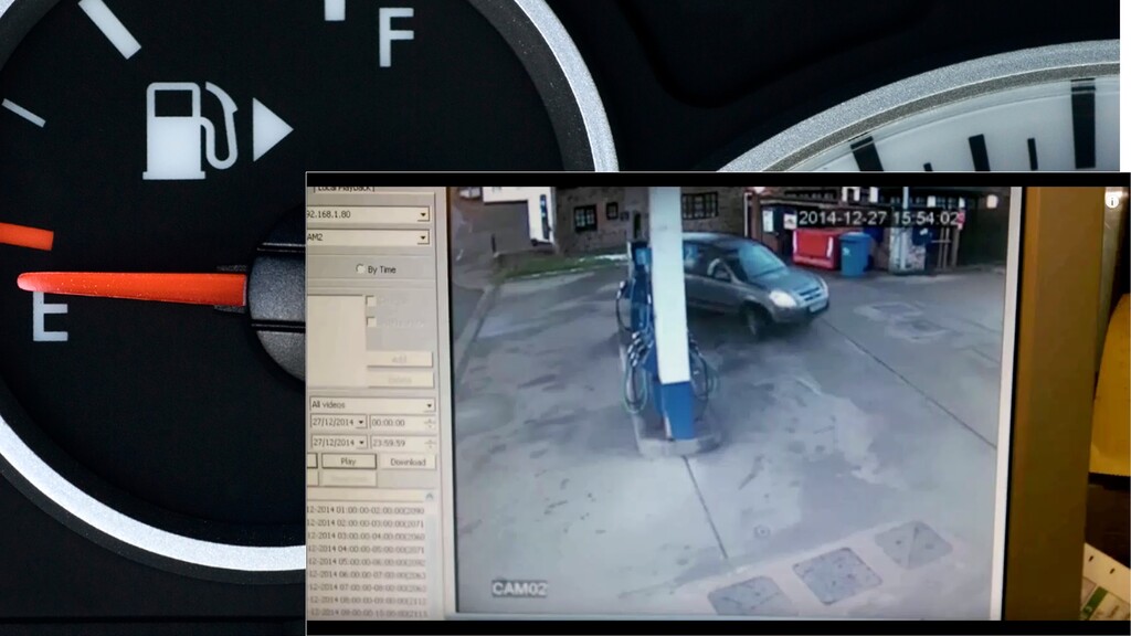
It creates joy. We all know that with, say, Apple products or whatever it is we like, we love, but it gets overlooked in many ways. It also reduces confusion. If you have a car or you've ever driven in your life. Right? Obviously. You're the you're the petrol station.
Look how I got, like, UK with you there. And you have that little arrow, and it's really important. Because if you don't have that This is really sped up. It takes two and a half minutes, and someone else comes, fills up pays, and leaves before it actually solves this problem.
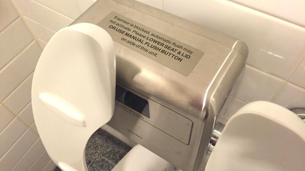
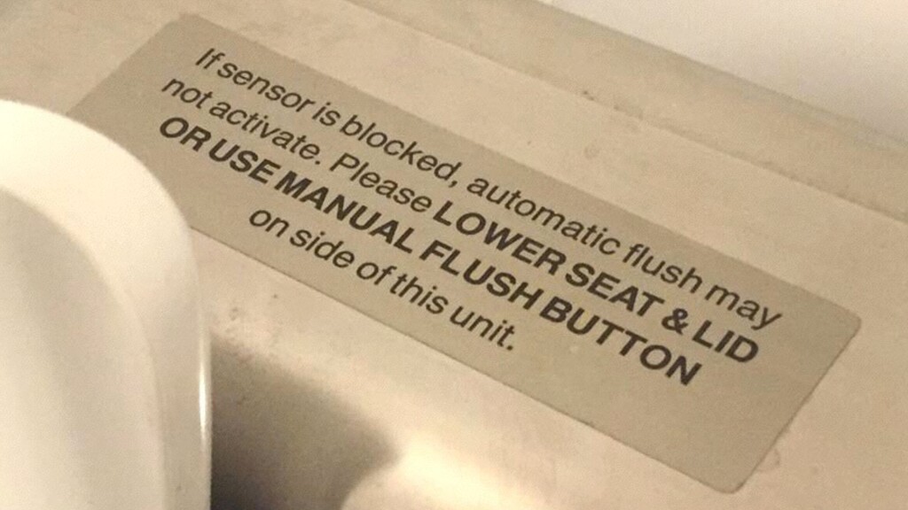
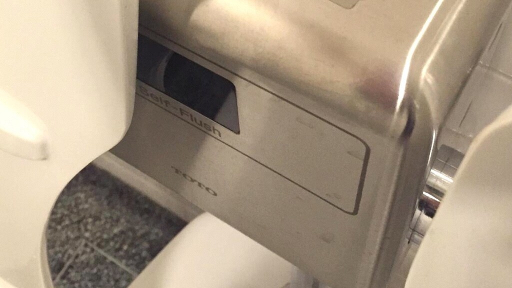
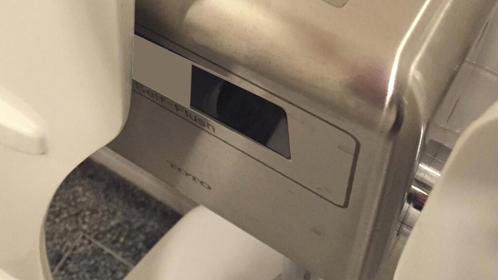
It should reduce germs. You've already seen these things. So, guys are kinda know, a guy goes in, you lift it up with your foot. Try and do that. Do your business. But, guys are kinda gross. If the sensor is blocked, automatic flush might not activate, lower the seat, and later use the manual button.
You're not gonna do that again, because it's really loud, and you don't wanna touch the thing. Just move it two inches to the right, and it will be perfect. Design can so easily solve problems. It can speed up repeatable tasks. I found another design problem over here.
So this happens every day, all the time, many times, and that's the problem, repeatable problems. So I need to get in. Here's the here's the card reader. Here's my card in here. Okay. Sure. I can do that, but it's annoying. Alright? I'd rather see? Annoying.
I'd rather do this, but it looks like I'm ******* the wall. I mean, it works, but, I mean, come on. It's it's just move it from here to here, and I could I could just walk past it. Right? Or put it there. I'm still numbing something, but see what I mean.
And then when we merge design thinking with the data that's come we're gonna have access to, that is the fastest path to delightful experiences. But you might be thinking, well, I'm not a designer or a developer. How do I create the mock ups for these tests that I'm doing?
Because I'm a designer and a developer. I can do these things. I don't have the Photoshop files. I can't delete Larry. I'm not a coder. I can't do this with CSS. Well, it's actually, you know, it's it's it's pretty easy. Without permission, you can actually start doing this stuff.
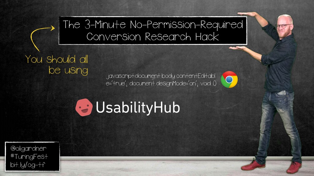
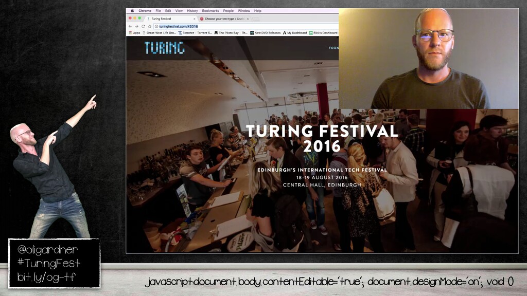
Alright, Edinburgh. This is the hack I'm talking about. You take that line of JavaScript and you paste it in the address bar. Now for some reason, Chrome strips it out. So you put JavaScript back in. And what it's done is made this page editable live.
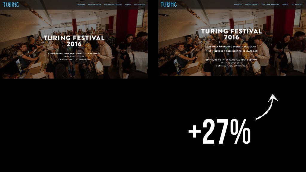
Not live on the Internet, but live in my browser. So I can make changes without asking for permission, without any tech skills. So what I'm gonna do, I'm gonna change the value proposition of the conference website, see if I can sell more tickets.
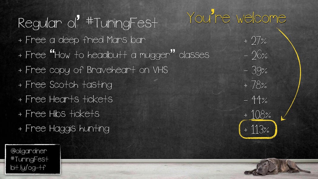
So let's say the only marketing event in Scotland with a free deep fried Mars bar. Because clearly, that's gonna convert way better than the original. So what you do is you take a screenshot of that. You go to usability hub, and you create a five second test.
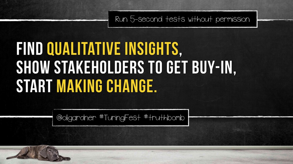
You upload your image, then you can set up some context, and then you can ask a question. What do you think? It's really simple. And you get all these answers back, and sometimes they're hilarious or scary, and you can take them to your stakeholders and go, everything's kinda broken.
Can you give me some budget or some time to try and fix this? People are much more willing to do that when you can show them evidence. So, there's another kind of test you can do. It's called a preference test, where they have as long as they want to look at it, you're basically saying, which one of these do you prefer?
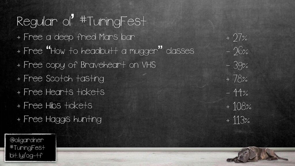
So, I teed it up by saying, your boss has given you the okay to go to a marketing conference in Edinburgh. Which of these would you rather attend? DeepRide Mars Bar won by twenty seven percent. So then that got me really curious. What else could we do to, you know, to calm Brian's nerves and sell more tickets for next year?
How about how to head a mugger class? Right? Classic Scottish self defense. No. That didn't work. It's little intimidating. Braveheart on VHS? That's gonna be a collector's item for sure. No. Scotch tasting. That's bound to work. Yeah. Okay. We're going the right direction again.
But let's get serious now. Free Hearts tickets. Hips tickets? I don't know how many Hearts fans are out here. Sorry. There'll be none of you here next year. And then, how about haggis hunting? Then you can get the international audience because they'll think it's real.
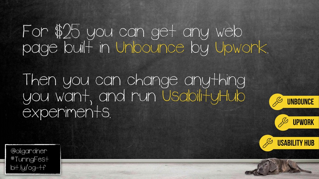
Okay. So, some food for thought. Food for thought. Or, here's just a little tip. You can talk to me about it if you want. Upwork is like Elance. For twenty five bucks, they'll build you any page from anywhere and build it inside Unbounce.
So, then you can just change everything. You can move stuff around, change the copy, change the graphics, whatever you want, really easy. And then you can do all this experimentation without any permission. Just get a free account or whatever, it won't cost you anything.
So, yeah. The full instructions for all the collaborative stuff will be in there, hopefully, next week. I'm from Vancouver, but I lived in Montreal for two years, and it's really cold there. So, I was looking for a sunny vacation for Nicole myself. I saw this one. I'm like, oh, it looks interesting.
Weirdly, it sends me off to airtransat dot com. Mean, that's kinda weird. Expedia's usually pretty good about that stuff. But I'm like, no, I'll look around. It looks kinda good. I'm like, book early and save four hundred dollars per couple per week. Now, I know it's not a button, but see but it's kinda suggesting I can do it.
I can book early and save. Nothing happens. I'm like, what do I do? Well, man, with my twenty years of experience, I know if I click that little tray there, it'll open up, and there'll be a CTA right hiding inside it. Boink. Exactly what I was looking for.
I'm feeling like so proud of myself right now. So I click on save up to four hundred per couple per weeks, the same thing, and it just closes again. So I'm like, alright, well, other one, what's that? It was for a single parent.
I'm not a single parent, but I just want something to work. Closes again. I do this for like a minute and a half. Just like, I'm clicking like the little arrow, maybe just four hundred, and like nothing happened. I'm like, What can I do on this page? It's so annoying.
Then I see these social share buttons, because I'm gonna go to Google Plus and talk about this, because that is dead. Maybe I'll email it to myself to remind myself never to come back to this ****** website. Printing it might be a good idea.
Take it to a travel agent, like, could you book this for me? I can't do it myself. You know? And then, I see this. I'm like, why is there a QR code on here? I have a QR code reader on my phone. They don't come by default.
I'm just morbidly curious about ****** experiences. So I'm like, alright. I'll I'll do this. Sure enough, pop so I pull up my phone. Gives me a URL. I'm like, okay. I'll bite. I'll click this. I have seen QR codes on websites and I have scanned them.
Do you know where they take me? Back to the website. It's exactly what it did except now it's a call to action. I can spend three grand on my phone, but not on desktop. Not happy about that. ********. It's total ********. There's so much ******** marketing out there.
The first rule of CTAs. You probably think, well, that's really obvious. Everyone has a call to action. Well, they didn't. And I bet if you look at the top twenty highest traffic pages on your website, half of them will have old content, and half won't have a CTA.
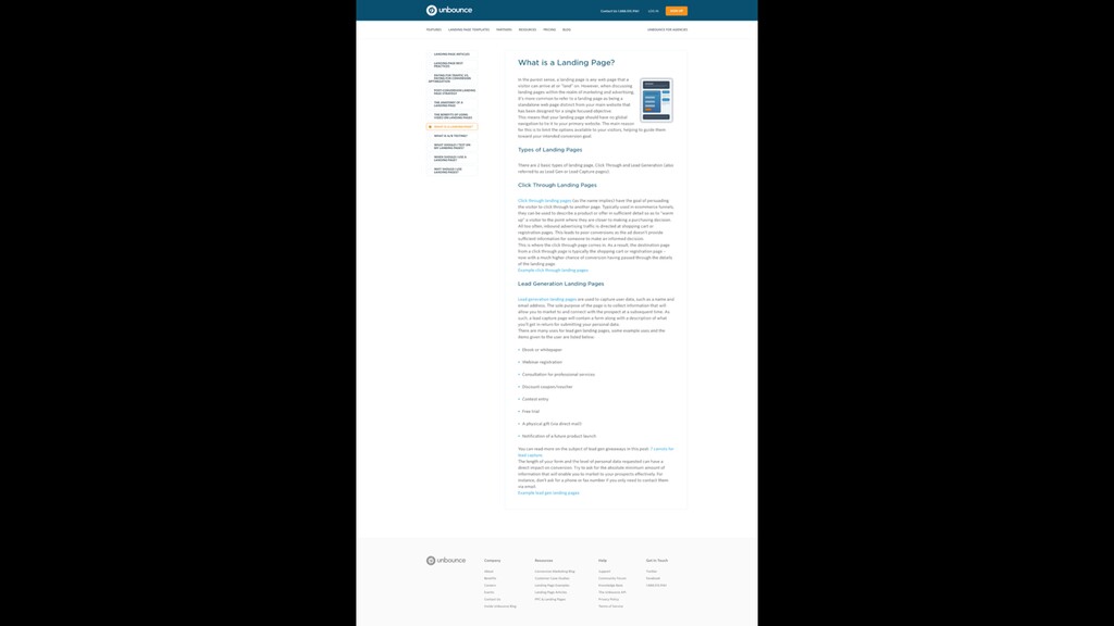
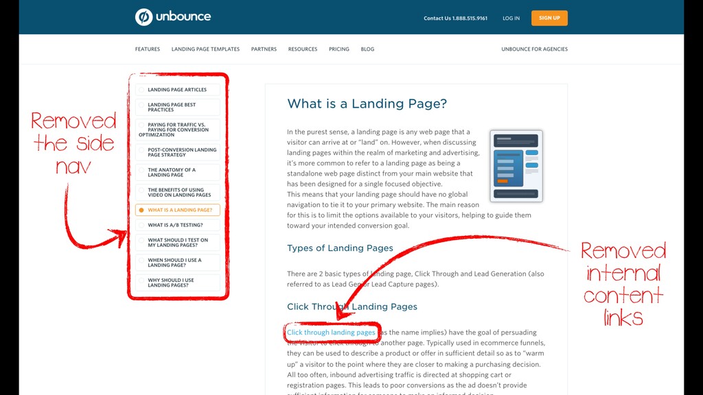
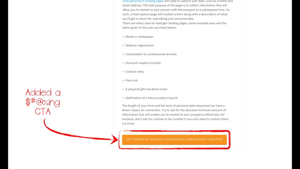
We've done it too. For seven years, we've owned what is a landing page on Google. Takes you here. This is like an information page, lots of internal links to other generic pages, side navs. So what we did, we removed the internal links, took away the nav, added the button.
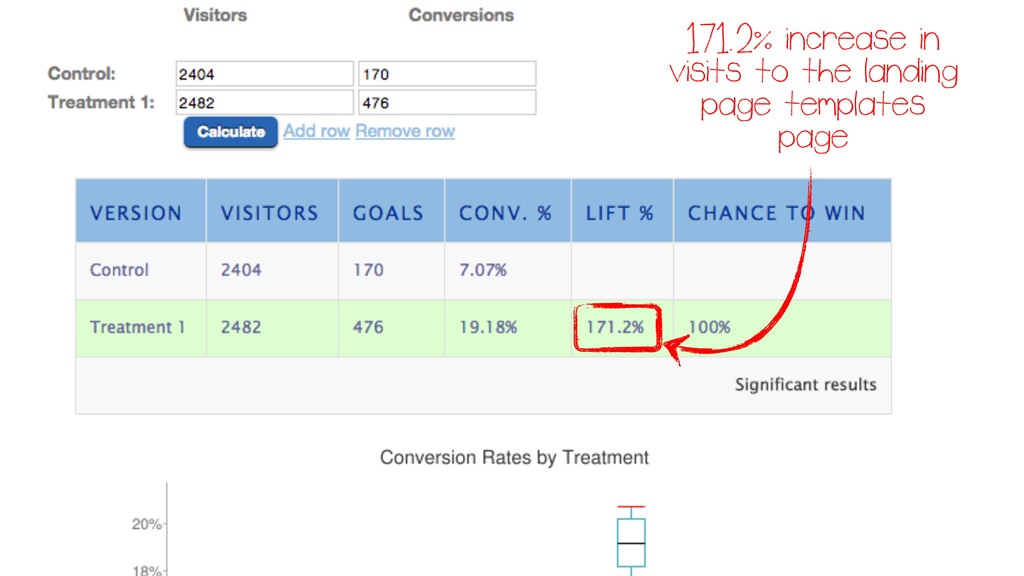
We know on our highest conversion path, if people go to the templates page, they're more likely to convert. So we just said, hey, look at the templates. Hundred and seventy one percent increase in people going to where they want them to go, just by following a few of those simple rules.
Every landing page, every page on your website has a conversion opportunity, and every conversion opportunity needs a CTA of some form. Whose site is this one? Now, this video I mean, I don't know how much you look at your video analytics, but there's a good chance most people don't watch it.
It might be as low as ten percent. You need to know that. And this is a great video. I think the content in this is better than the content below it, and you need the supporting content in case people don't watch the video.
What I would suggest is a contractor is your target audience. Sit down with them, make them watch the video, and then simple instruction. Whenever they see something that they like or is beneficial to them, tell them to stop and have a conversation about it.
The copy you'll get from that, it will fuel your website, your campaigns, your ads, everything. That's the voice of user you really need. They may also not like any of it, but I think that's a good technique. Because video's complicated. This is because of all the data I've got from Wistia.
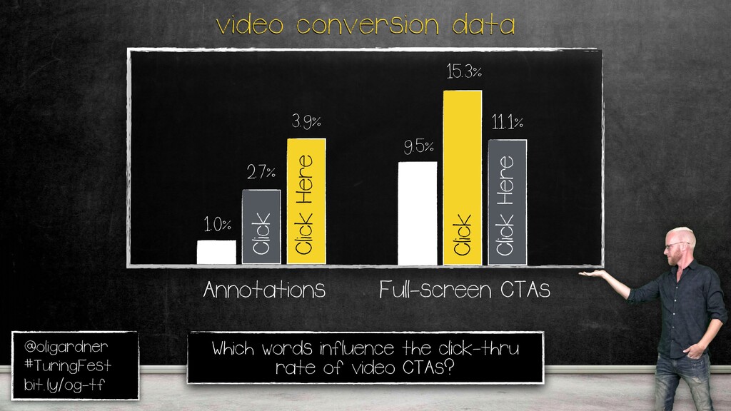
About size of the video player, where you should put it, but more importantly, talking about CTAs, there are three types of CTA if you use Wistia if you're video hosting. There's a turnstile. That's an email collection portion of way through. There's an annotation, like a little thing you've seen on YouTube that you can click up there, or a full screen CTA.
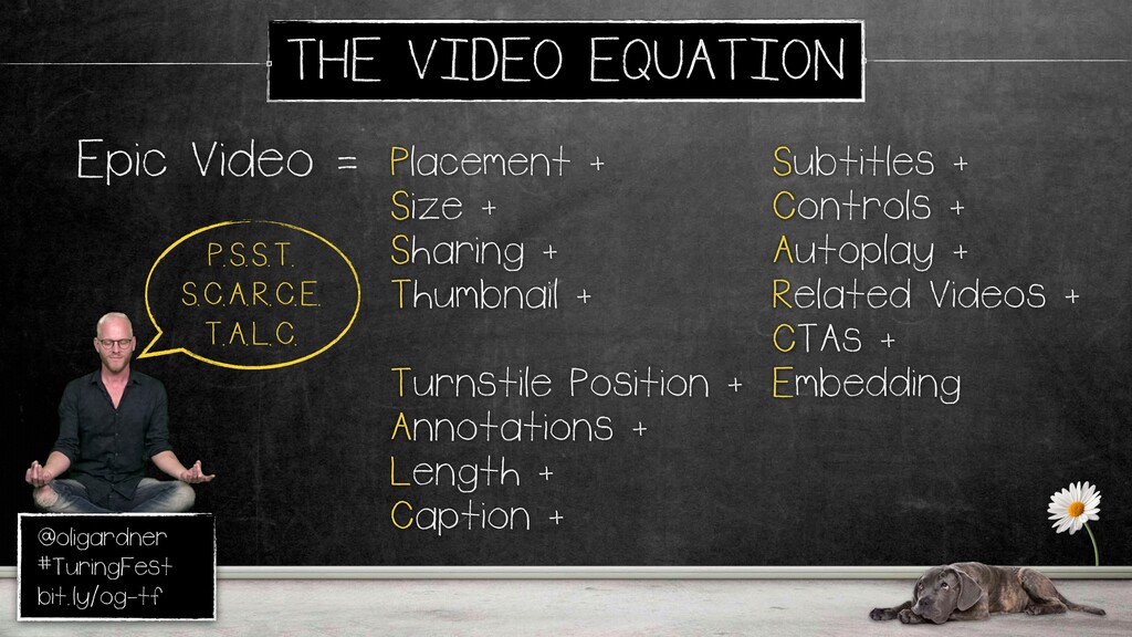
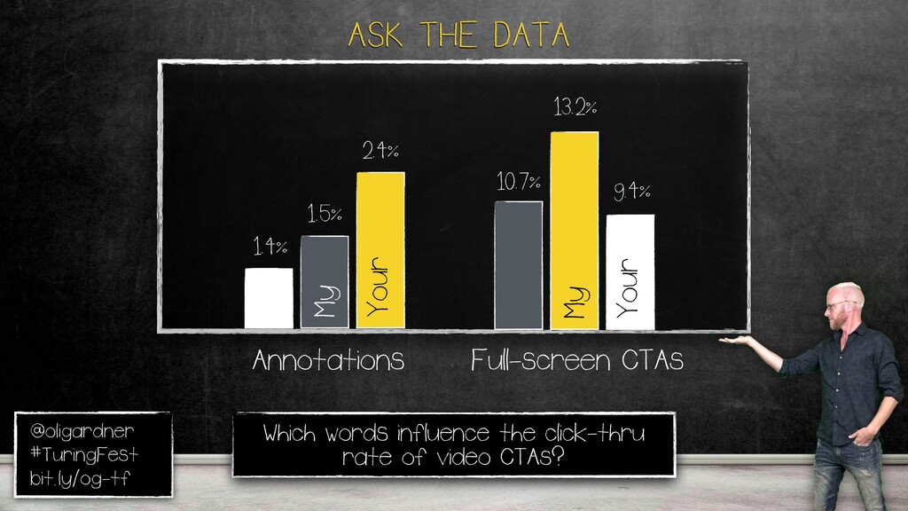
And I wanted to see what the impact of certain words, I'd love to do some of Natalie's stuff with this, on this. So, again, this is really long. There's the acronym. Because we all know if you're if you're running out of talc, you need to be really quiet about it.
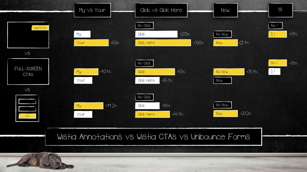
Because why do you have talc? Anyway. So looking at annotations versus CTAs, is there a difference when using certain words in the impact on conversion? So in annotations, up here, click here destroys not saying click here, and it kinda makes sense because it's over there, like click over here.
For a full screen one, it's click. It's a little softer, but both of them beat not saying it. It's a nice action word. People kinda need to be told what to do sometimes. My versus your. Lots of people debate this. Start my free trial, download my ebook, your ebook.
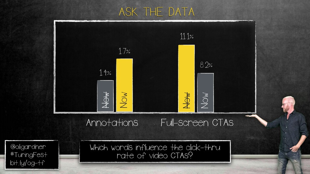
Well, for the annotation, your wins. Full screen, my wins. There's a pattern happening here. The bigger right in your face thing needs to be a bit calmer, a bit nicer. How about now some urgency? Now works for annotations, but not for the full screen CTA.
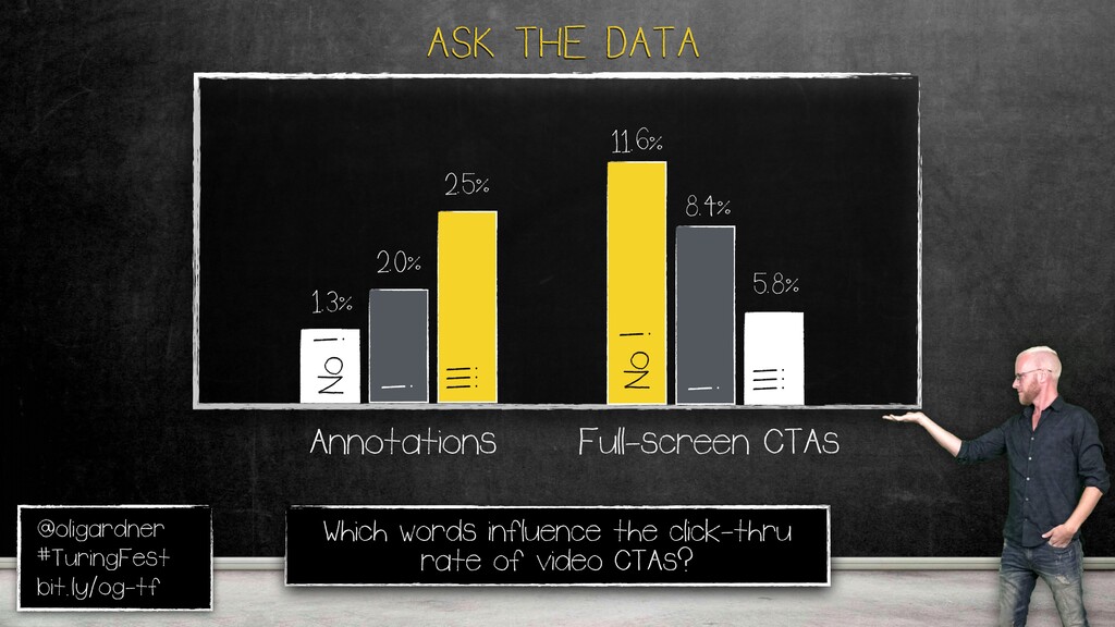
Again, these things are complete opposites. How about some exclamation points with annotations? Just go crazy. Ugh. Actually, that's low sample size. This is massive amounts of data. So this is very, very good data, apart from that one. So you have to go into one exclamation mark.
It actually works. Full screen, don't do it. Every single piece of data here is completely opposite, which is why it's dangerous. Say you read a blog post about a certain thing, and you implement it everywhere. Like, this in a CTA works. No. Every one is different.
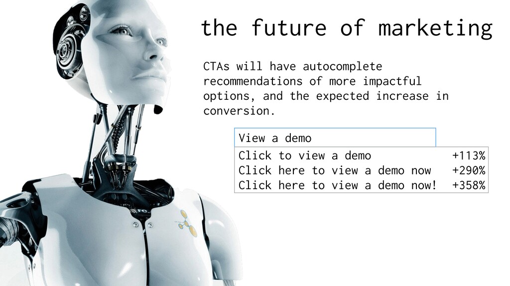
Here's a summary page. You'll get the slides after. And this includes unbounced data about lead gen forms with the same kinds of things. Every conversion opportunity is unique. In the future of marketing, at least what I wanna see in the future, when you're typing in your CTA, it will give you an auto suggest, kinda like Google, but with a predicted increase in conversion based on all of this data, which would just be mind blowing.
Every single conversion opportunity is unique. You can't apply what you know at one thing to others. We have to And that's what machine learning will do. It'll stop us making these mistakes I was talking about at the beginning. Because that's what makes us human, and we can't forget the human part of this.
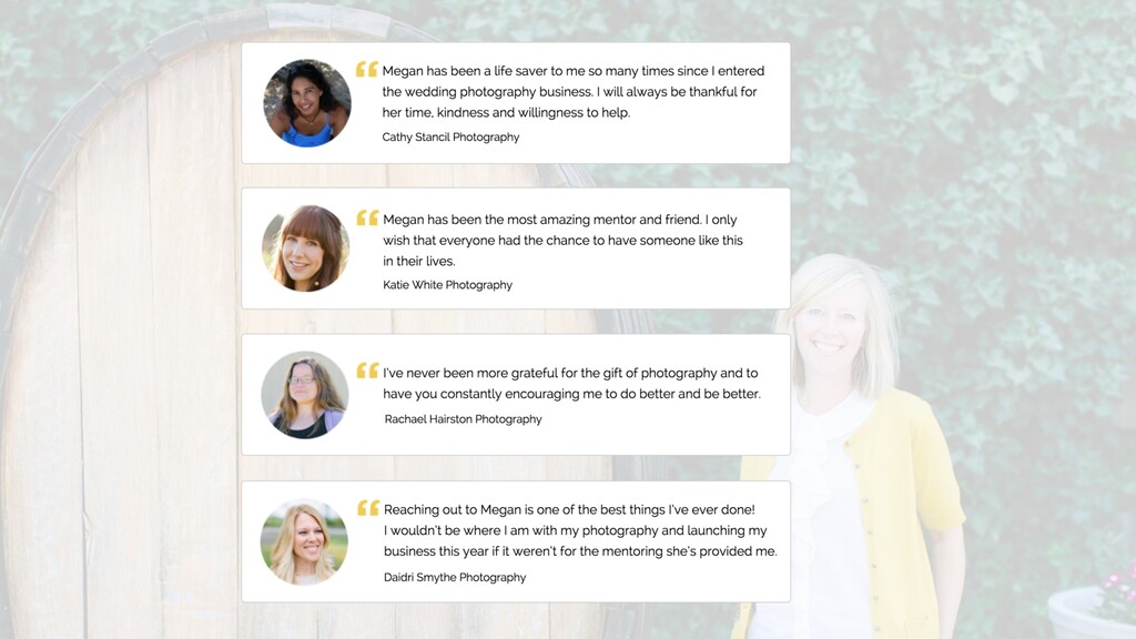
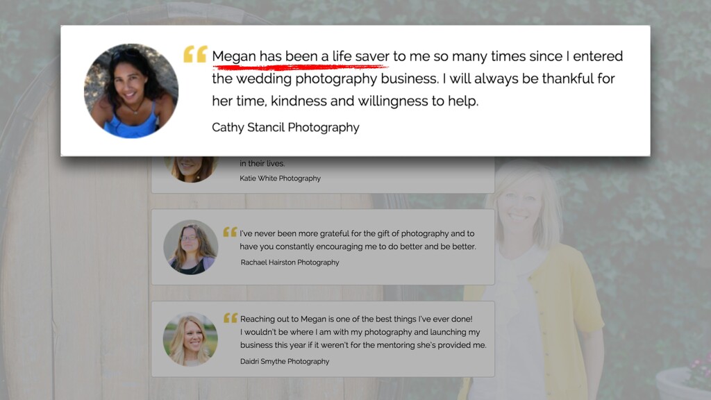
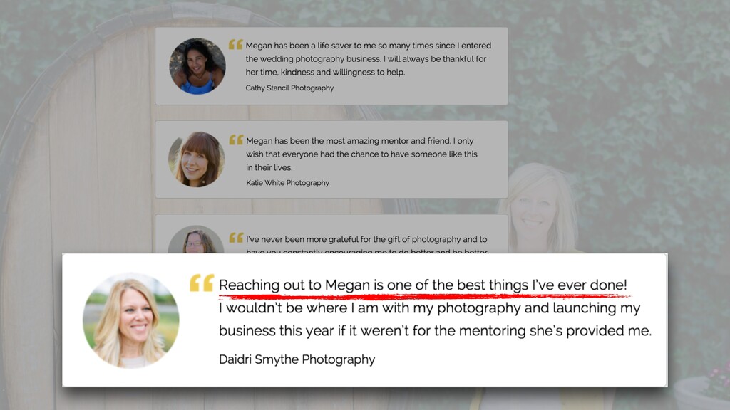
Here's a photography course I was critiquing. I got to the testimonials, and I started reading them. Megan has been a lifesaver. No, she hasn't. This isn't Baywatch. This is a photography course. Reaching out to Megan is one the best things I've ever done.
You must have a ****** life. That's the best thing you've ever done. I mean, don't get me wrong, this is actually a really good course. Mean, some amazing photographers have come out of it, but this is getting into the realm of hyperbole, where you're like, that's a bit of a top.
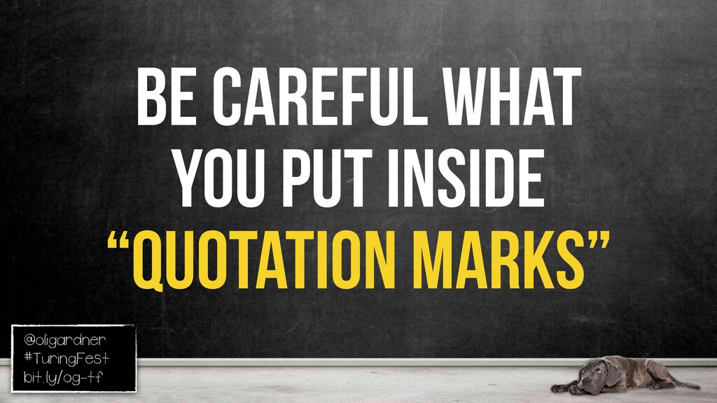
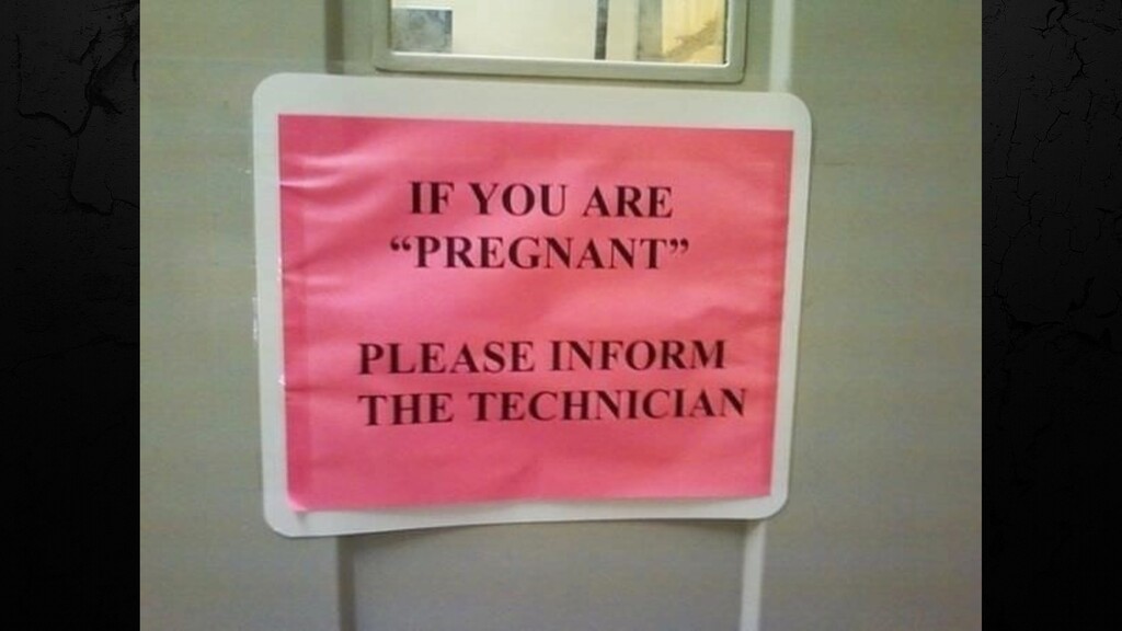
You stop believing them so much. You gotta be really careful what you put inside, quotation marks. I don't want him outside my house. How mean is that? Yeah, we'll let you marry her, but you're not getting any of my money. It's terrible. This is from someone, some HR thing.
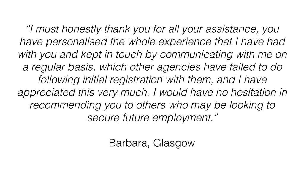
I'm gonna read this testimony. I must honestly thank you for all your assistance. You have personalized the whole experience that I have had with you and kept in touch by communicating with me on a regular basis, which other agencies have failed to do following initial registration with them, and I appreciate this very much.
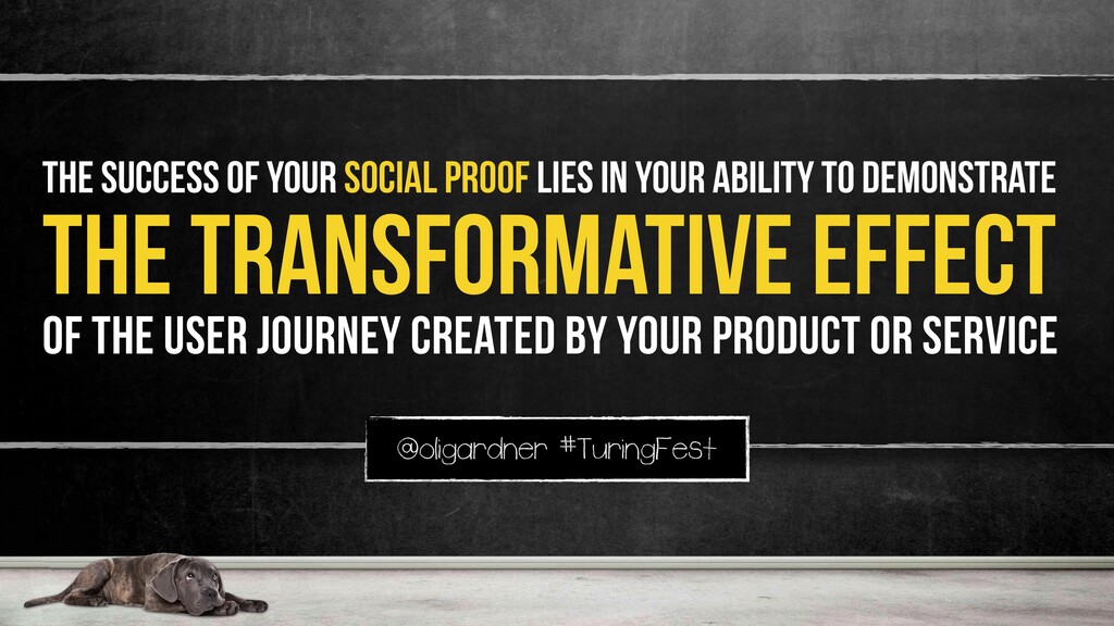
I would have no hesitation in recommending to others who may be looking to secure for God, this is so boring. No one's gonna read that ever. And it's by Barbara from Glasgow. I mean, it's so anonymous. The secret to a great testimonial is demonstrating the transformational impact of someone being your customer going through this.
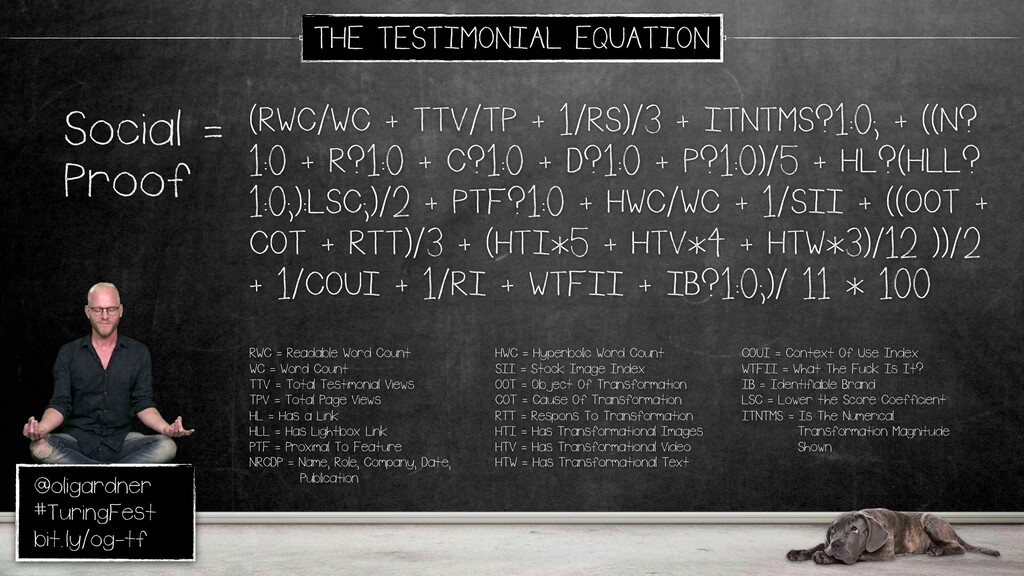
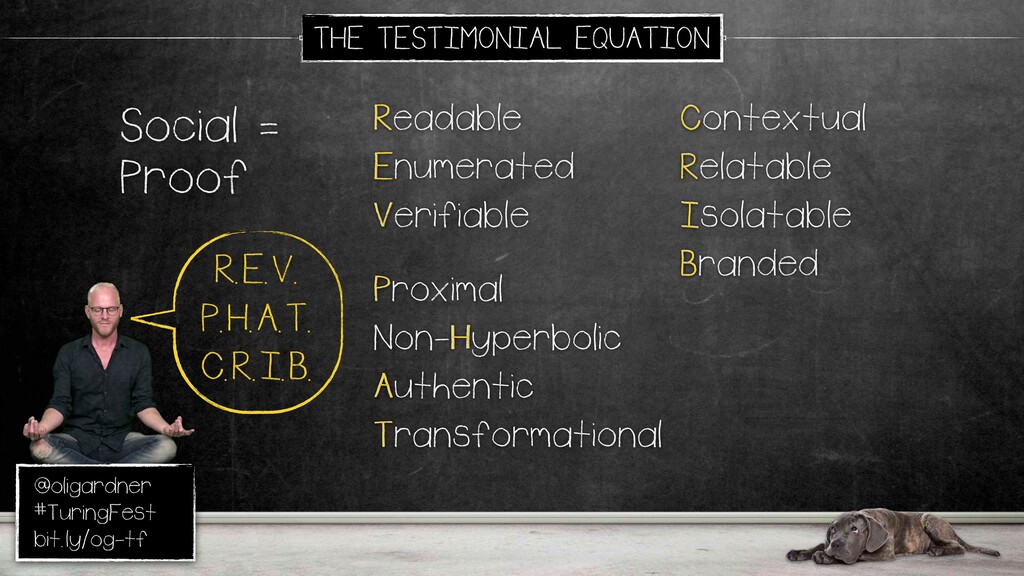
It's why those sleazy before and after photos work. You don't have to be sleazy, but it's a really important thing. So here's the testimonial equation. Again, there's a lot, but we're in a church, so Reverend Fat Crib actually is quite appropriate. So, I'll apply it quickly to this one.
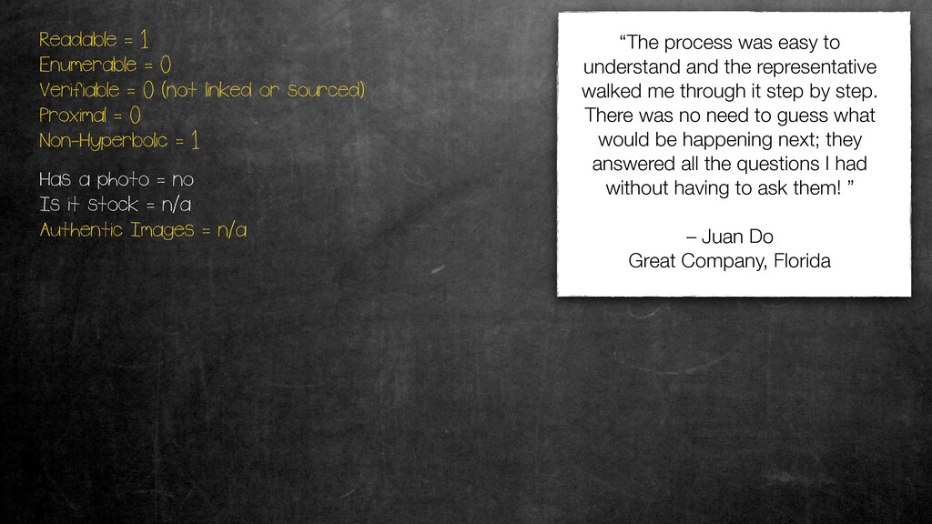
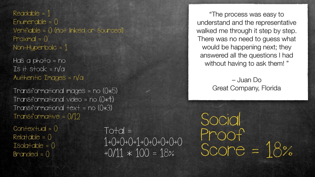
One of these generic ones. Readable, that's for like, does it have the swoop? It doesn't, so it gets one there. Enumerated Enumerable, there's no numbers in there about the transformation. Verifiable, if you have a link to the source, that's great. Just make sure it's in a light box, so it doesn't leave.
Proximal, is it near what it's talking about? It's not. It was a group of other testimonials. Non hyperbolic, yes, it's not blabbing on. Has a photo, doesn't count. Transformational images, video text? None of those. Contextual, relatable, isolatable. Do you know what it is in isolation again? No.
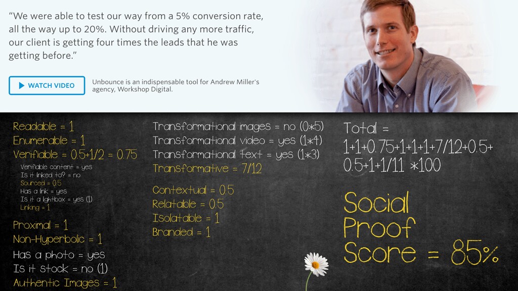
You can never tell what they do, and it's not branded. Eighteen percent. So, is a terrible testimonial. This is on our homepage. So, going through it again, readable, doesn't swipe. Enumerable, you can see it goes from five to twenty, verifiable. You watch the video and you see him, and it's kinda trustworthy.
I'll give it And it's just a little bit of that. It's not kinda sourced, but it is linked, and it's in a light box. So, it scores well there. Proximal is right next to our main value prop, talking about conversion. It's non hyperbolic, has a photo which isn't stock.
Authentic image gets a one. Transformational images, no, it doesn't, but it does for the video and the text. These are weighted. Images are best because you immediately see the change. Video's second best because you might not watch it, and text just kinda comes in third.
So, score's great there. It's contextually related to where it's around. It's relatable. I believe he's a marketer, so the kind of tribal thing. Isolatable on its own. You know it's unbounced, you know it's worked up digitally. You understand the whole thing, and it's branded with our name eighty five percent.
You can see how much better that is. So, what you can do on that landing page, again, there is an interview script. Take one of your customers, or several customers, and ask Read this script out. The questions in there will give you every single piece you need from the equation to have an amazing testimonial.
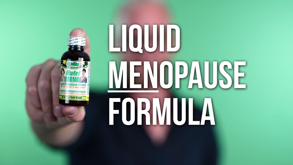
It's really, really easy to do. I bought something online. It was a health product, and they sent me the wrong thing. So, I emailed them and said, Hey, you sent me the wrong thing. They're like, Yeah, we know. We sent yours to someone else, and you got theirs.
If you print out this thing, put it on, mail it back to us, we'll check it back into our inventory. When we make sure it's in there, we will send yours out. I'm like, No. You send it right now. You messed this up.
They're like, What's not our policy, sir? I'm like, I don't care. Eventually, they agreed to send it to me right now. When it arrived, it had the right product in it, but it also had a whole bunch of samples because they're trying to suck up.
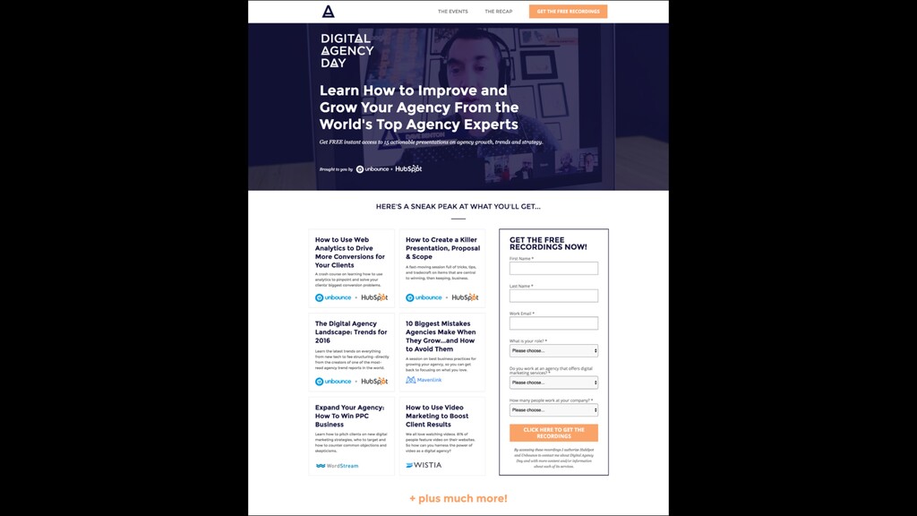
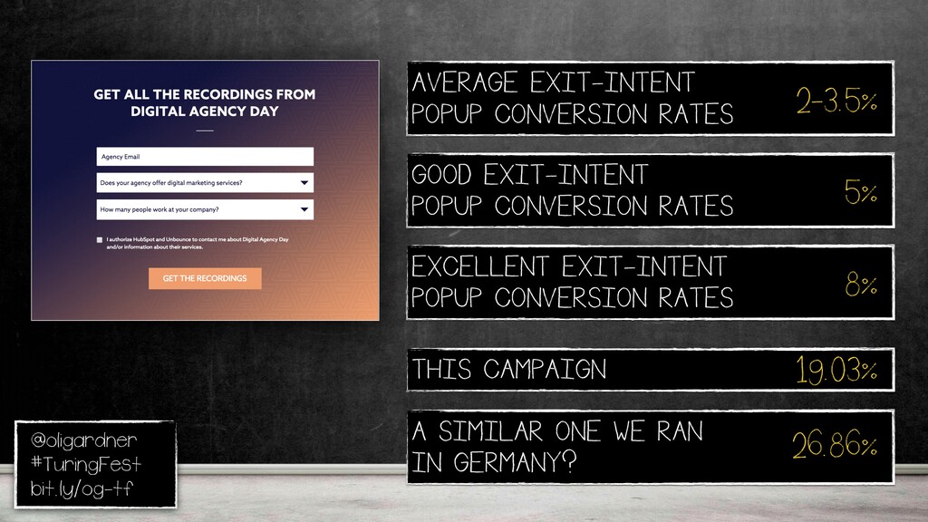
And this was one of them. You probably can't see. It's They didn't care enough to actually make a proper apology. I mean, the only relevant part is that. Or maybe formulaic, I'm talking about equations. So we did an event, an online event for agencies.
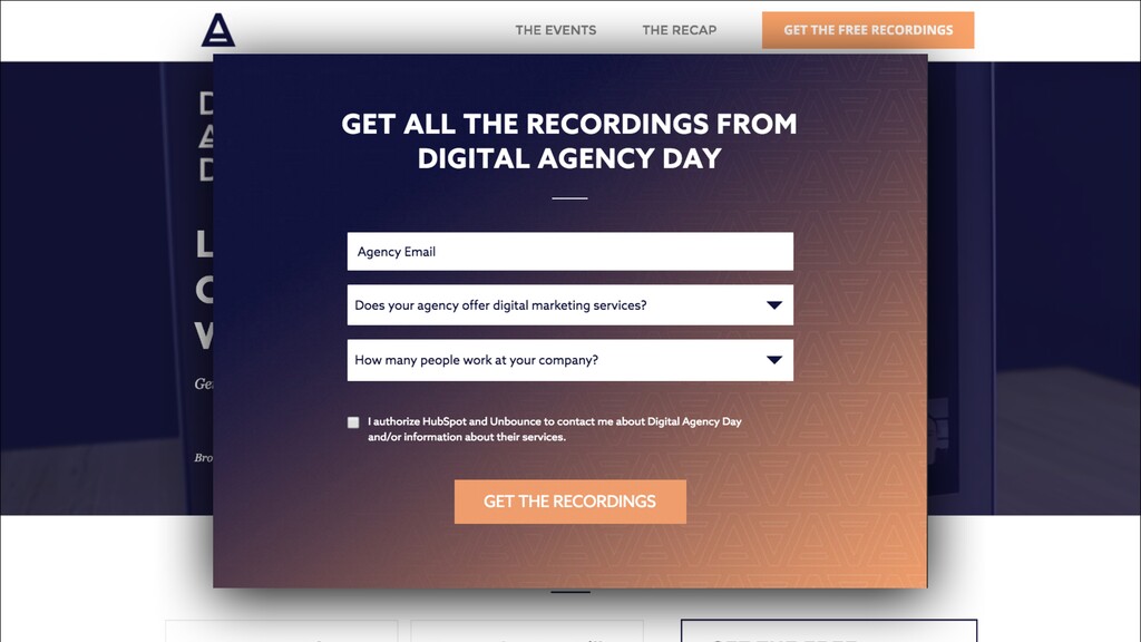
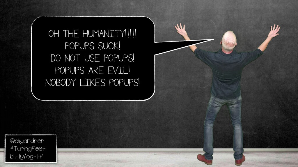
It was a really cool event. This was a landing page. Now, if you left, you got an exit intent pop up. Know, everybody hates pop ups. Photos are evil. Nobody likes them. They're terrible. Don't use pop ups. It's not true. Anything can be delightful. Right?
Emails, banners, pop ups can also be delightful. We acquired one of the companies that does does the exit intent stuff, so we had access to all the data. On average, two to three point five percent they convert at. A really good one, five. An excellent one, eight percent.
This one converted nineteen. And we did a similar event in Germany, almost twenty seven percent. Right? So these are really helpful. We're giving the recordings video. It's very high value. We see this all the time. When you're giving away a recording or video, these things work like gold because it was relevant, valuable, well timed, and designed to delight.
Technology is not the problem. We don't need to be scared of machine learning, or of this, or any kind of automation. We are the ones that cause the problems because we misuse it. We use psychology in manipulative ways. A lot of affiliates do that because they don't give a **** about your customers.
They care about the high level conversion because that is what they get paid for, and then they leave. We can't behave that way. We have to be more respectful. And then we can put our value systems into these algorithms, like you know, Moz, Tagfi.
If you put Tagfi in there, then the suggestions it makes for you, and for a headline change, or something will be more in line with how you want to talk to your customers as a human brand. Right? So we shouldn't be scared of it.