
Companies spend hundreds of thousands of dollars every year on their data stack. They all collect data, model it, analyze it, and some even visualize it. But they’re all missing the most important bit - the Last Mile. The Last Mile is what drives change in the organization and makes people engage with and act on the data. In this talk, we’ll explore the latest trends in the data stack and how you can make data more actionable in your organization through storytelling.
← All talks 





Lead Turing Fest 2024
Babe Are You OK? You've Barely Touched The Dashboard You Claimed Was Mission Critical
Auto-generated transcript - may contain errors. Tap a timestamp to jump the video.
Hey, everyone. How are you today? Yeah. Thank you so much for joining this first talk, and hope you're enjoying TuringFest so far. So I want to start by saying that data talks are very often dry, boring and sometimes lifeless at the conferences. Probably you noticed that, not always, but sometimes this is the case.
And just want to tell you that my presentation today is just going to be different. We look at what I think is the most exciting part of a data value chain. This part is called the last mile of analytics, which we'll learn more in a few seconds what this means and what this can do for your company, for your organization.
So we'll talk a lot about culture and data cultures in your company. And of course, we'll look at some exciting data visualizations we'll explore together with you. Yeah? And most importantly, I hope we can make this session as practical as possible so we can take some of the takeaways and start applying them to your company to drive organizational change and most importantly, to impact more people to taking actions of data in your company.
But first of all, I needed a title to catch your attention. And just to tell you what my talk is, is different and we will talk about something else. And every title I was coming up with was somehow boring. It was something like, oh, The Last Mile of Analytics, or When You Was Trending Data, How to Drive Change don't sound as exciting as I hope my presentation is.
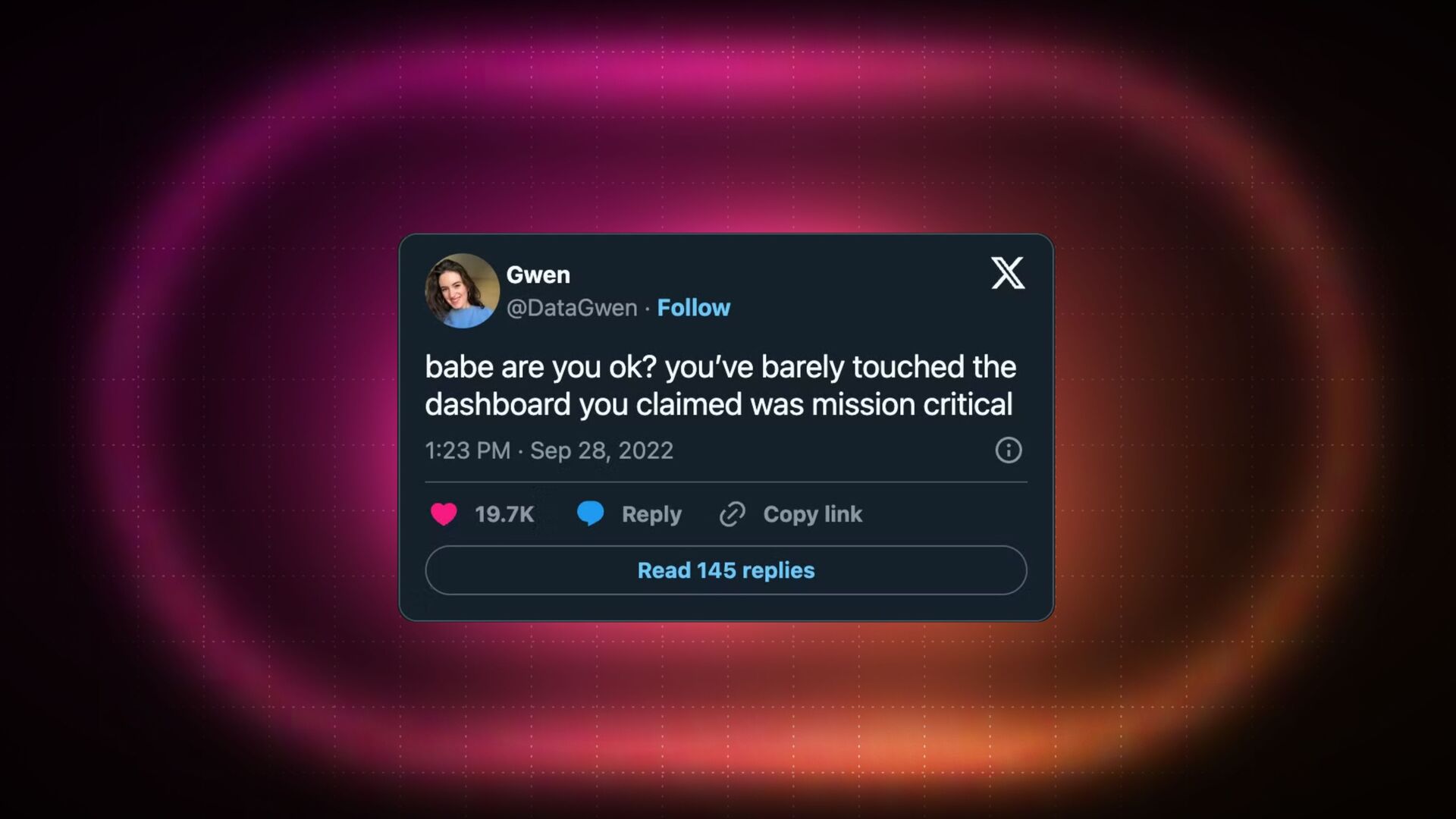
And then I found this tweet from Gwen, and I felt like, oh, this tweet is genius, and it does three things extremely well for me. One, it perfectly describes my presentation. Two, it's funny. And three, it has the social proof with almost twenty thousand likes.
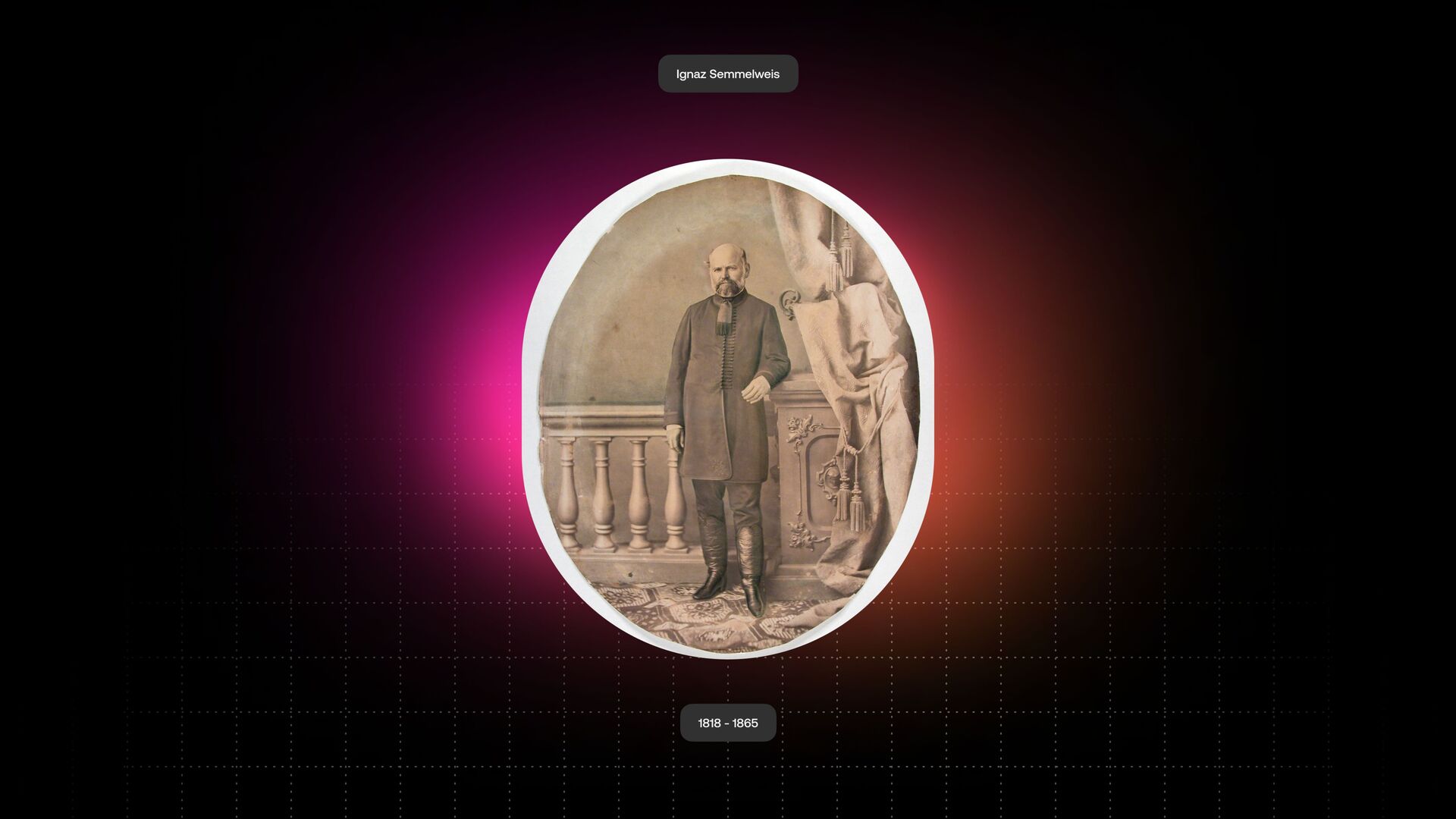
So if so many people like this, I just thought you'll like it as well. So it's the story of the title in this case. So again, thank you so much for coming to my talk, and let's just dive in into the presentation. And first, we'll look back at the nineteenth century Hungarian doctor who is named Ignaz Semmelweis.
Has anyone heard of Ignaz Semmelweis before? Amazing. You did. So in eighteen forty six, he was appointed an assistant at Vienna Hospital, and this hospital in Vienna had two maternity clinics. One clinic was run by the doctors, and the second clinic was run by the midwives.
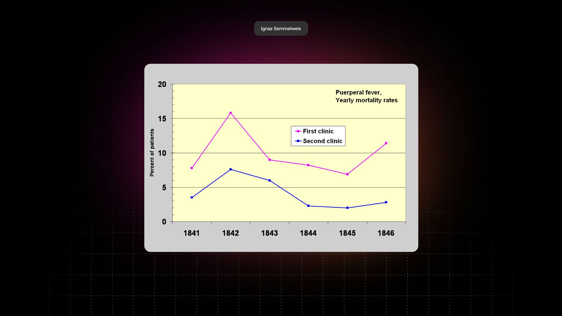
And in that time, mothers were dying quite a lot by a very mysterious illness, which was called the child bed fever. No one knew what's causing this illness. Why are these mothers dying all the time? People had so many theories about this. But when Ignaz started his work, what he noticed is that in the first clinic where he worked, run by the doctors, they had significantly more deaths than in the second clinic.
In the first clinic, the number of deaths was above ten percent in this case, around twelve percent, on average for nine percent of mothers who were dying. And in the second clinic run by midwives, the number was just around three percent. So Ignacio was very confused by these numbers, and he took on a quest to find out why.
And back then, they had many theories around what's causing this. And one of the theories was the hospitals were overcrowded. Another theory was that it has to do something with ventilation, And many, many other reasons. But in one of the days, one of his best friends who was a doctor at this hospital was accidentally poked by a scalpel while performing an autopsy.
And this friend, he died shortly after that. So when Ignaz inspected the body of this person, what he discovered is that he found exactly the same symptoms in his friend who died as in the mothers who were dying in the hospital. Yeah? And what he also found is that doctors were often attending the maternity clinic just after they were at the autopsies without washing their hands or without doing anything like that.
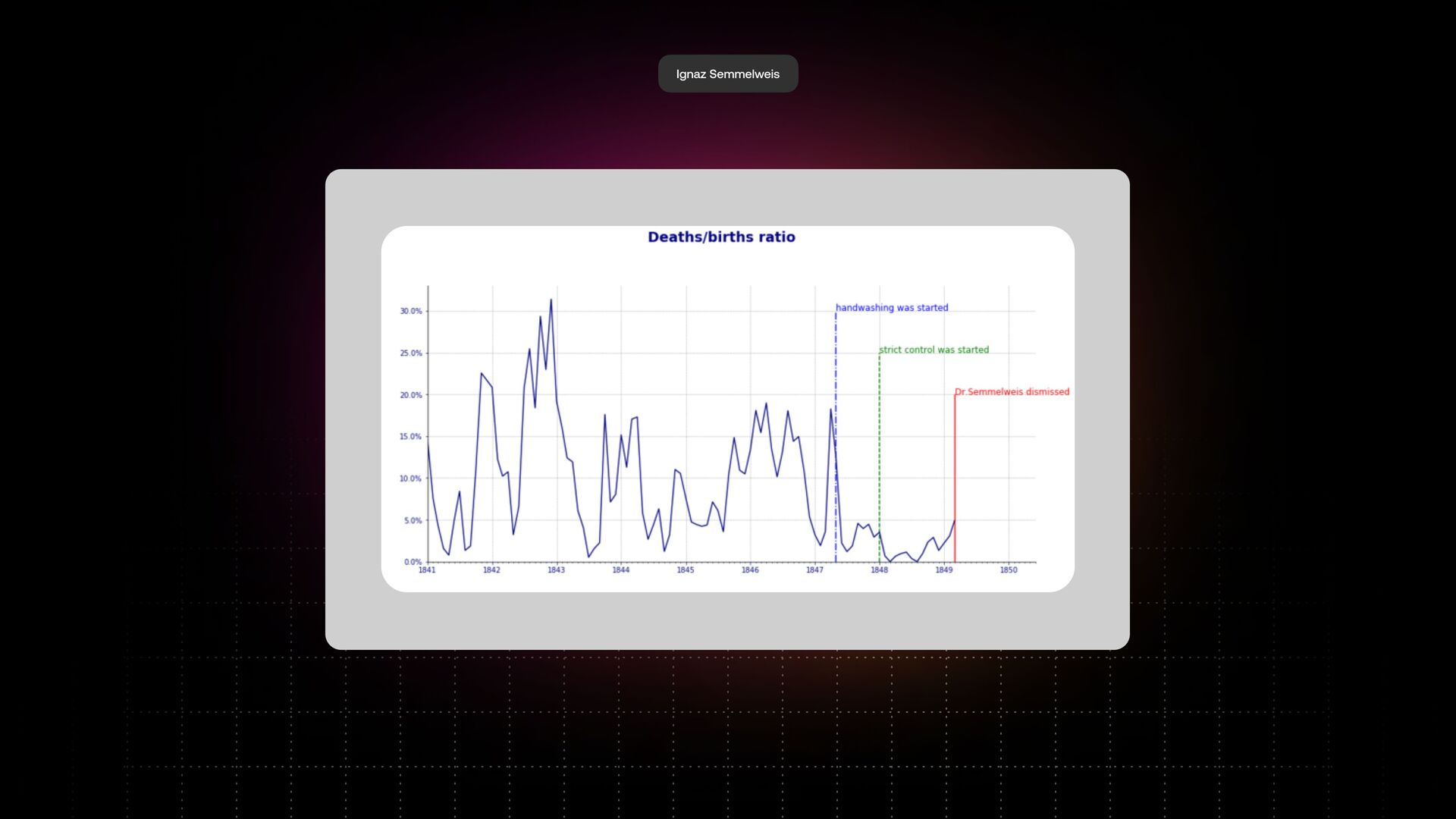
And bear in mind, all of this was before people knew about antiseptics or people knew about germs theory or anything like that. People had no idea what's going on in there. This is when he had his moment. Because we had eighteen months of data, we were able to plot this data on the screen.
Two months after the death of his friend, he introduced a new policy of washing hands at the hospital. What they noticed is a significant drop in the data, in the deaths of mothers in that hospital. When the stricter policy was applied almost one year later, they even had months with zero deaths.
This was unheard of in Europe at that time because mothers were still dying of a childbed fever. But he couldn't scientifically prove why this is happening. And he had a big push back from the medical community who was very skeptical about his findings, and they had other thirty or forty reasons why this is happening.
So what happened then? He was dismissed from the hospital just in nineteen forty nine. And of course, let's look at why this happened, which is very fascinating in my point of view. While we can't judge the past by today's standards or present standards, I think there are some mistakes that Ignas made back then, and one is called the curse of knowledge.
And if we find something in the data, we all think that it will immediately be obvious to everyone around us, to our team and so on. We just send them a chart, they'll know what's happening, they'll make the right conclusions, and they'll action this data, which is almost never the case.
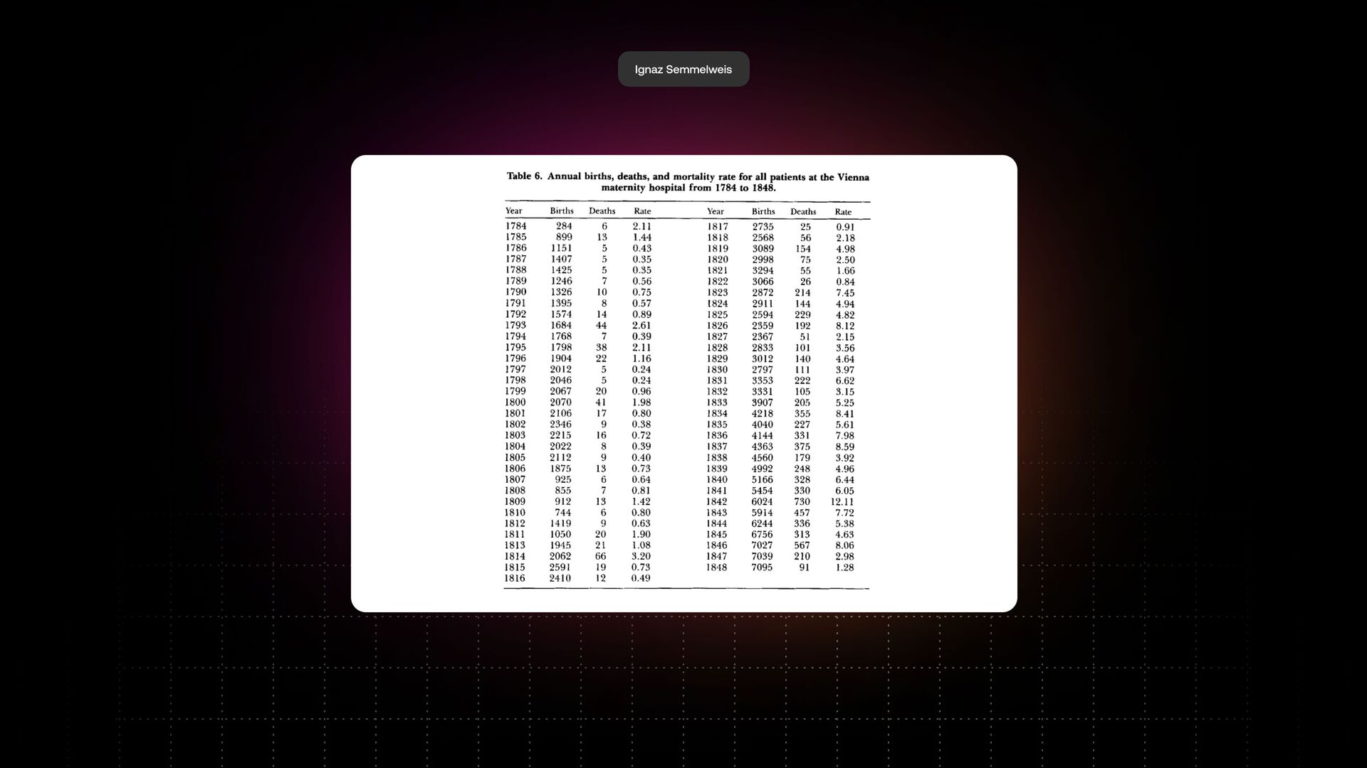
Second reason is that the narrative evokes emotion. If you just send someone cold facts without the narrative, it's not nearly as impactful as it should be or might be for the audience. And the third reason, the power of data visualization. Ignaz presented all his data in these tables.
That's what he did. And we're not telling a clear story. And the way our human brain works is that we cannot see trends and patterns looking at a table. We want this data to be visualized. We want this data to tell us a clear story so we can act upon this data, which didn't happen back then.
And you might say that, Oh, but back in the mid nineteenth century, data visualization wasn't an established science, and I would agree with you. But we have two other examples from John Snow, who visualized the cholera outbreak, and from Florence Nightingale, who visualized the war in Crimea, but data visualization techniques were available at these times.
They just weren't that common. So failing this, Ignaz was dismissed from the hospital. He spent his next fourteen years arguing with doctors around the world who were depriving his theory and writing very toxic letters about why it was happening. Eventually, he suffered a mental breakdown.
Unfortunately, he went into mental asylum, and he died two months later after that without seeing his theory being implemented around the world. And guess what? In fifteen years, ten years after that, a French doctor just proved a germ's theory and the world entirely changed.
But Ignace never saw this happening. And probably, if you would apply the learnings I described, the story would have been different. Yeah? Okay. Now I'm going to move back to the business world. And I'm going warn you, the examples I've given you are not as dramatic as the example of Ignas, but we can still see the same patterns happening in the business world every single day.
And I'll start my business presentation now with a very simple question for all of you. How can you measure the value of a dashboard or a report? Have a quick think about that. Yeah? And when I ask this question to people around me and people in the industry, they often give me very different answers.
Someone might say, Oh, the value of a dashboard or a report can be measured by how many meetings you had, or by how many useful chats we had, or alignment from the team, and so on. I don't think this is true. I think the answer is quite simple.
The value of a dashboard or report is measured by the useful actions it prompts in your company. If you look at the data and we do nothing with this, this data is useless. No one needs this data. No one will interact with this data.
But the way you measure this is by seeing how many actions people are taking from your data, basically. Yeah? Are we all aligned on this? Because if we don't, my presentation doesn't make sense from now on. Yeah, so I'll make sure of this. Cool.
So we all align with the value of a dashboard to report as measured by the useful action it prompts. And now let's do this. Let's look at a mid sized company. How many of you work in a company, like around fifty to one hundred people?
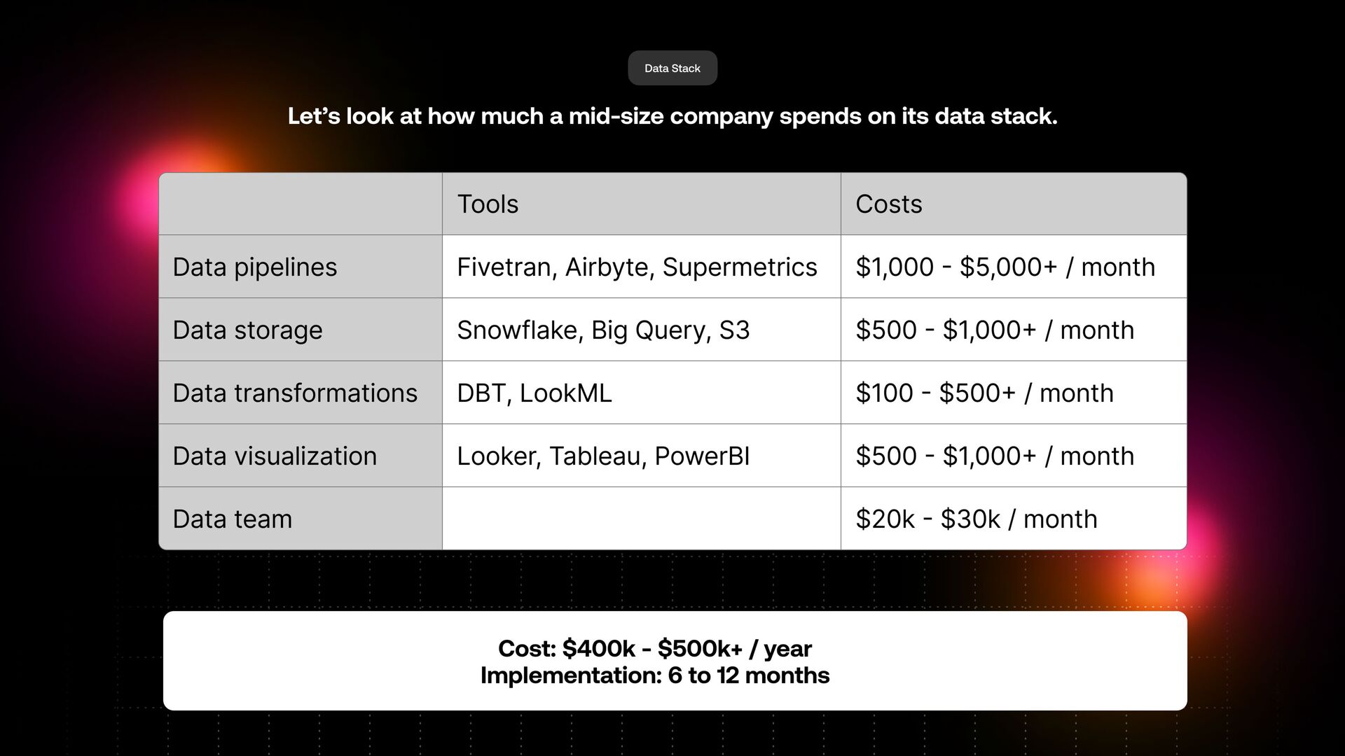
Can you just raise your hands? Or just want to see how many of you will know the problem I'm talking about. Exciting. So let's look at how much a mid sized company spends on a data stack. And they implement a lot of tools.
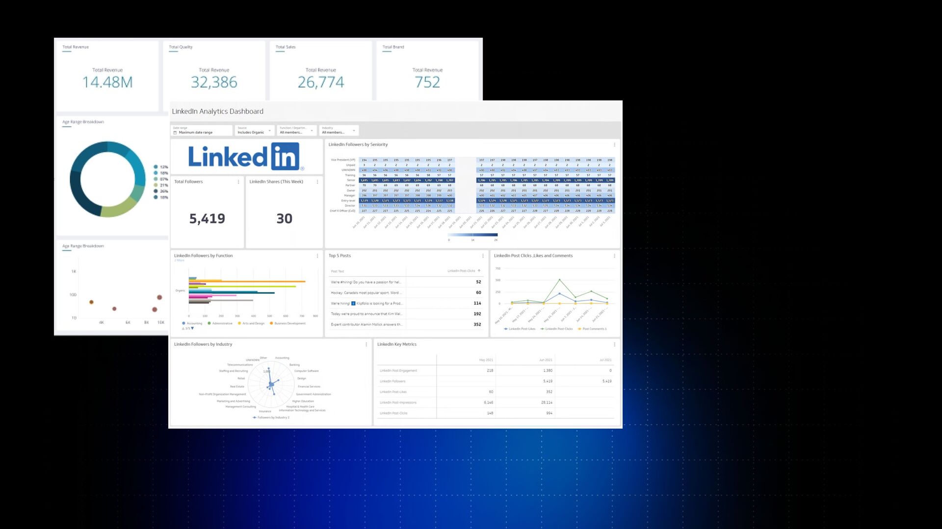
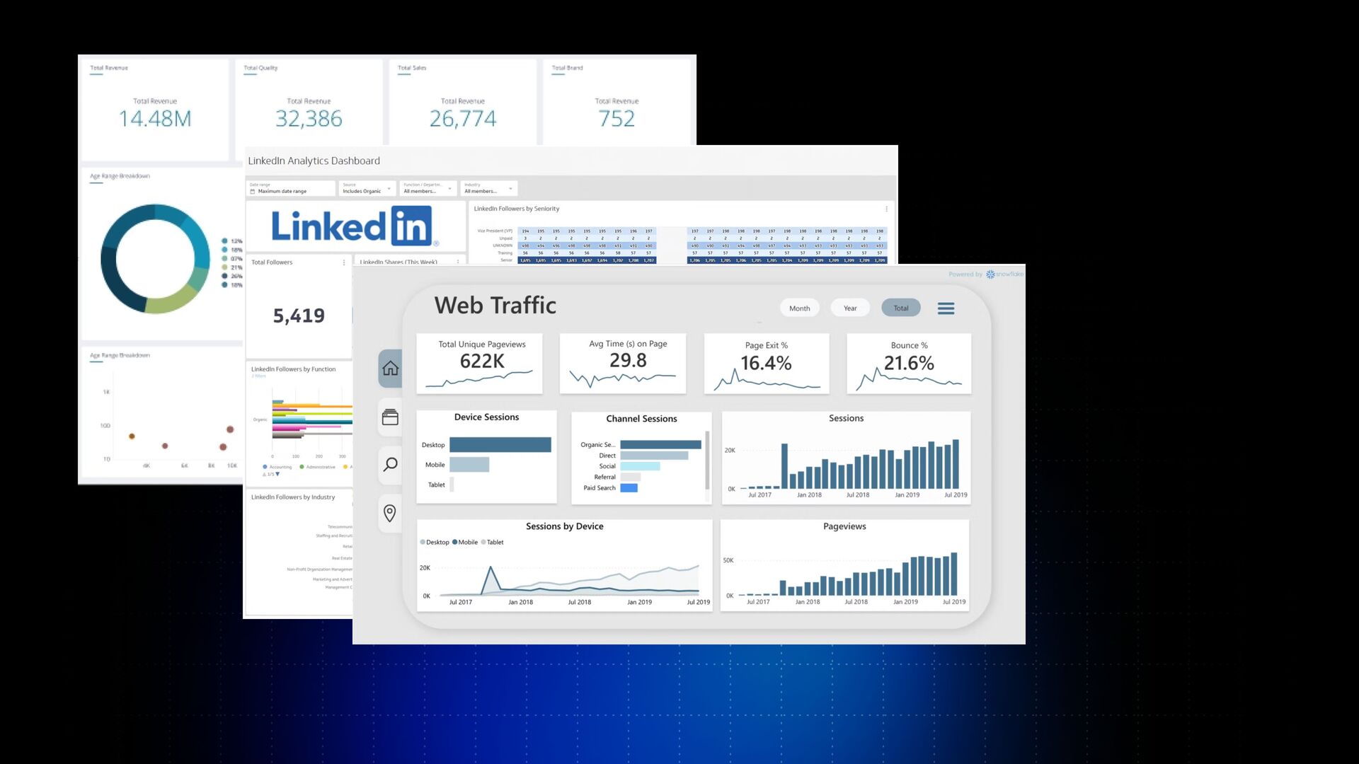
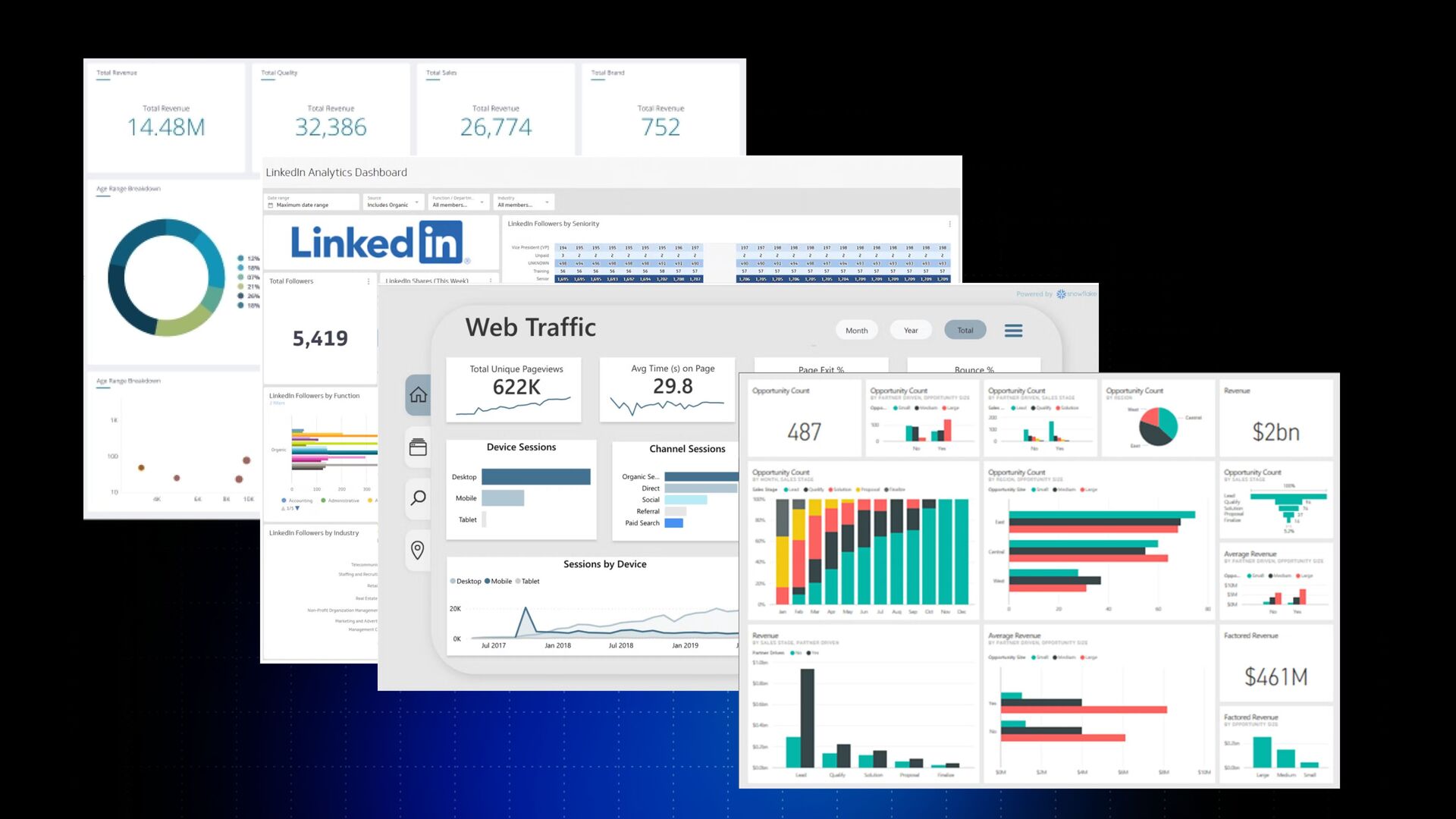
We have data pipelines, some of these tools like Fivetran, Supermetrics, AirBytes. We have data storage, like in Snowflake, data transformation and tools like DBT. We also visualize this data or use BI tools like Looker, Tableau, Power BI. And also, spent money on a tiny data team in this case.
He had to implement this solution and maintain this. So how much this comes to is around half a million dollars a year companies spend on their data stack, a mid sized company. Larger a company goes, these numbers can become just astronomical in this case.
And also what's worth saying is that apart from the money, the implementation of these tools is anywhere from six to twelve months. Have to properly implement this whole data value chain. Guess what? Even though we spend so much money and so much time on this, it still doesn't help people in the organization to take actions on the data.
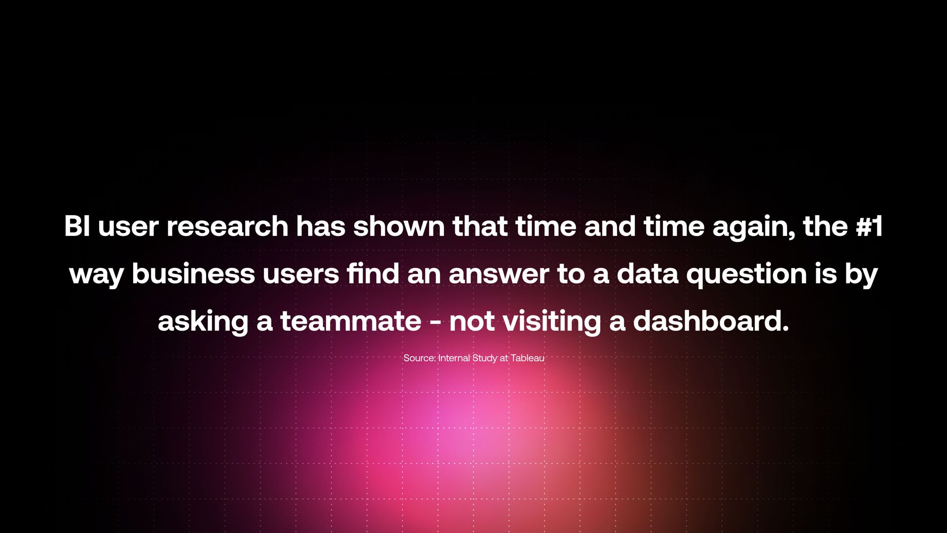
Right? And I'm going to show you a study conducted by the Tableau internal team, which says that the BI user research has shown that time and time again, the number one way business users find an answer to a data question is by asking a teammate, not visiting a dashboard.
Yeah? And I'll I'll suggest a fun experiment for you. If you work in a company and you have a BI tool implemented, go and ask the person responsible for the BI tool how many people are opening the dashboards or reports on a daily or weekly basis?
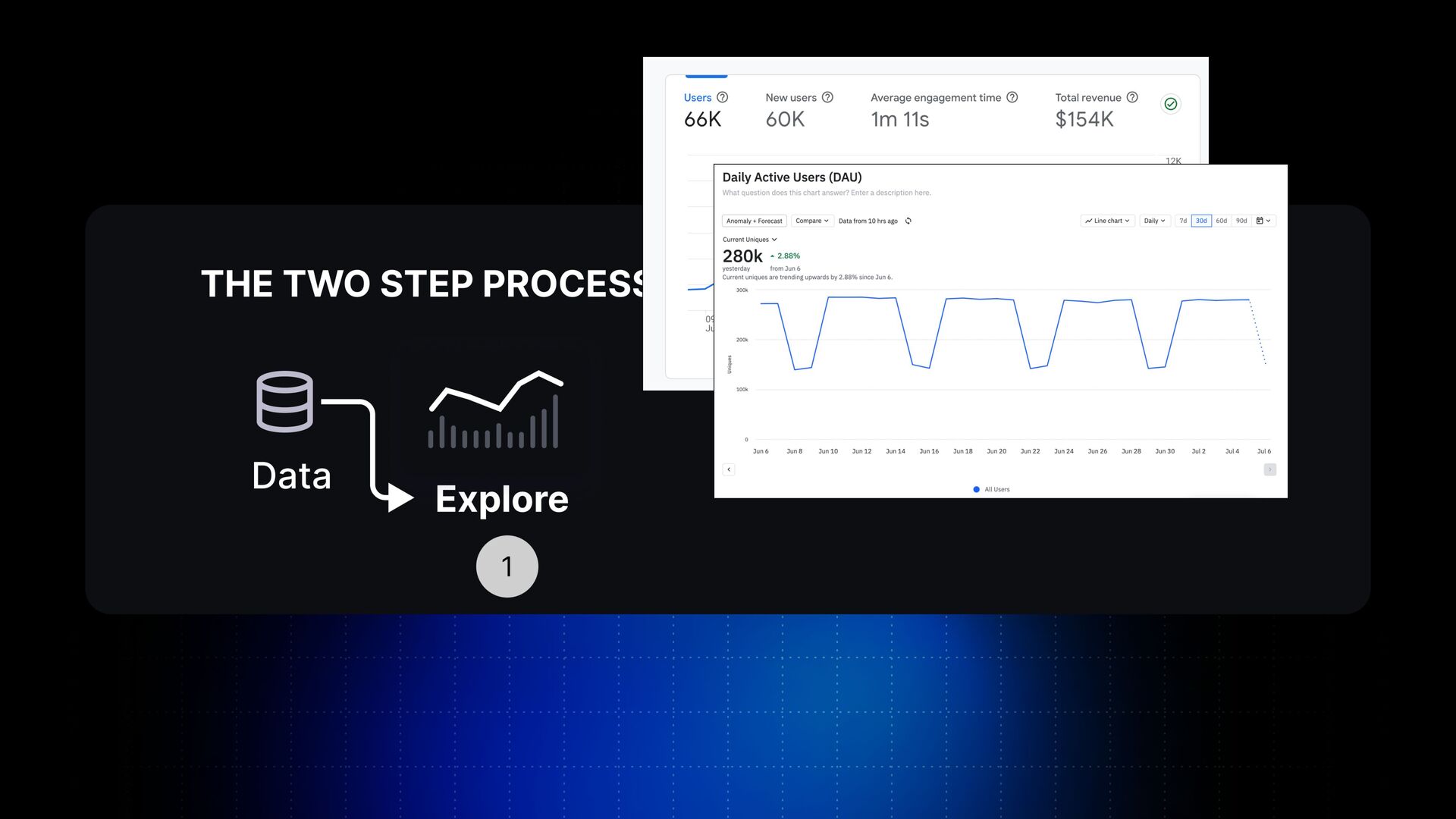
And what we noticed in my company, that there is a trend. There is a spike because of the novelty when you implement the solution for the first month, two or three, when it goes down, basically, close to zero. People don't open them, people don't interact with these tools.
And it's so absurd to me that when you spend so much money and so much time implementing these solutions and people don't interact with them, what's the point of them? Why are they doing this? Why is it important at all at the end of the day?
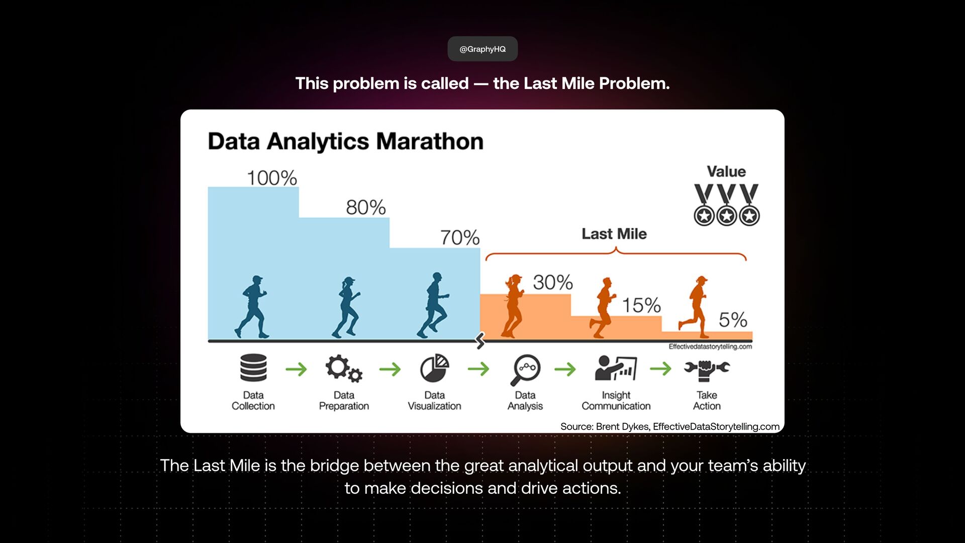
So we'll try to find why is that. That's what my presentation will be focused on today. And this whole problem is called the last mile of analytics. And we're going to look at this interesting graph created by Brent Dykes from effectivedatastorytelling dot com, which illustrates this quite well.
Everybody collects data. Some of the companies might have very advanced and sophisticated strategies for collecting data. Some companies might not, but you still have your product analytics tool, website analytics, social media. Everybody is collecting data, let's put it this way. Also, you can see that a big, big fraction of these companies prep data, transform data, make this data useful for the companies.
And also, a big proportion of these people actually visualize this data. But you can also now see this big disconnect between the great analytical output that you get in your BI tools and then people taking actions on data. Just imagine this. A hundred percent of people who are collecting data, just five percent of them are taking actions on the data, which I think is a massive, massive problem.
Data has one goal: to prompt actions in your company. But it does just for five percent of the people, despite spending so much money and so much time implementing these solutions, basically. So this is called the last mile of analytics, the last mile problem that we'll talk about today.
So in this presentation, I'll help you get started with the last mile. And don't get me wrong, last mile, it's a very, very big thing which involves organizational change from a cultural point of view and so on. It's not enough that the CEO stands at the all hands meeting every Monday, Tuesday or Wednesday and tells the company that, oh, we're data driven or we make data driven decisions.
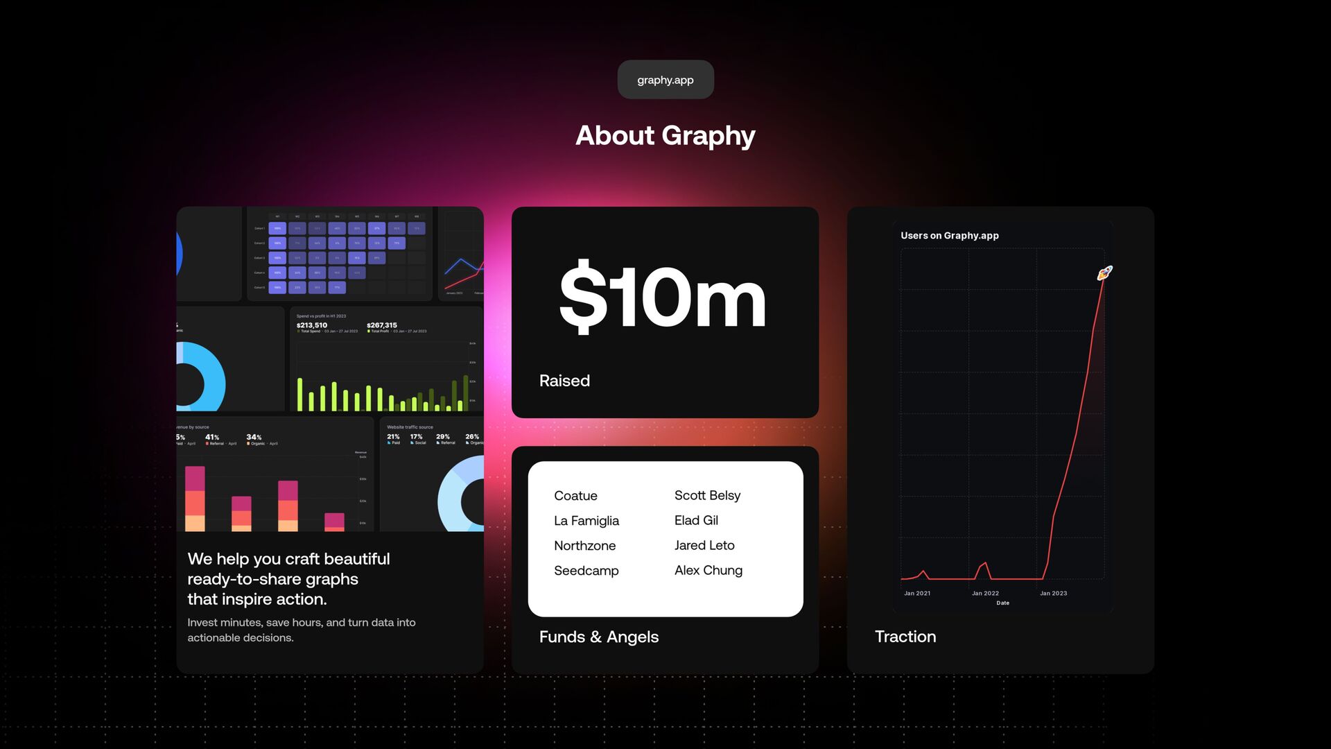
That's not enough. The companies should make a conscious decision in bridging this gap called the last mile. Yeah? And so why should you listen to me? I'm a founder and CEO of a company called Grafi, and I started this company in Edinburgh. It's one of my favorite cities in the world.
I lived here for five years, and my company was in the space for five years now. And we're trying to crack different problems from the data space. We started with a more generalized BI tool, but as you can see on this chart, it wasn't taking off quite well.
But a year ago, we made a pivot towards the last mile and data storytelling. And in just one year time, we grew from zero to just under one hundred thousand users because of it. So again, that is proven people are very, very interested in this problem and also have a chance to work with the world's best data companies to understand how they work with data, what matters for them, what's important for them.
So I hope this gives you a little bit of credibility on why you should listen to me and why we should dive together through this whole problem. So first of all, to breaching the last mile, we look at data storytelling. And data storytelling will help you close the last mile.
It's one of the techniques which will help you close the last mile. This last mile is something much bigger than that. Yeah? And it will help your team to make the connection between the output from your data tools and help them take actions on the data that you already have.
So people also see data storytelling with many different things. People say data storytelling are dashboards, reports, animated charts, presentations, so many other things. But it's so much more than this. And data storytelling is the structured approach for communicating insights from your data clearly.
And it consists of three key elements. Yeah? So it's about data. So it's about visual. And so it's about the narrative, basically, in this case. Let's break down each of them. Data, it's something all of you have, something all of you collect. Visuals, it's all about visualizing this data in the right way.
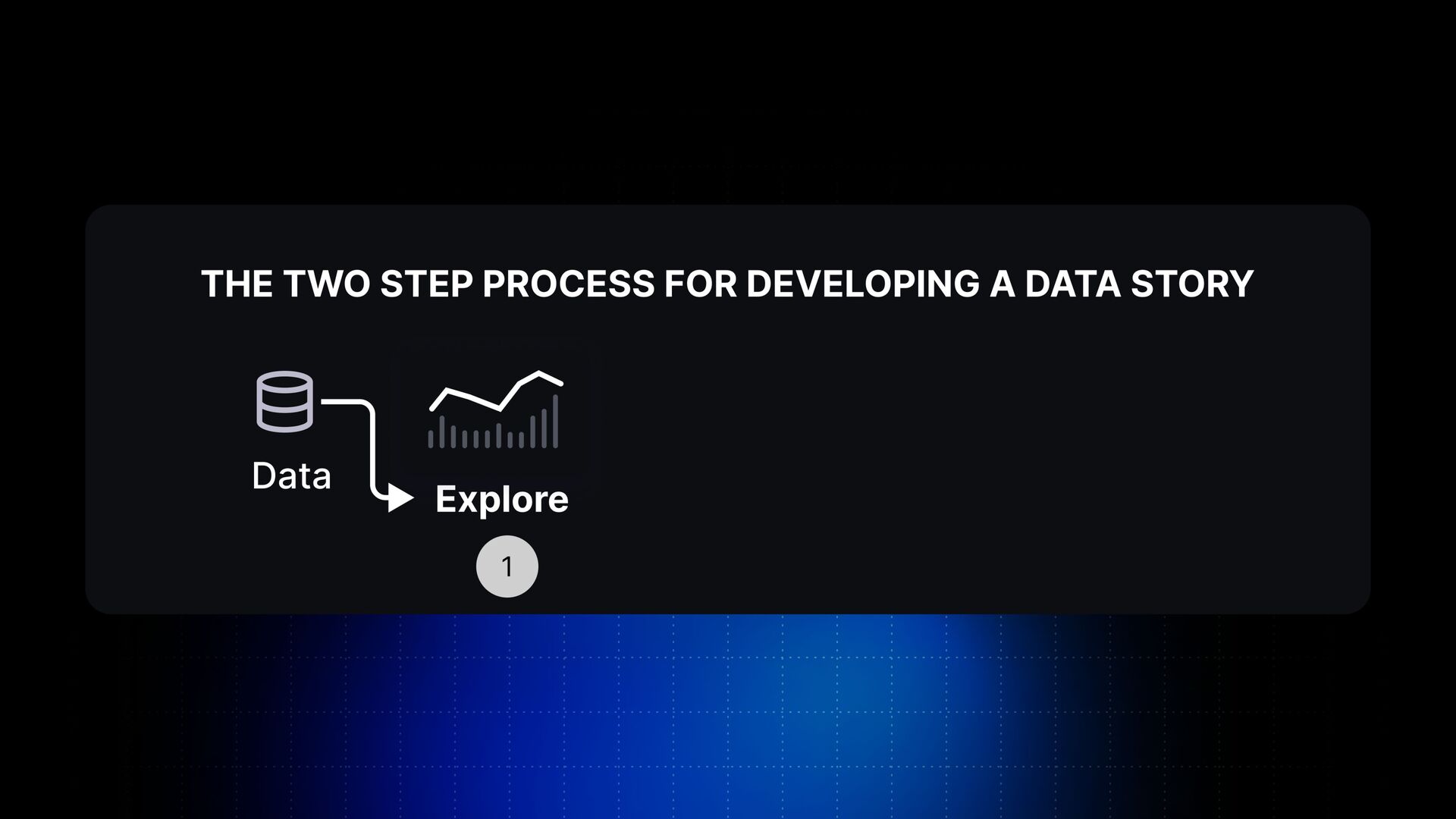
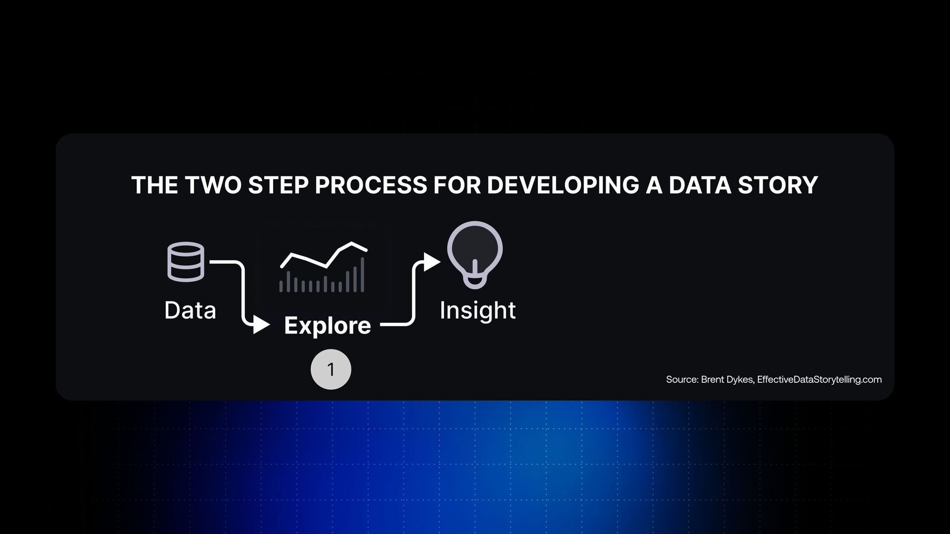
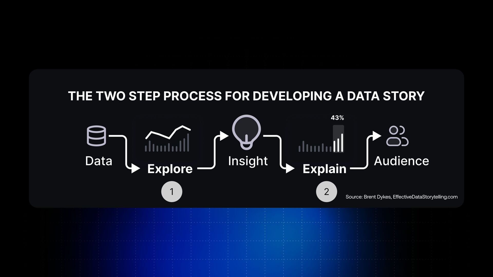
And the narrative is the insight you want to communicate on your data, which we'll see just in a few seconds. So data storytelling is a two steps process, and I'll show you how you can develop this data storytelling. So first of all, you've got the data, and you explore this data.
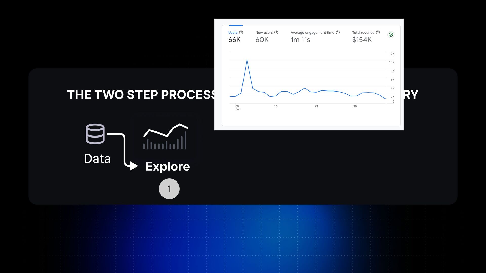
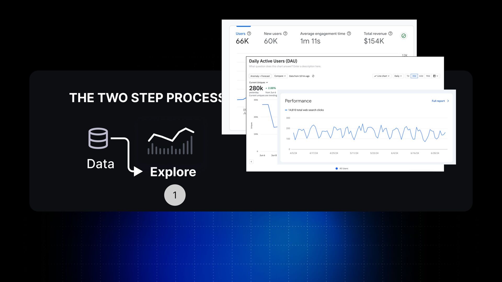
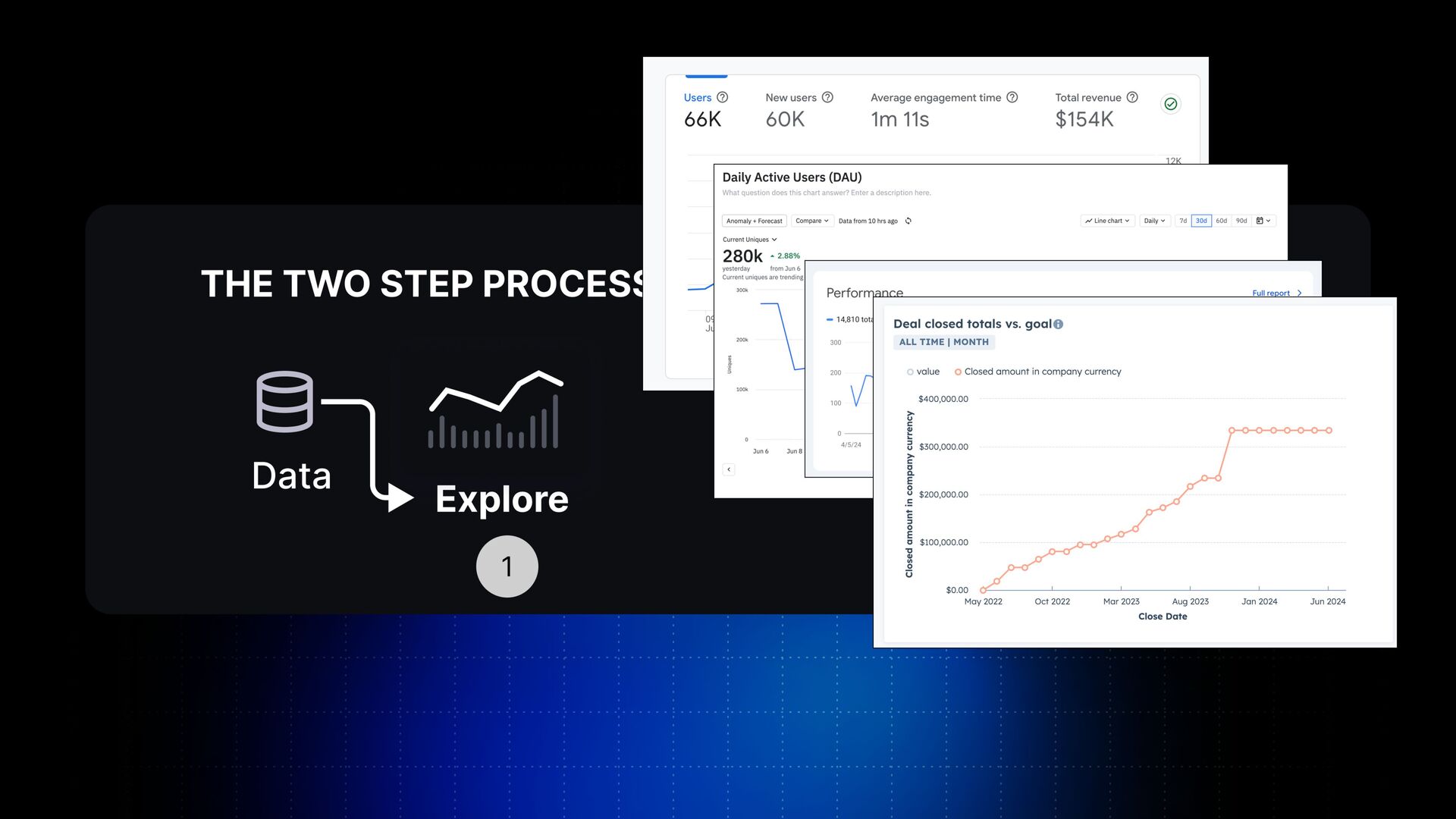
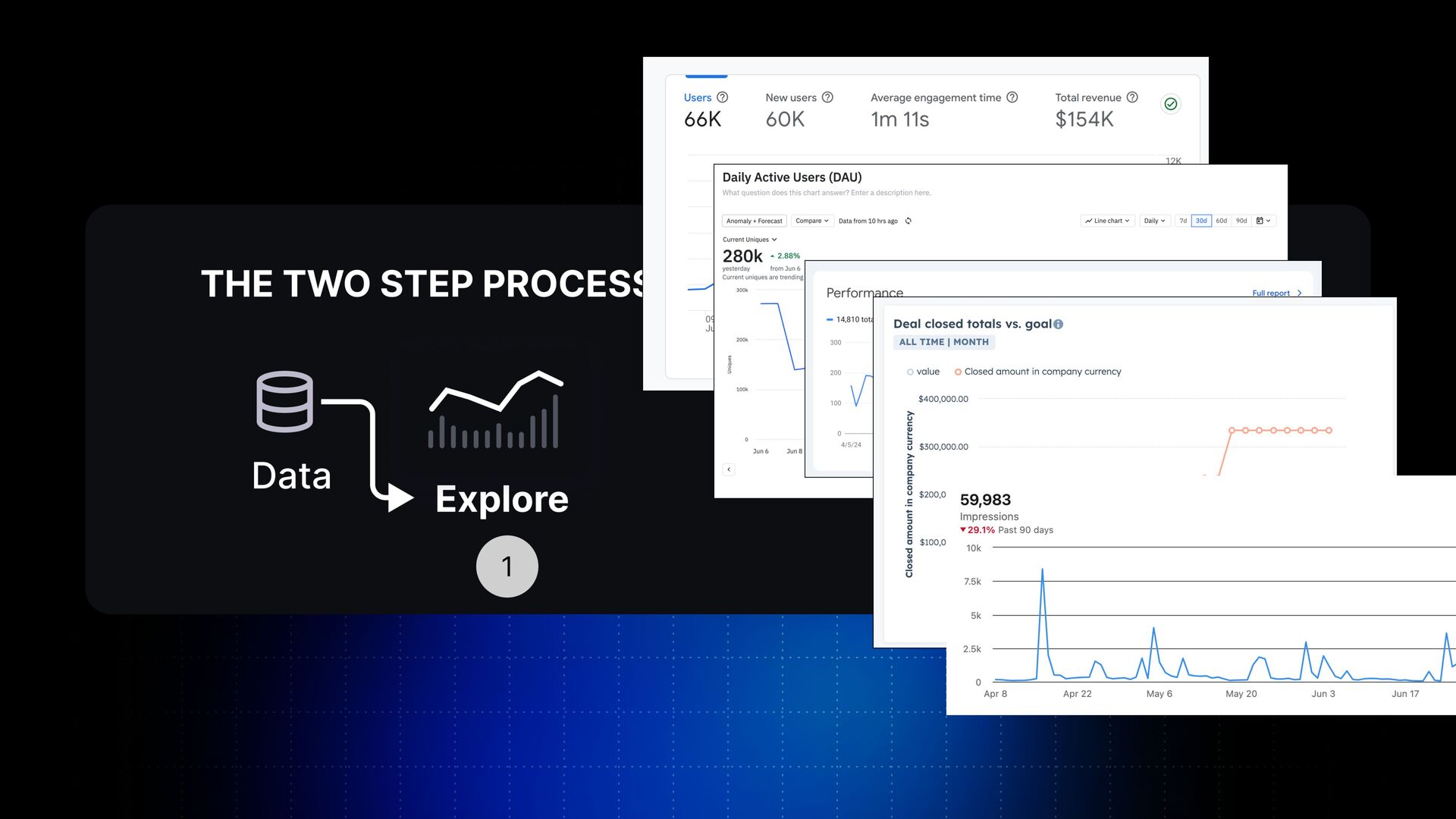
Yeah? And all of you are doing this if you're working with data and charts. That's exactly the output you're getting from tools like Google Analytics or Amplitude or Google Search Console or HubSpot or LinkedIn, and so many other tools. They all give you the data, and they all give you this data to be explored.
And this is where every single tool is stopping. Every single tool in the market stops at their exploration phase. But what they're all missing is an insight on this data. And you might have many different insights for the data. The insight might be that we have a spike or we have a trend, or you want to comment on a specific point, you want to tell a story around this data.
And once you identify this insight, you have to explain this insight to your audience and share this with your audience. That's another graph from Brand Dykes from effectivedatastorytelling dot com. And as I'm saying, every single company stops at step one, and that's why no one is taking actions on the data.
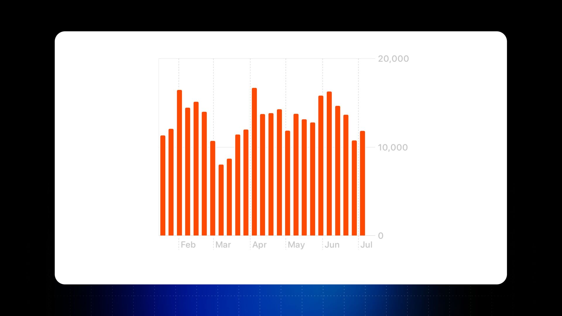
So now look in more details, how can we go from step one to step two? How can we empower more people to find the insight and explain this data? And I'll start with this chart with a simple chart, Apple Health. How many of you are familiar with this chart?
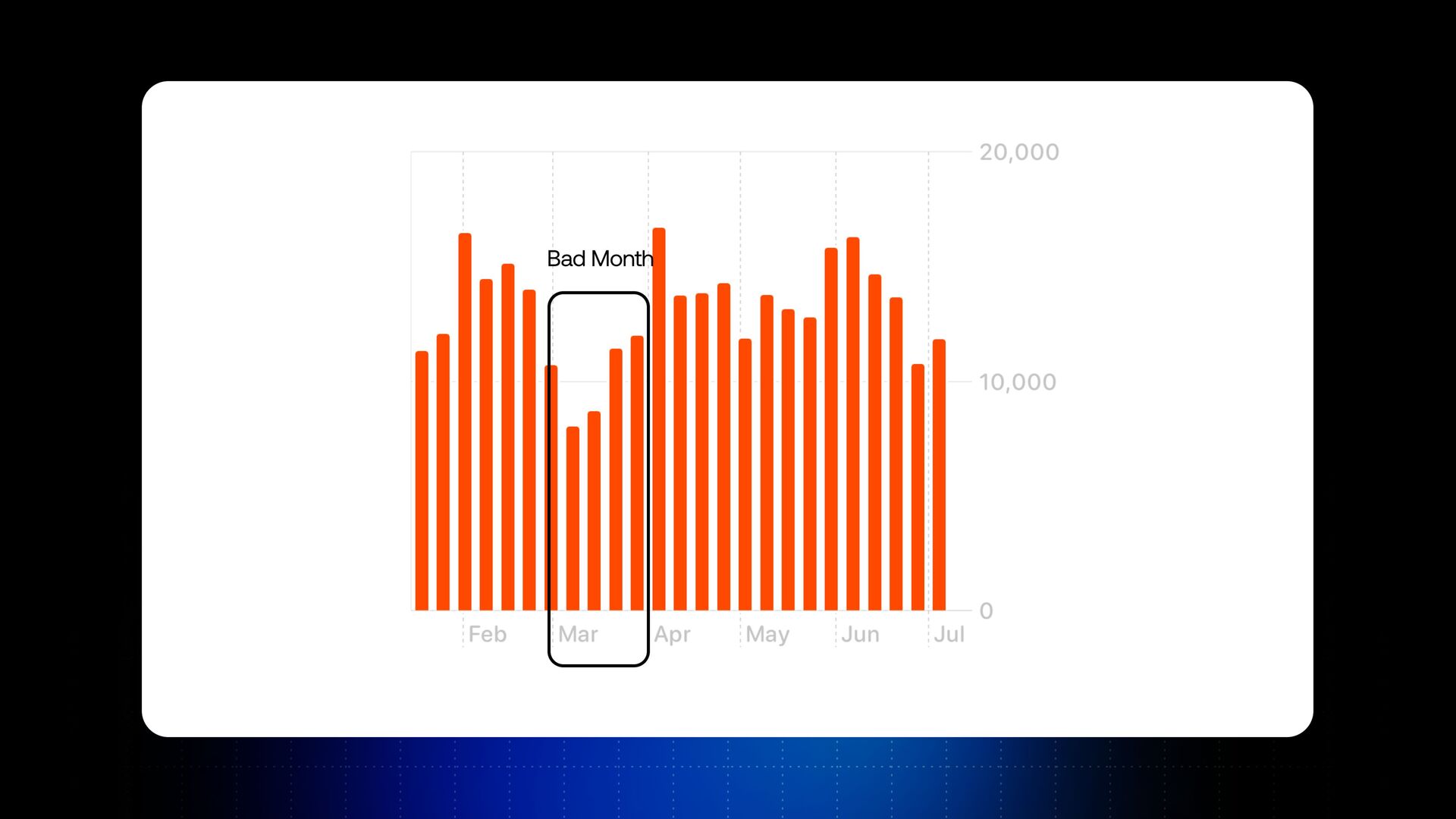
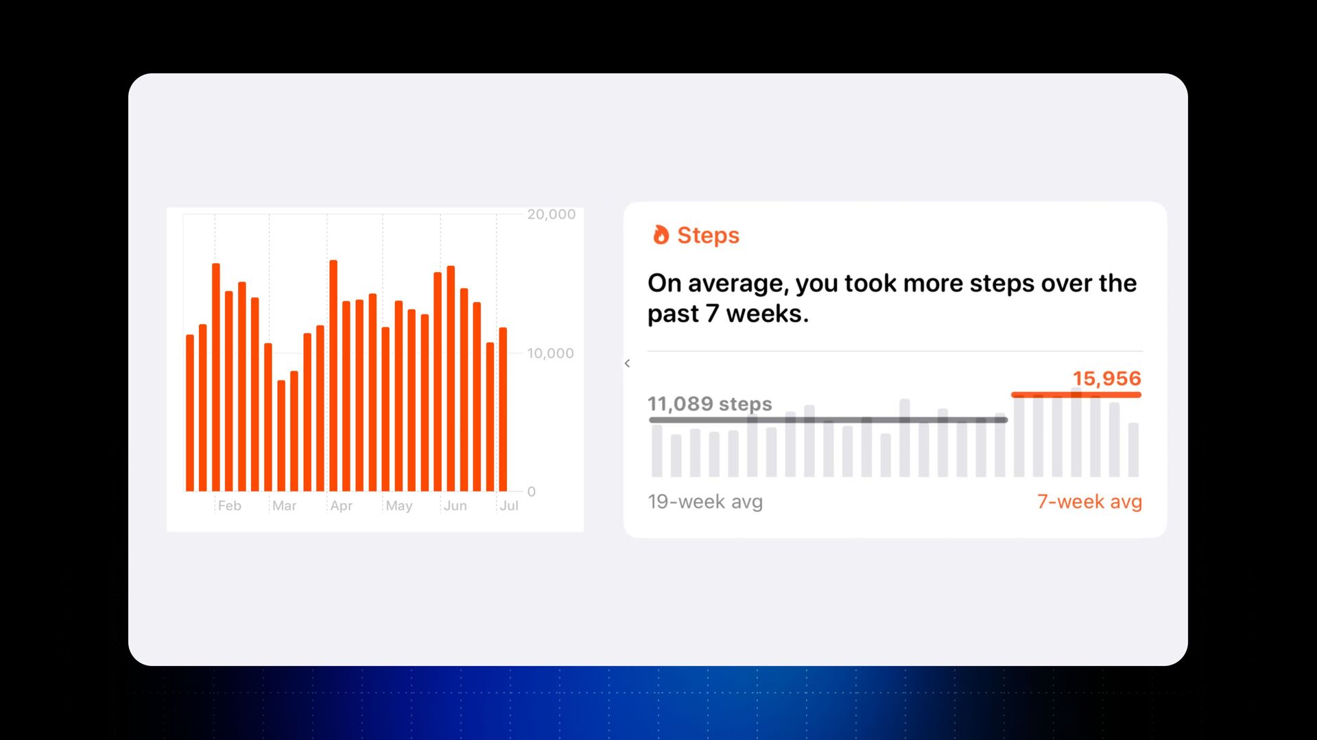
Just raise your hand. Awesome. So what this chart does, it's looking at the steps, on average, I took every single day for a few months before that. It's a very simple chart, a consumer chart, but I want to start with a simple chart just to make my point.
So what would happen is this chart is good for you to explore the data and find out insights from this data. But if you take the same chart, and let's say just for this argument, you share this chart with your team, everybody will arrive to their own conclusions and their own insights about the data.
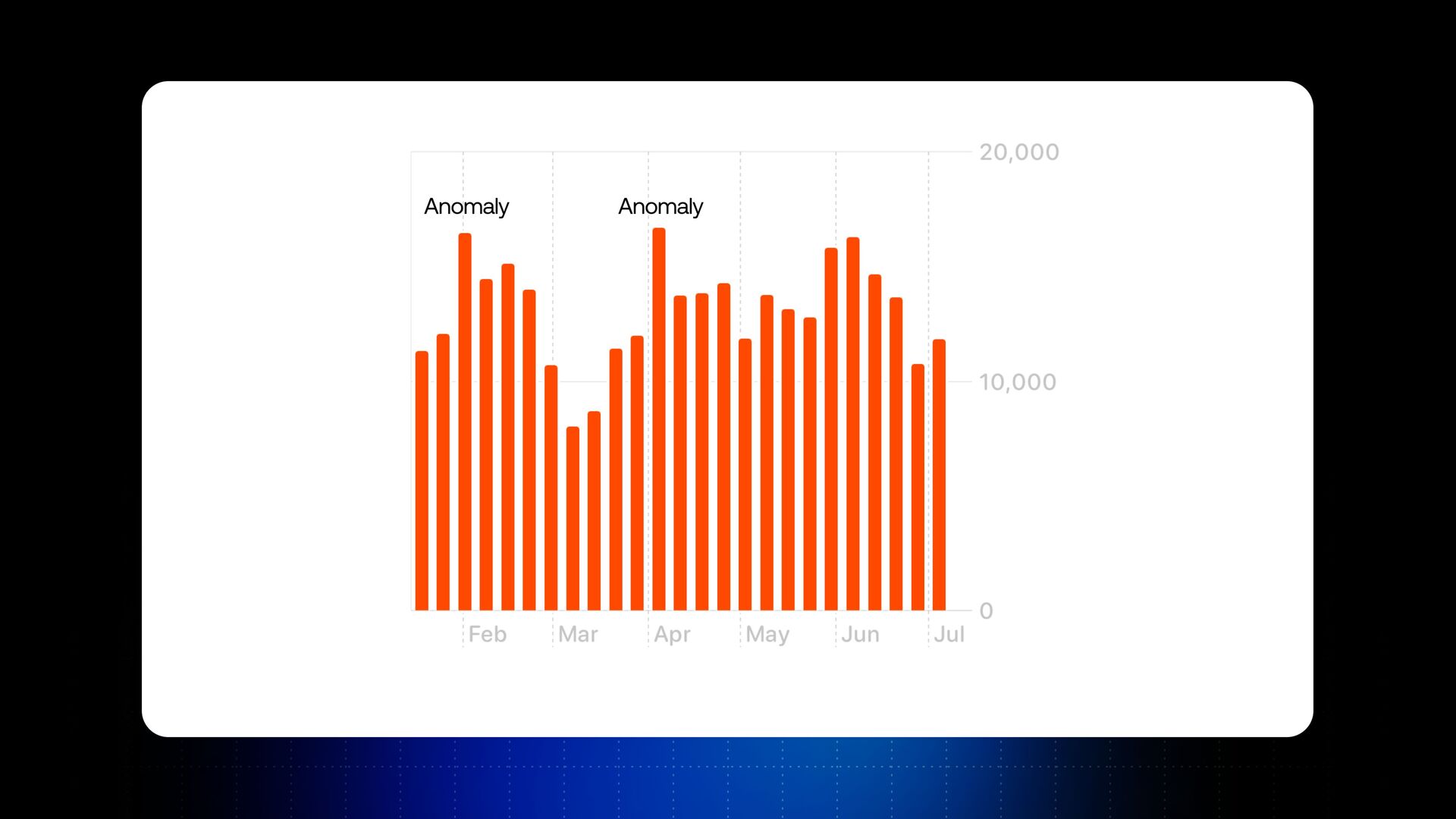
Let's look at this example. Someone can see the anomalies in data or spikes. Someone will try to understand, oh, how do we have more of these spikes moving forward? And they'll try to come with actions and strategies how to increase these spikes. Yeah?
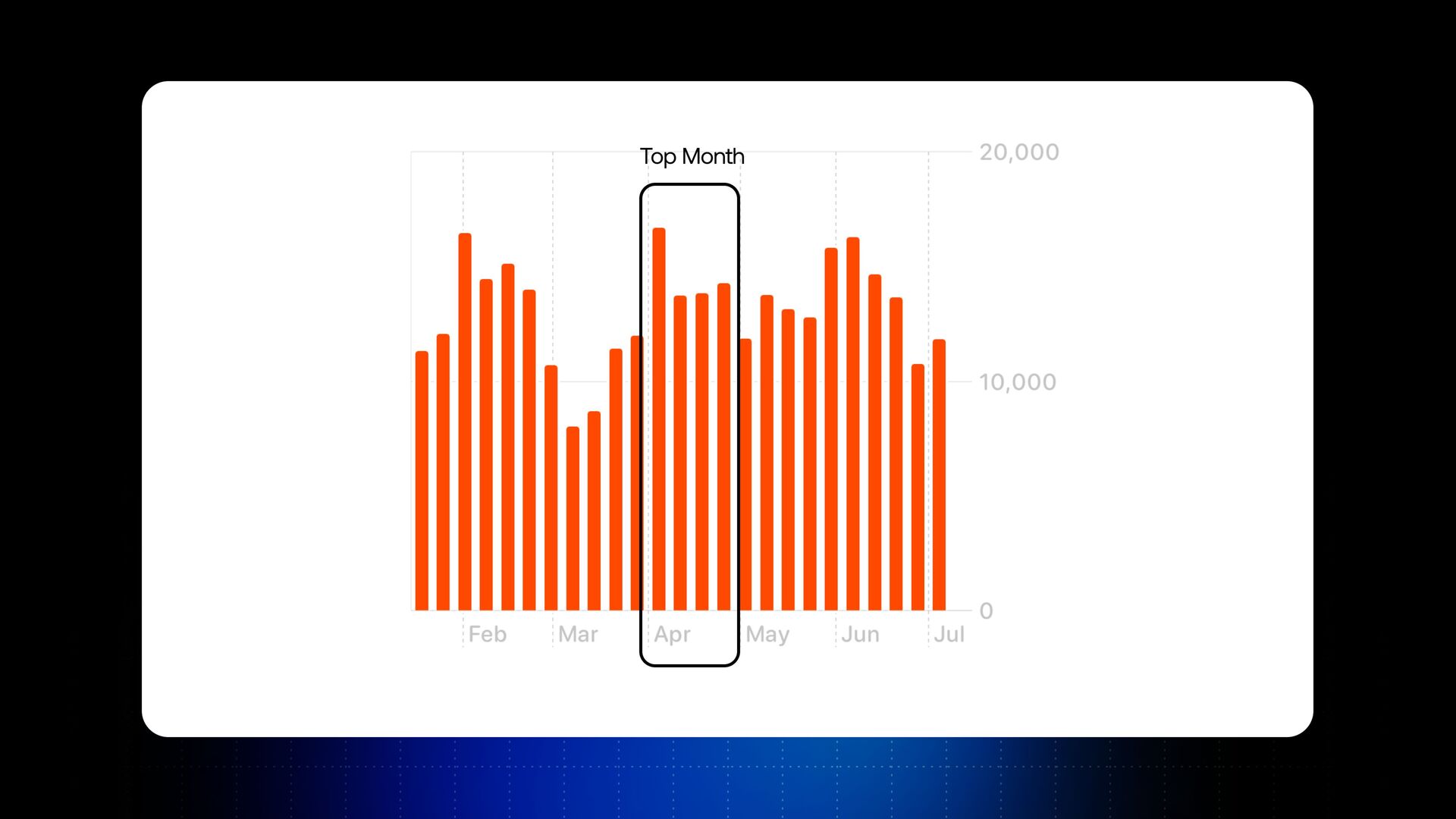
Someone else might say, oh, April is our top month. How do we make sure we have more months like April? See? That's another insight for someone else. Someone else might say, Oh, March is a bad month. Can we discuss about how March never happens again?
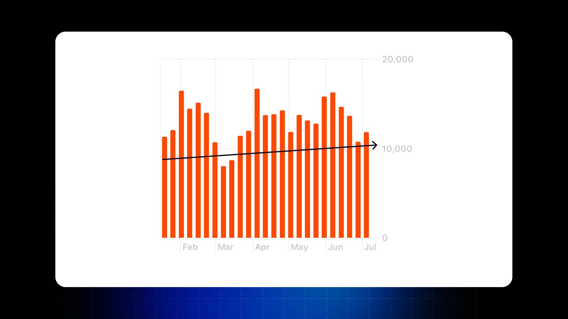
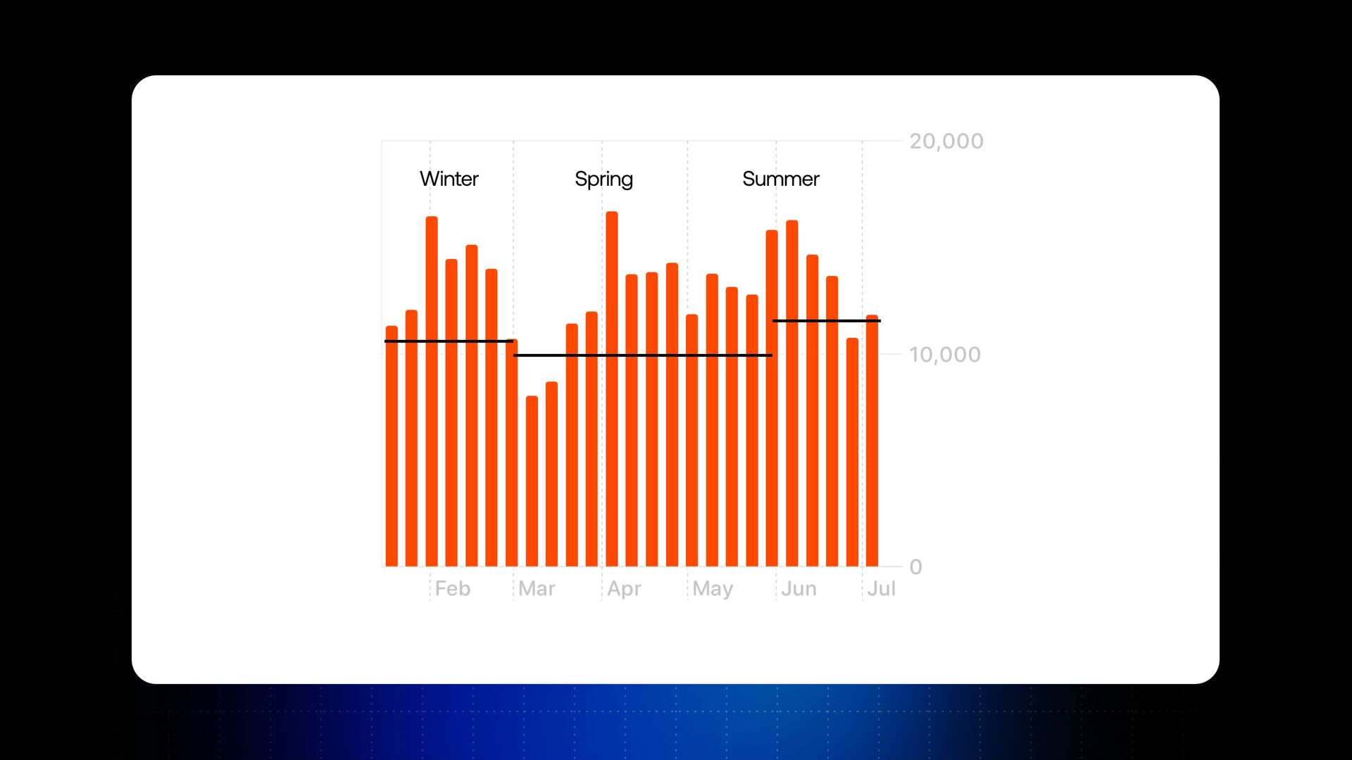
Someone just says, Oh, I don't care about anomalies, I just want to look at the trend and make sure we're increasing the trend. And someone else might say, Oh, we just care about seasonality, so can we make some projections based on that? So my whole point about this is that it's a very, very simple consumer graph you can see, but even this chart can have ten insights or more.
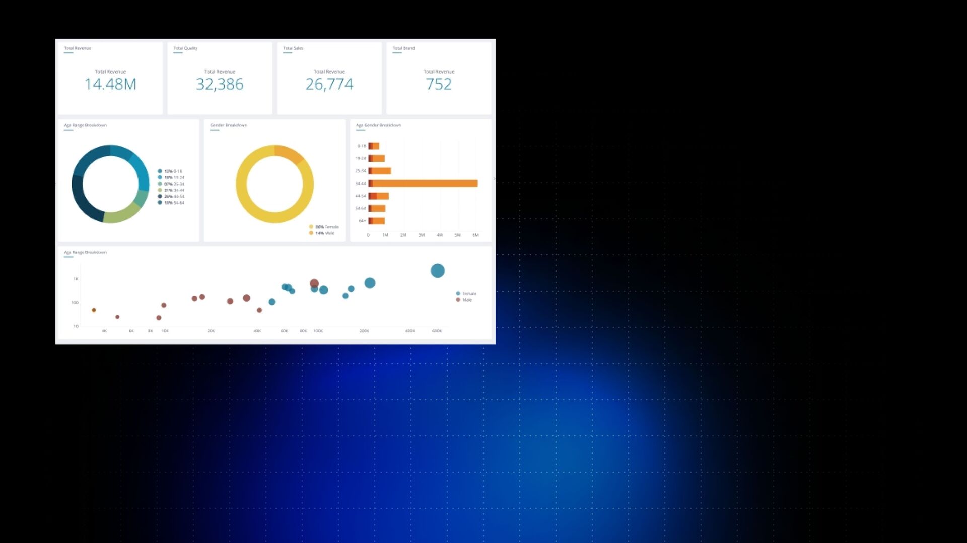
So you can see how people might be confused if you share this chart with them. Yeah? And this is a simple chart. Now imagine you're being sent this or this or another dashboard and another dashboard. And what will happen? There are hundreds of insights that people might see in this data.
And you'll see this behavior. Yeah, they'll be excited about data, they'll try to explore what's going on, they'll see it leads to nothing, and no one is going to open them. No one is going to interact with them. No one is going to take actions based on this data, because it's not designed for that.
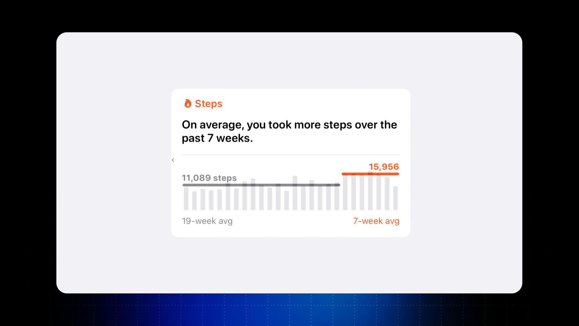
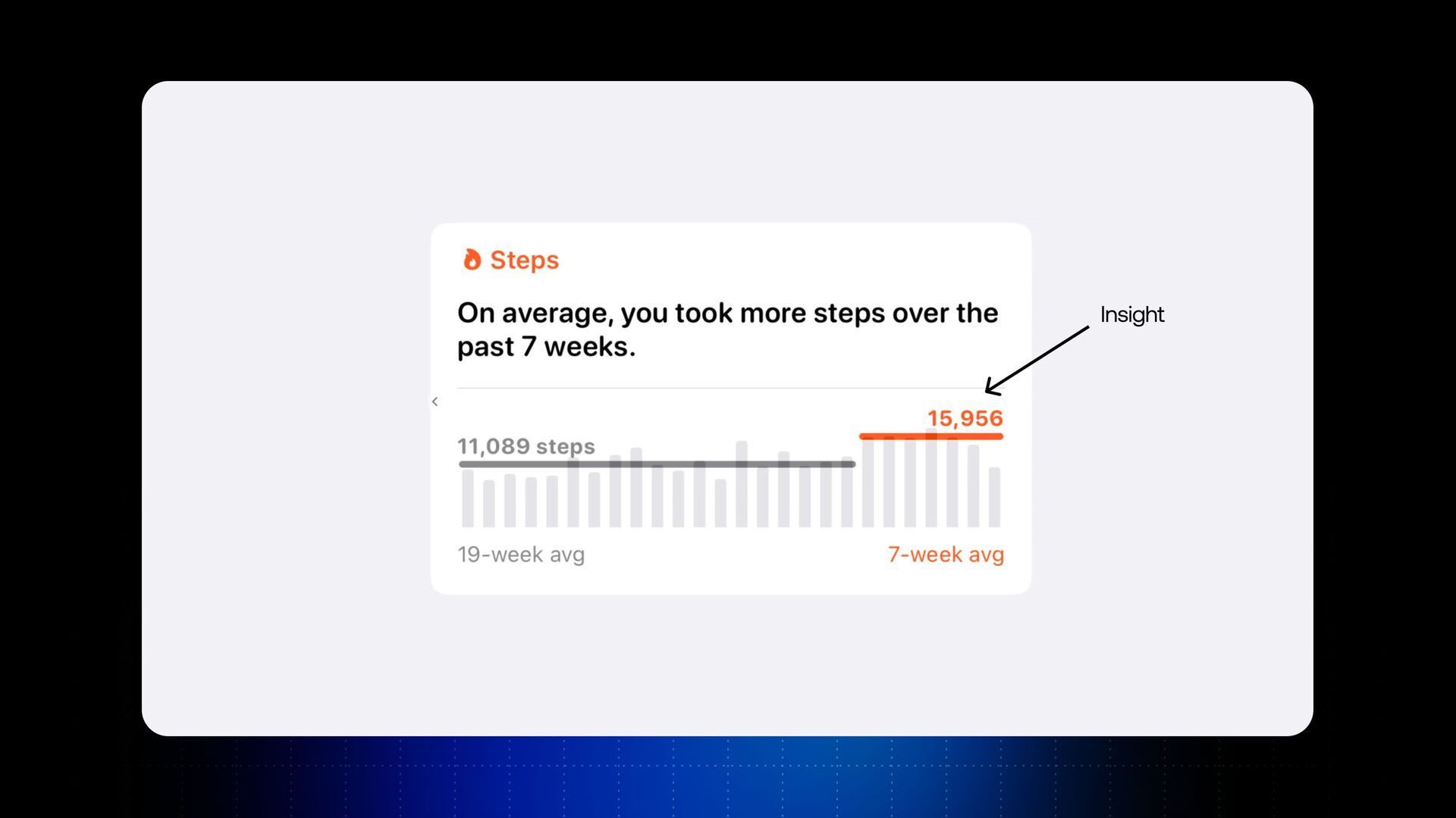
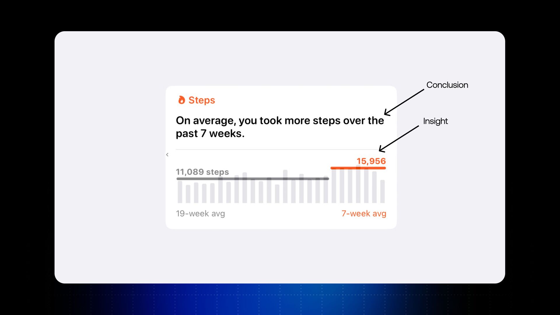
All these charts are designed for the data to be explored, not explained. And so now I'll show you another example. The same chart from Apple Health with steps over time. Let me show you this chart as a story now. Yeah? The same chart, the same data, but has a clear insight on this chart.
So the insight here is that, hey, don't care about the spikes, don't care about the top months, best months. All we care about is averages. Yeah? It's the insight on this chart. When I have a clear title of a conclusion, the conclusion says, on average, you took more steps over the past seven weeks.
And if you communicate your chart with a story, if you tell a story from this chart, it's very easy to action this. Now I have three actions, basically. Action number one is I can walk more, and I can set this as a goal with my team.
Action number two, I can walk less, and action number three, I can maintain the same number of steps. Yeah? So you can see how this chart can just remove ambiguity. So you don't need to go to a meeting and spend the first half an hour or forty five minutes discussing what does this data mean?
What does this data do for me? Like, let's explain the data. If you do data storytelling, this disappears. Your entire company can focus on just actioning this data and focus on the important bit around this data. Yeah? Does this make sense? Cool. So now what we'll do is we'll just compare these two charts.
And by the way, it's very important to say that I'm not saying that the chart on the left is worse than the chart on the right. All I'm saying is that these two charts have different meanings or purposes. Chart number one on the left, it's for you as a creator to explore the data, to find the insights, basically.
Once you've found an insight on the data and by the way, as I showed you, this chart can have many different insights. Now your job is to communicate this insight properly to your team. I'm trying to say with this, never send the chart on the left to your team.
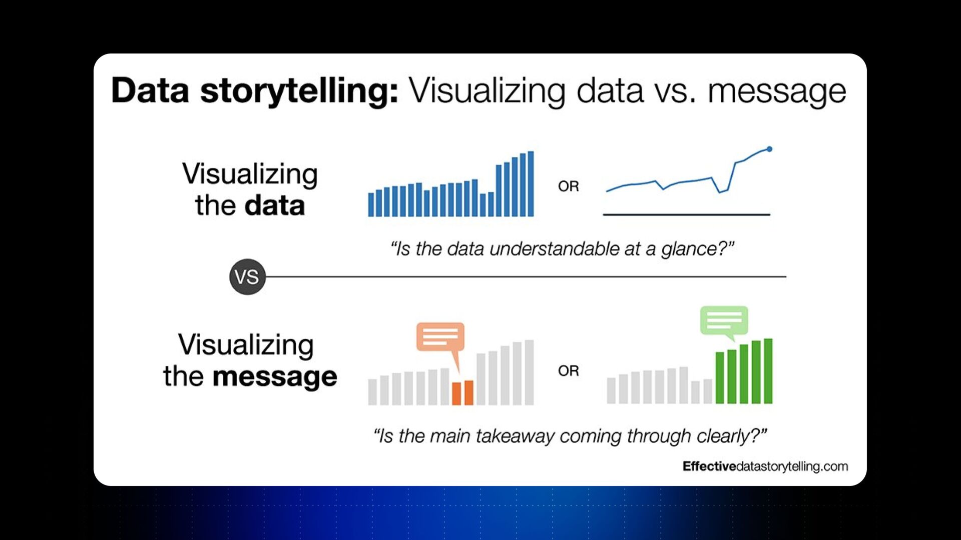
You're going to probably confuse them more than help with that. Always send a data story instead from this chart. Yeah? Again, this is very well represented in this diagram in this case. The first chart was looking at visualizing the data, and the question it's answering is, is the data understandable at a glance?
That's all it does. It tells you about the data. Yeah? And so when you have this chart and when your team is looking at this chart, just say, oh, the data is clear, but what do I need to do with this? If you want to make this chart actionable and empower people moving forward and making decisions from this chart, all you have to do is to send them a chart which is visualizing the message.
Don't confuse other people. And you just remove the ambiguity of interpreting the data, asking what the data means, and spending time in meetings looking at the data. All you do is, hey, as a creator, I've got the data. I spend time understanding what the insight matters for us.
Let's go and discuss this insight. And of course, sometimes you have pushbacks of, hey, I don't think this insight is important. I think we need to discuss about something else. That's Okay as well. You go back and you change the insight, and you communicate this insight to your team.
And especially if you're a remote company, just again, if you send the first chart which visualizes the data, it's just going to confuse the people in your company more than help them make decisions and take actions on the data. Right? Okay. Now, what I want you to take away is that I'm going to show you a step by step guide on how to create data stories.
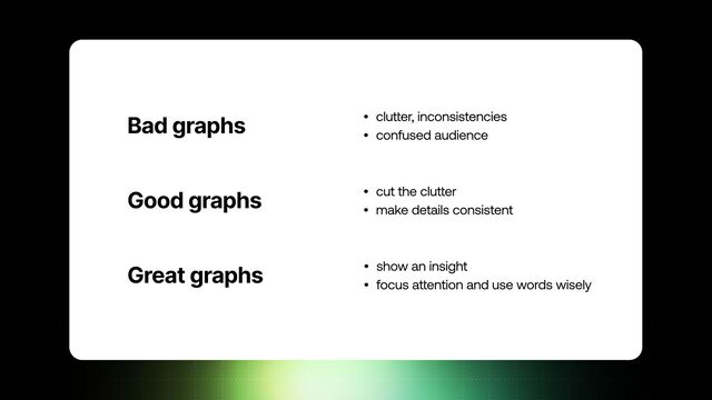
So you can go after this conference tomorrow or next week and start implementing this change in your company if you'd like to. Yeah? So first of all, a little bit of theory. For creating data storytelling, you've got three types of graphs. First one is a bad graph.
And a bad graph has a lot of clutter, has a lot of inconsistencies. Yeah? And so what happens with bad graphs is when you send them to someone, you think they know the insight. You think they'll see the chart the same way as you.
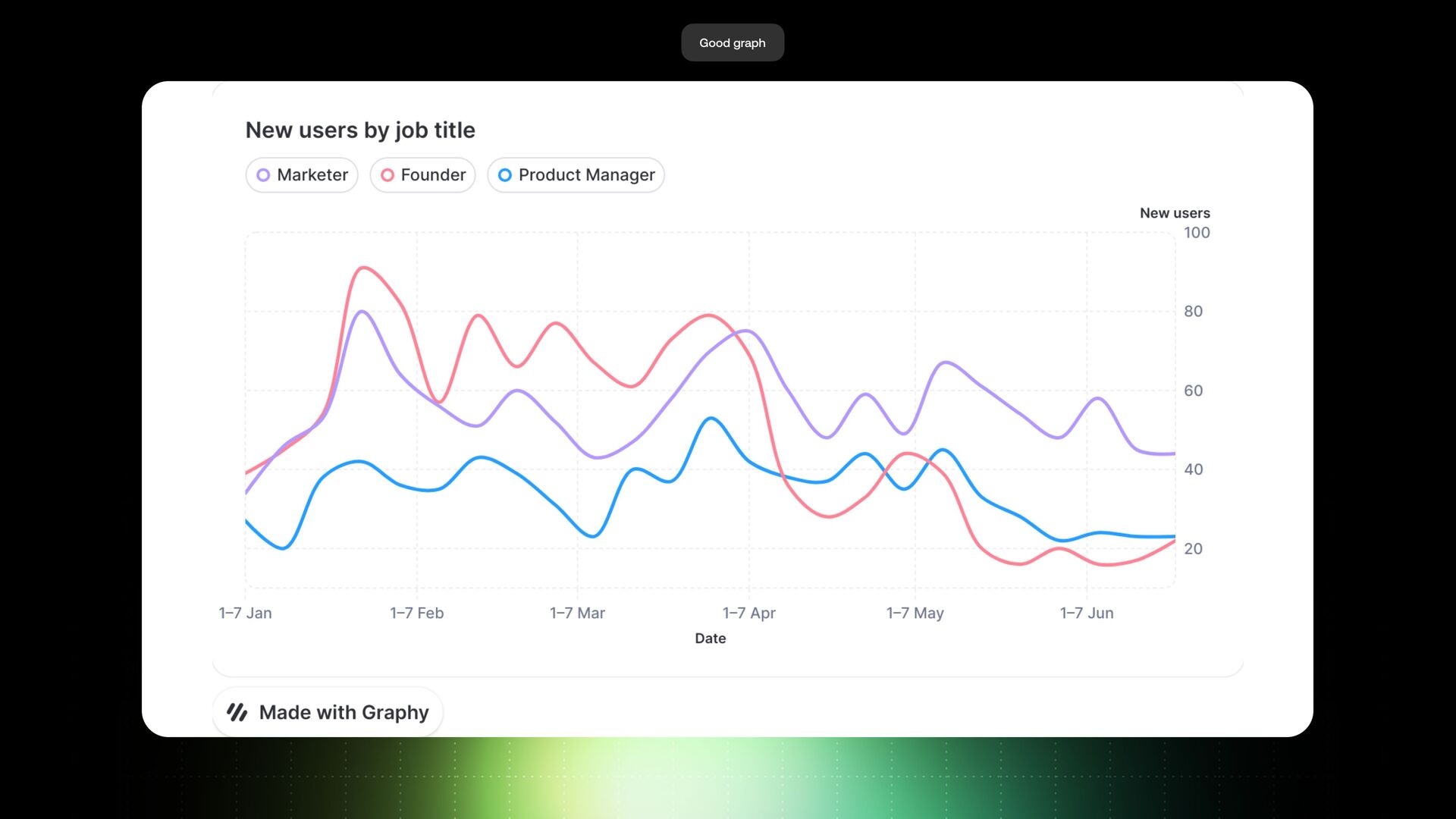
They're being distracted by lots of small elements, lots of design inconsistencies, lots of noise on the chart. Yeah? Good graph is a graph which is absolutely decluttered, which doesn't have clutter on it and helps you look at the data, come up with conclusions and make sure that you can find the insight from this data.
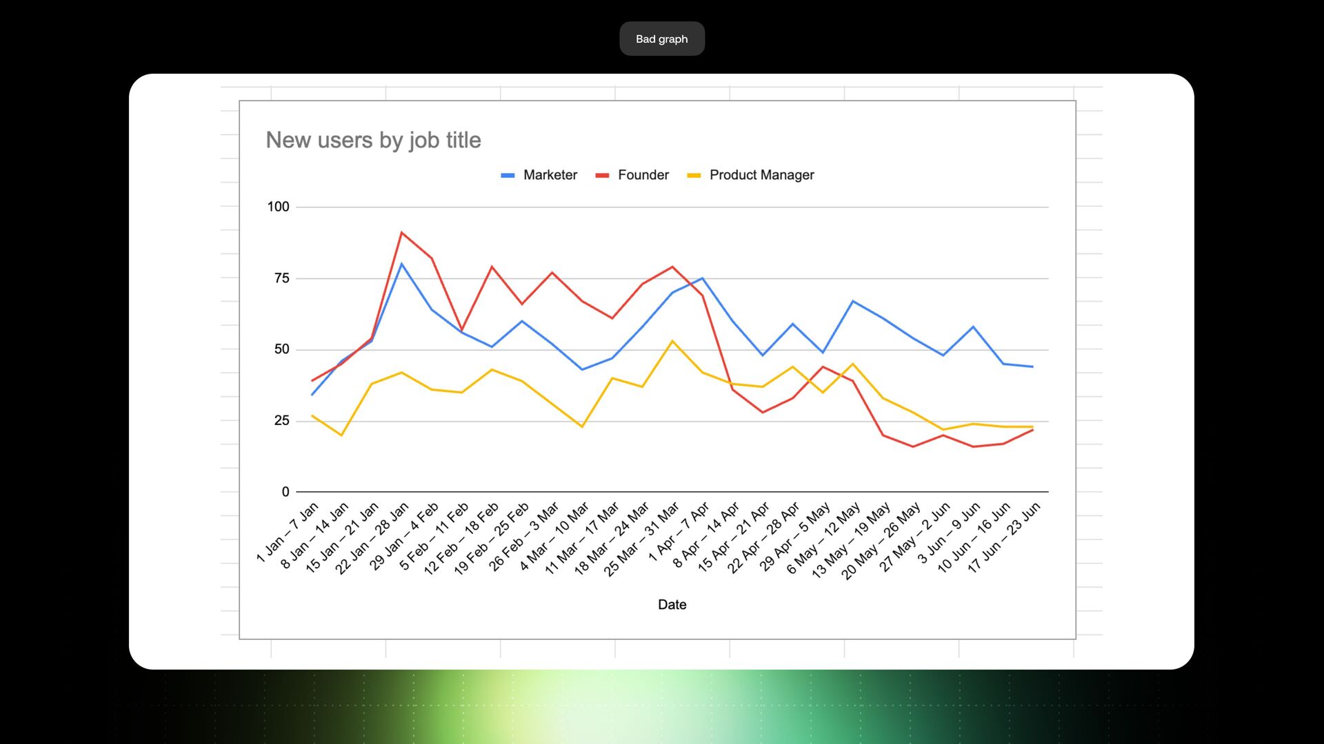
And from good to great graphs, you show an insight on this graph. You show a story on the top of this chart. So I've got two examples for you. Let's dive into the first one. This is a bad graph, and this is a default graph you get from Google Sheets.
This is quite a simple graph if you run a B2B SaaS company. This graph is looking at sign ups by job title, by weeks. What's wrong with this graph? You might say, Oh, nothing is wrong with this chart. But look, there are so many elements which distract your attention from the borders on the chart to very thick grid lines to this y axis, which is very busy and takes a lot of space from the chart, it really impacts how people interact with the data and interact with the charts.
Don't forget about this. Everyone is busy, everyone has their job and their area of focus, so they want something clear to explore the inside. If I take this chart and transform this chart into a clear chart, like, that's another picture. Yeah? I remove the noise.
Now it's very consistent. It works quite well, and the colors as well are helping the user to make a decision. Every single one of these elements make a difference. Trust me, it just makes a difference how people interact with your chart. This is a good graph.
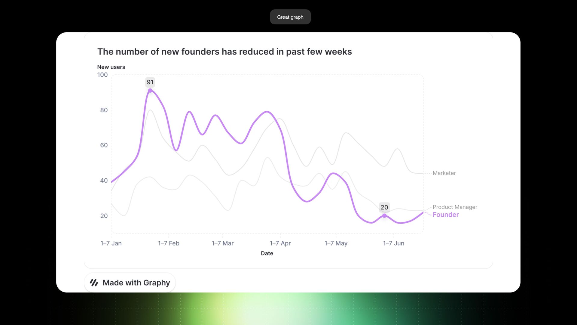
And how do we get this graph from a good graph to a great graph? Yeah, we have an insight on the top of this graph. And when I explore this graph, there are many insights I can look For example, in the first half of a graph, have to see an uptick in marketers, on founders when it's going down.
I can say the comparison between marketers and founders. I can set a goal here. I can do so many things. But the insight, let's say in this case, my company cares about is why does the number of founders increase? So if you send this chart to your team, they won't get this.
But if you send this, which is a great graph in this case, it's much more clearer than that. Have a clear insight on the chart. I highlighted the line which is important to me. What my company cares about is that the number of new founders has reduced in the past few weeks.
It's the most important thing for us. And don't try to represent two insights on the same chart or three. You'll confuse your audience. Less is better in this case, one insight at the time. The insight I care about is that the number of founders decreased.
There are also some changes in the graph as well. I highlighted this line, which is about founders. I move the legend from top to the right so it's easier for our eyes to follow where the data is. And I also highlighted two data points for you.
So you can see the highest point and you can see one of the lowest points to have a contrast in your head, what I'm talking about. And if you receive a chart like this, it's way more actionable. You can just go away and think about how can we increase the number of founders.
Do we need to promote the product in other places? Do we need to make some changes and tweaks in our onboarding? And so many other things. So this chart is actionable, yeah? And it will help your team make decisions on the data. Look at another example as well.
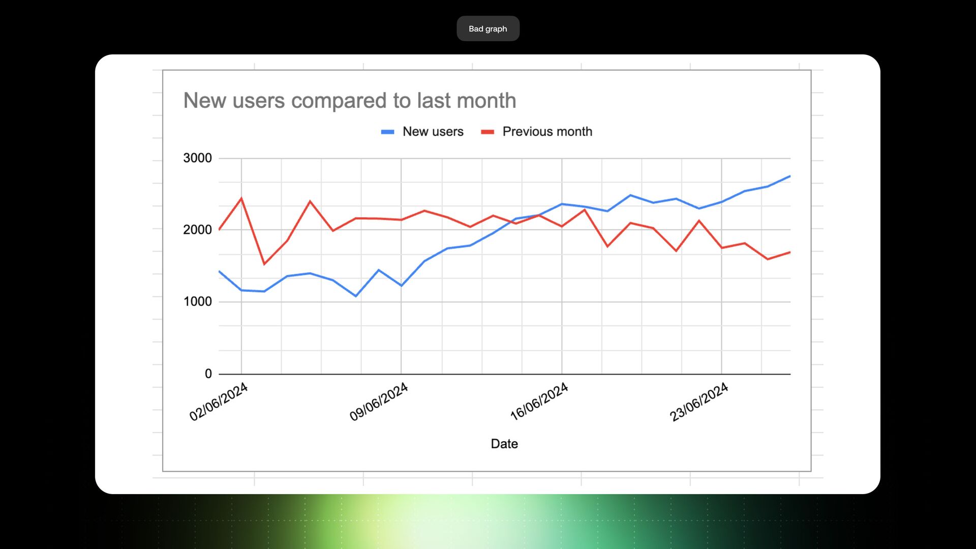
That's again a very common chart that you would see in Google Analytics too, but it's a chart for users in current month and previous month. So again, what's wrong with this chart? There is a lot of clutter in this chart. Very few grid lines, don't have a purpose in this case, inconsistencies and colors, y x axis takes a lot of space, and so on.
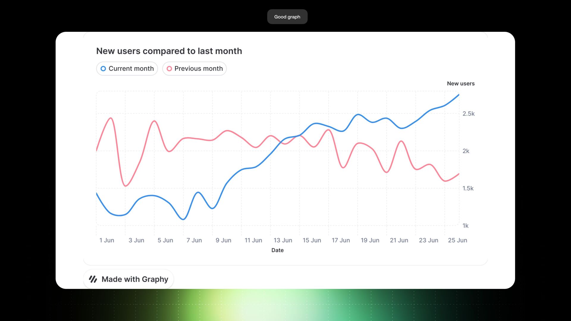
So what you first thing you have to do is to declutter this graph if you want people to understand this graph. So from a bad graph, we'll get to a good graph as well. It's very clean. It's very clear. So it empowers your team to look at the data and not be distracted by many other unnecessary elements of this graph.
It's a good graph. And the conclusion, like, what's a great graph? What's this graph missing? An insight. Correct. Yeah, you need to find an insight and always communicate an insight on a graph. Without this insight, this graph doesn't make a lot of sense.
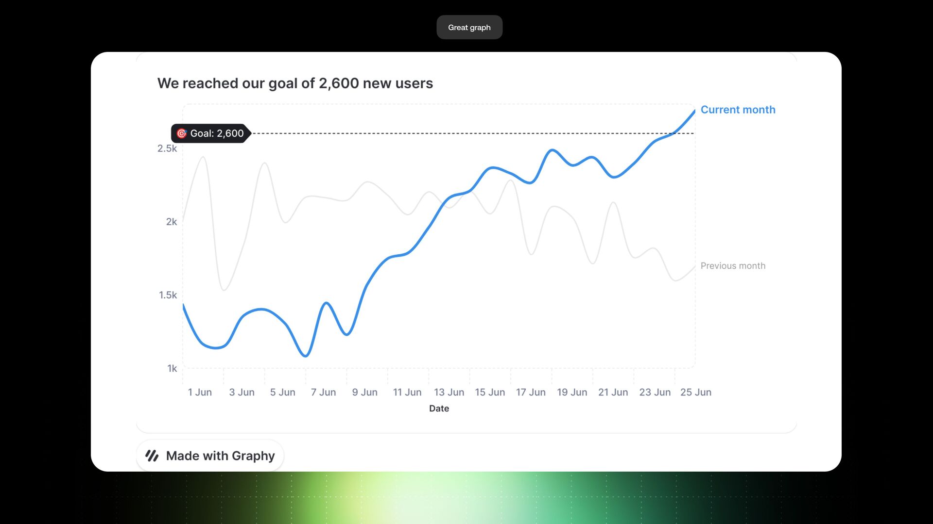
And the insight on this graph, what I care about, is the goal we set as a company. We had an OKR or a KPI or whatever this might be, and the goal we set was to hit two thousand six hundred users. I can just say, we reached our goal of two thousand six hundred users, and it's very, very clear on the graph.
I still have a line of a previous month. Yeah, didn't remove it, because it provides additional context, but I'm not making this line front and center for audience to interact with this. I'm just sharing this for context for the audience. And now we can see that the current month will hit our goal, and now it's actionable.
Now the action is like, do we set a new goal? Do we increase this goal? Or do we move away to another goal and look at something else, basically? So you can see, suddenly you make this chart actionable for your team. Another point is that tools are very important in my point of view.
And the question I've been asking myself this is so obvious to me. You see it, you get this, it's obvious, you can align your team and you can make right decisions, but why are not more people doing it this way? And one thing I found out is the tooling itself.
There are many tools you can use for data storytelling, like your BI tools, Tableau or Power BI, Think Cell is good for consultants, you use Excel and Google Sheets, but all these tools are kind of low level in this case. What does low level mean is that you have to set all these elements yourself, and you need to just learn so much theory knowing how to do this, and to be aware about these insights, to be aware about what a good graph is, and what a bad graph is, and how you can make it great.
And my company, Graphics, does this basically. We set these defaults for you, so you never have the bad graph. You always have either a good graph, or if you found an insight, you have a great graph in this case. And we also power this with AI, we give you suggestions of insights you might extract from a chart to help you get started with data storytelling.
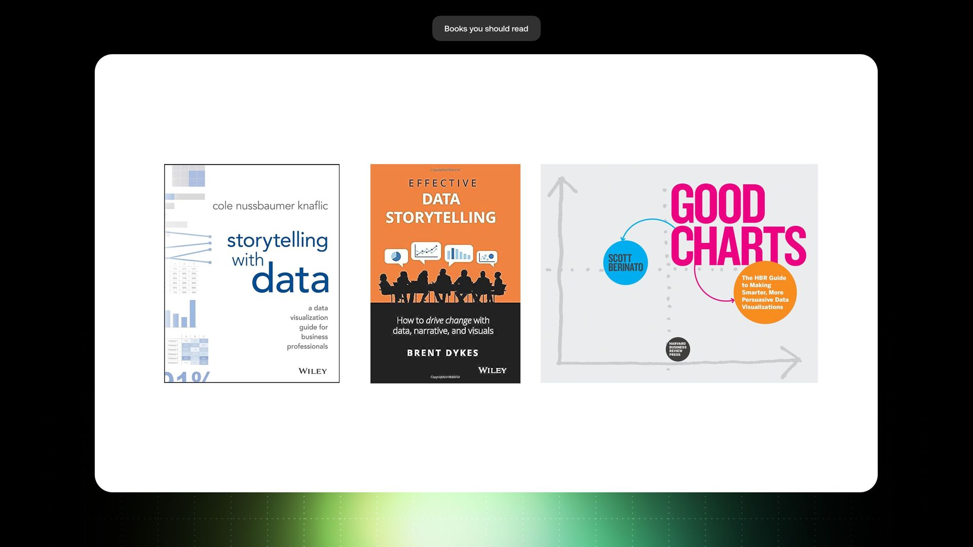
So we teach users to do that. And another slide, if you're excited about this topic and you think that's something that you'd like to implement in your company, I'd love to recommend a few books you should read, which helped me get started with this topic.
These three books are one of my favorites, and they're amazing for getting started. Your first book is Storytelling with Data by Nicole Naflick. This book is quite good at explaining how to go from bad graph to a great graph. Cole has a new terminology called stellar graph, which is one level beyond that, which is exciting, which blends multiple data sets into one, and basically how you can transform two graphs into one.
Is awesome. Another great book is Data Storytelling by Brent Dykes. And I use some of his diagrams from his book in my presentation as well. And Brent is just amazing in telling stories about data storytelling. And he talks a lot about cultures in our company and how to get buy in on data storytelling.
And last but not least, it's a book by Scott Berinato called Good Charts. I'll argue that Scott actually speaks about great graphs or great charts. He just calls them good charts in this case. But it's a very good guide in helping you create great graphs with an insight on the chart.
Yeah? Cool. So just on time, conclusion, and we are done in this case. So we'll start with this story from Ignaz Semmelweis, and we looked at how data storytelling could have helped him make his point more prominent. Yeah? That's what's happening in your companies today, in many, many companies around the world.
People don't start from the end goal. People know, oh, having a dashboard or having a data stack, it's a must. Our investors told us about this. They see the company, Exxon, doing this, So LinkedIn posts or something like this. But in reality, this is not very, very helpful.
If you want to make your organization truly data driven, you should always start with the last mile. Last mile is the most important part because no one takes actions on the data. All your expenses and time invested in this data stack, it's kind of useless because people don't take actions on the data.
So, I hope you all enjoyed this presentation. Yeah, data storytelling can help you bridge this gap between between the great analytical output you are getting and people taking actions. Thank you so much, and I hope you enjoyed this presentation.