
There are now more searches being done from mobile than desktop devices and Google is moving towards a mobile-first index. Avoid losing your SEO results and learn how you can refocus your SEO process to prepare to the new mobile-first search reality with guidelines, tips and tools.
← All talks 











Grow Marketing Turing Fest 2017
SEO in a Mobile-First Index: What Marketers Need to Know
Auto-generated transcript - may contain errors. Tap a timestamp to jump the video.
Look for excellent. So I am I am so very happy to be here. Finally, I have a story to tell about Aimwork. Right? Four years ago, I was living in Brussels, and a friend of mine, a British friend of mine, was coming over during the weekend.
Right? And she told me, look, I am going to come with a friend, but I am not going to arrive on time. So please take take my friend to dinner. Right? An industry friend. Actually, he's here. I'm not going to tell his name.
I don't want to put him in a weird situation. So the thing is like I took took him, you know, to have like typical food from from Belgium, etcetera, etcetera. It was a lovely night. We had such a great time. And he spent the night mostly telling me stories about this amazing place called Aimburg.
Right? Remember, am a non native English speaker. So with his accent, he spelled like this Aimburg this, Aimburg that, Aimburg, Aimburg, Aimburg. At the end of the day, I was like, Okay. You know, I'm sorry. I feel ashamed, but just you're telling me about this amazing place where you live live called Einberg.
And my geography is not that bad, but I have no idea where it is in in in the UK. I have no idea. But it's like and then it's like, okay, Evenburg. It's like, okay. So this is how you actually pronounce Evenburg in in in the UK.
Right? So, well, one thing I learned that night and then it's it's you know, since that day I knew that I had to come, I knew that I had to properly learn how to say it. I thought that I knew until I arrived, and then I realized that people actually say, Einbrook or something like never mind. Forget about it.
Forget about it. I'm just happy to be here with you sharing. It was just too funny. And two things before starting. You will see that I have many tips, many resources. I make references about articles, guidelines, tools. Right? It's not necessarily that you write because I'm, like, going to try to share as much as possible.
Right? So I have already shared my slides over Twitter. I Tweet Tweeted the slides. You can follow me in Twitter at Leida. You can also choose not to follow me and miss all the awesomeness that I share and just to go and click on on the slideshare link.
Or if you don't have Twitter, somehow it's it's reasonably it's going to hell right now it seems. But yeah, anyway, you may be not necessarily want to be there. There is a little, there's a little something. There's a little sheet under your chairs if you haven't seen, made by Deepcall with a summary of the session and actually a reference, URL where you can find the slides also in SlideShare.
So might be come handy, of course. And then I have two questions to make. How many of you use your mobiles, your smartphones to to search online? Just to search in general. Right? Yeah. Of course. Most of you. Perfect. How many of you actually buy, do transactions online, reserve, register on mobile specifically?
Mobile? Okay. You see? Less. I see less. Hands up. However, this is how we search nowadays. You will see there's a gap between the share of people, the amount of people who share versus those that actually do transactions through mobile and we are going to see why it's very likely that this happens.
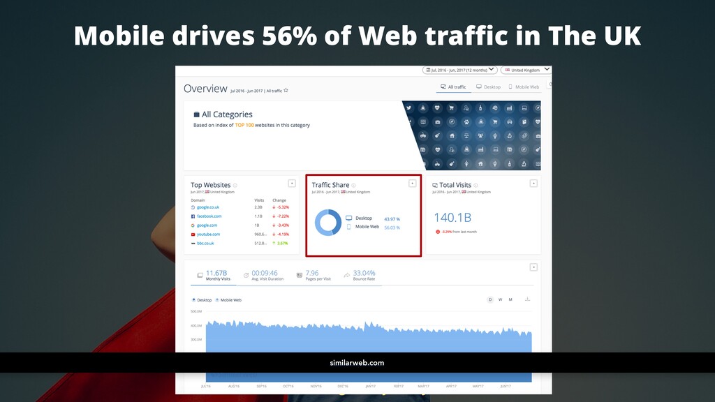
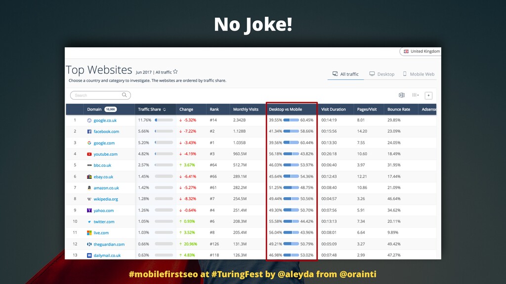
However, there's a huge percentage of people, especially here in the UK, more than half of the traffic comes from mobile. Yes. Mobile devices. No joke, really. Like all of these top websites, top websites in the UK. Take a look. More mobile searches than desktop one.
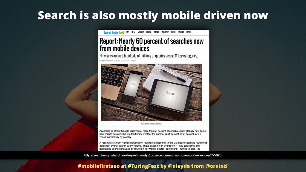
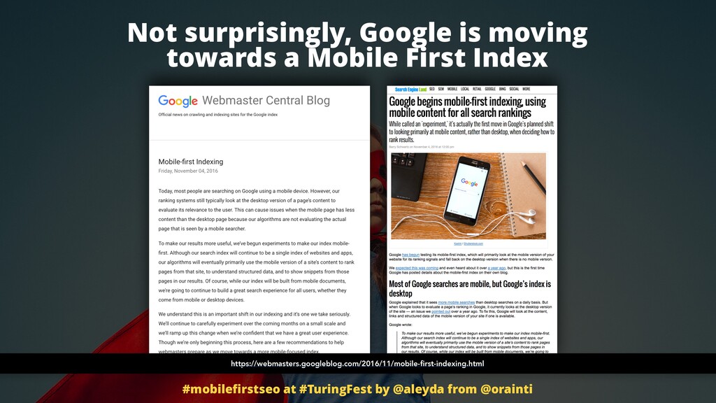
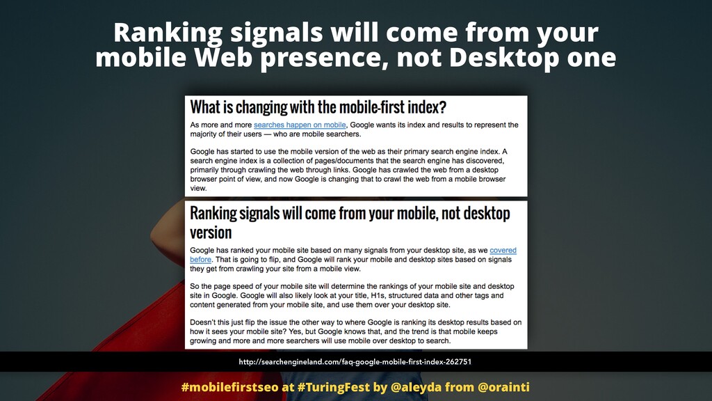
So search is also mostly driven now. We can say, yes. Google confirmed last year that there were more searches being done through mobile devices than from desktop ones too. So it's not just overall traffic actually. So not surprisingly, a few months ago, Google confirmed and say, Hey, you know what?
If most of the people is searching through the mobile devices, we are going to start taking mobile content into consideration to rank the websites. Very reasonable, right? They want to be able to give you the best possible experience. And of course, if they are still ranking the websites of what they are finding in their desktop versions, sometimes there is a gap between what exists on desktop versus mobile.
So they want to make sure that the mobile, the specific mobile web experience is relevant, is popular, is scrollable, is accessible, really fulfills the user intent. So they are moving towards a mobile first index. This means that all ranking signals will come from mobile first now, from your mobile web presence.
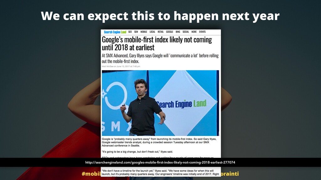
This is likely not happening like this year. I mean, please don't go out and, ah, we're going to lose all traffic this year. We don't have a mobile version. No. This is likely happening next year. They are leaving enough time for us to prepare.
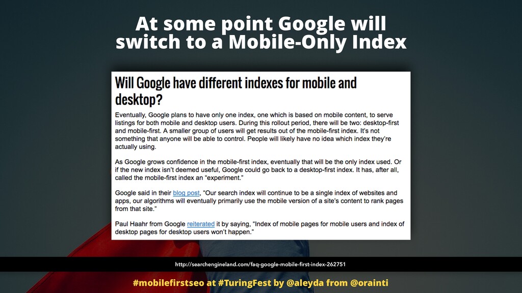
At some point they have also said that they are moving towards a mobile only index, meaning that if we don't have a mobile version, a mobile web presence, in that case, we're pretty much, yeah, in a much more difficult situation, right? Because they're they are not going to access and take into consideration our desktop web presence anymore.
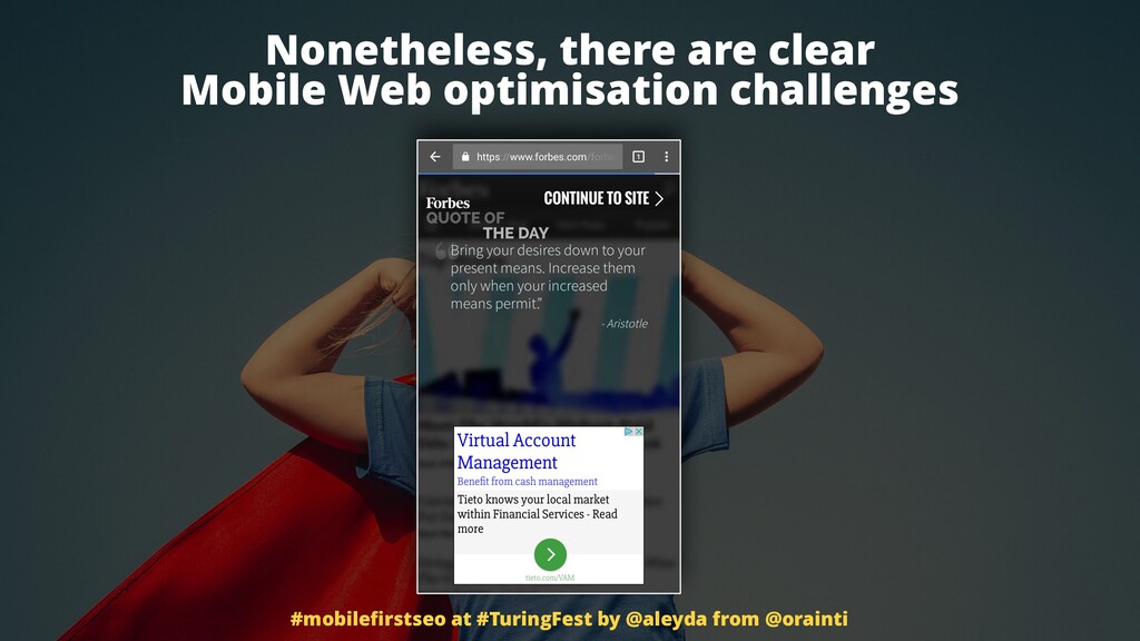
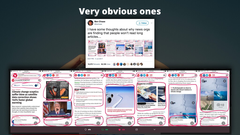
Nonetheless, we see again and again that there are very evident mobile web optimization issues. Even if you are not into SEO or or a conversion expert or a usability expert, it's just how many of you love these interstitials that are shown, the quotes from Forbes whenever you click on their pages?
Right? Lovely. It's so inspirational. How many of you read this? It's like, no one. Right? It's like, who will read them? It's like, why? What's the purpose? Maybe an opportunity to show more ads? Yeah. I imagine. And this, it it it's it's really a surprise that there are less conversion and less people is incentivized to do transactions on the on the mobile websites.
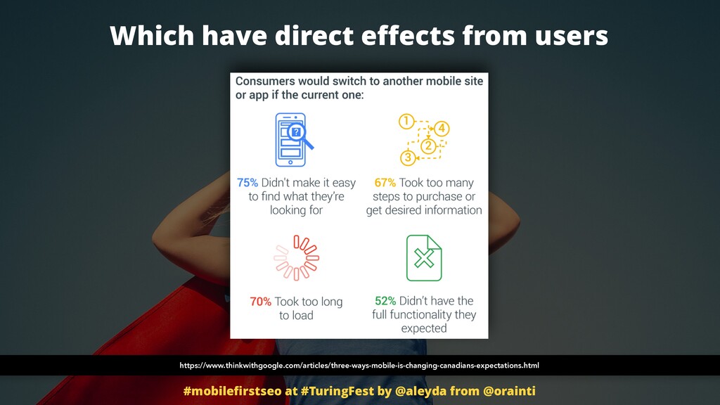
White people, they don't engage as much and read as much. What what what the white experience is not as good. Right? Like, yeah, maybe too big buttons, too many ads, not a really mobile first experience or priority experience. Really, these of course have direct effects from a user perspective.
Use we we are we are not going to stay and we are going to end up like consuming if our mobile website takes too much to load or doesn't provide really like what we are really looking for or it's too difficult to browse or scroll.
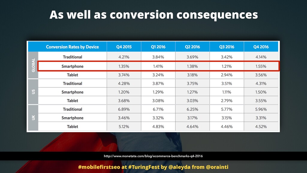
No way. And this is already shown through many surveys that have been done, conversion surveys. You can see and it's pretty sad. It's a scary gap. All the traffic is going mobile. However, conversions on mobile are ******. We need to do something. We cannot let this happen.
Just by this, our our our our profits can, you know, not be necessarily in the best position to grow. So it's time for us to save our mobile SEO. And luckily for all of you, I am an international SEO consultant and many, many, many of what I do today has to do with that, to connect the companies that I work for, that I consult for with them, with mobile searches nowadays.
I work for many well known companies, so likely I don't stock at it, And I am able to help you too today. It's about answering some key questions actually to drive your SEO process to become a mobile oriented one or a mobile first one too.
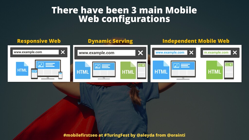
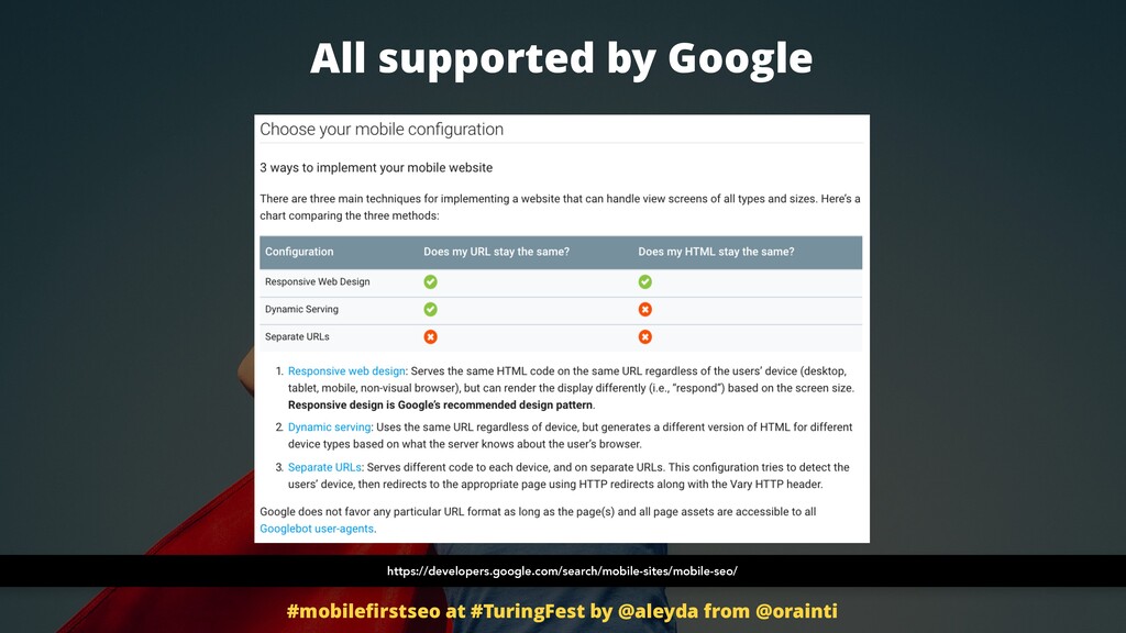
First, does your site have a mobile web version, right? We knew that there are three alternatives. There are three main alternatives nowadays to have a responsive web design, to have dynamic serving, that is that you will deliver different HTMLs through the same URL.
You will identify which is the device and based on the device you will show one or other HTML targeted toward that type of device. And then in independent mobile websites when we have specific m subdomains showing specific URLs highly targeted towards mobile devices.
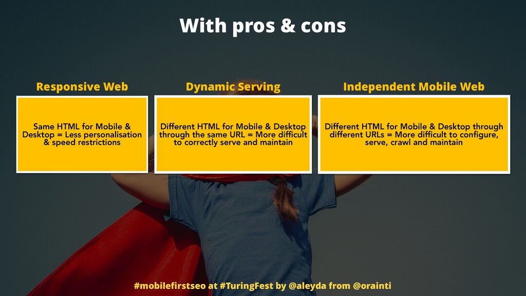
They all have pros and cons, right? They all have also best practices that we are going to see. We need, we cannot just rely on, oh yeah, It looks good on mobile. It's mobile optimized. That is like to say that our website is optimized already just because it's correctly shown on desktop.
It doesn't work that way. It's a first step. There are pros and cons. There are, yeah, different positions. Like for example, if we identify that our mobile audience has a very specific behavior on mobile that is completely different or highly different from the one that the audience has on desktop, it maybe want to go for a dynamic server independent mobile website, right?
Because we really want to target the HTML, the content, the experience, the offering towards those users. So we cannot just just have responsive web design that what it does is to just reformat the same content based on the screen. What is the thing?
A lot of people for a long time, they thought that just having a responsive mobile website was the one way to go. Mostly because of this. You see, these these are Google's mobile SEO best practices and they mentioned the three options. However, you see when they mentioned responsive web design they have, responsive design is Google recommended design pattern.
And everybody thought it's like, oh, yeah, let's go. That is the only the best option. Not necessarily if you are in the situation that I mentioned before where your your audience has a completely different behavior or if you really want to segment. Also the problem with responsive is that you need to load again and again the same resources, the same images, the same everything on mobile, just reformat it.
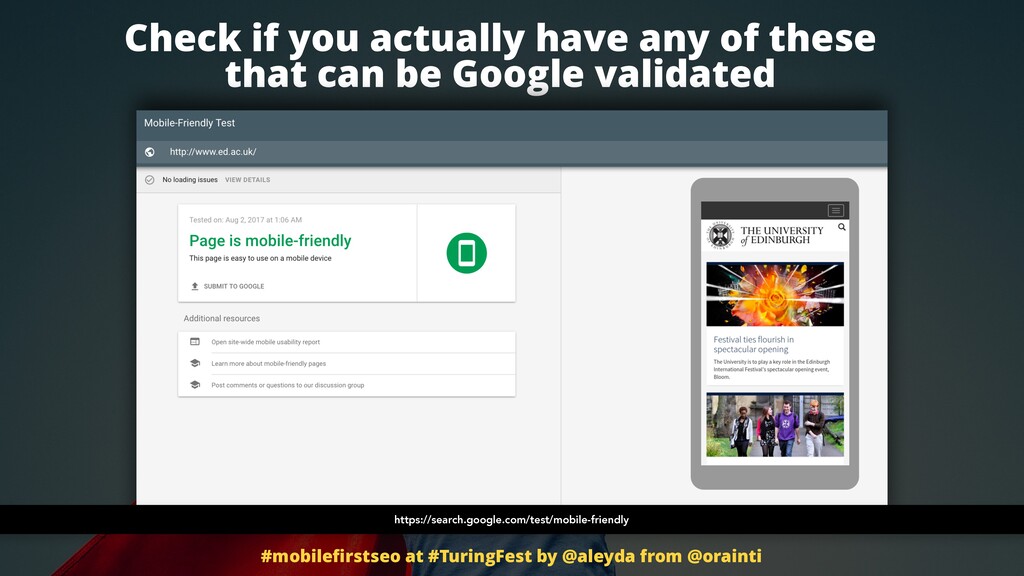
So it's probably the best from a performance perspective. Pros and cons again, assess your specific situation. The first step that you need to do then is to go and check if you actually have any of these alternatives implemented on your side And if you at least can pass the Google validation.
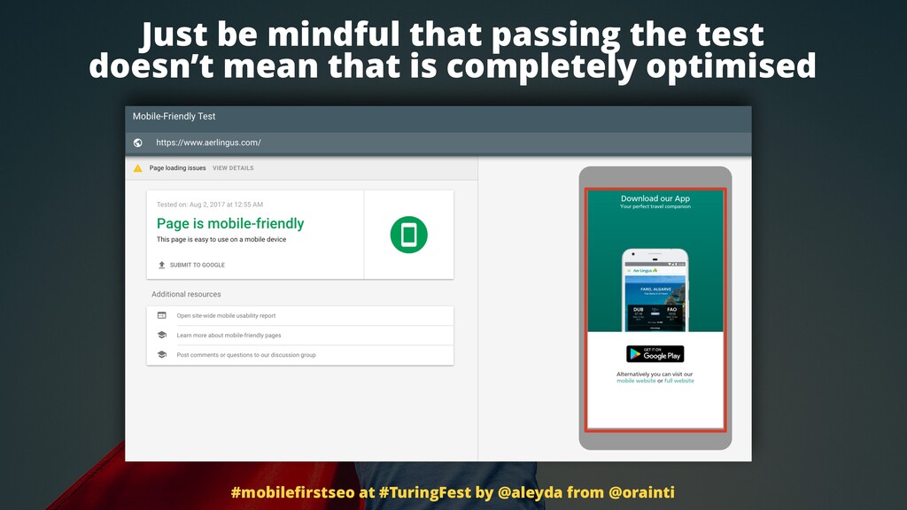
Here's the URL. Go validate your homepage, at least your homepage. Take a look if it happens. There's a caveat there. Not because you go and take your main website URLs and do the validation and they pass. That doesn't also not necessarily means that is they are completely mobile optimized.
Take a look at this example, for example, is Aer Lingus. And you can see how when they identify that there's a mobile user agent, a mobile crawler coming or a mobile user visitor too, they show, yeah, an interstitial, surprise, surprise, trying to incentivize the user to download their mobile app.
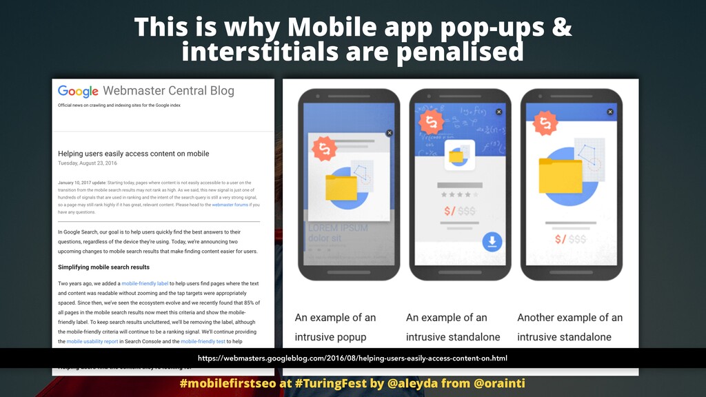
Pretty much when they do that to me I say like, why? Is your mobile site ****** or what? What you are trying me to make me move away to your app? Like, no. Right? Anyway, so this is actually not optimized from for even from a Google perspective, for Google standards, because we are going to see how there is an update that targeted websites that were using using interstitials.
Now any website that user use interstitials or pop ups on mobile, they will likely get penalized. There's a filter for that. So surprise, surprise. Be mindful that there can be some false positives going on and not necessarily rely on one single mobile tool like this, but it's a good step to start.
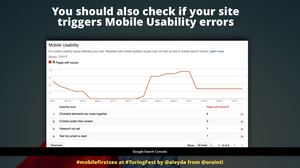
You should also check if your site triggers mobile usability errors. Google Search Console. Go take a look. Also very low hanging fruits, very specific configuration that should happen, should exist in any mobile optimized websites. The viewport is set, yes or not. Whatever type of configuration you have, you need to include the viewport to become mobile friendly.
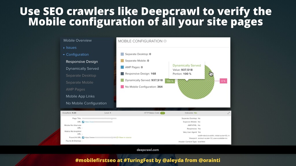
You can also, of course, and you should use SEO crawlers like deep crawl, for example, to verify the mobile configuration of all of your site pages. And what I what I love about deep crawlers that they have this specific reporting right there that already validate on segments for the most important configuration that you should assess in order to identify if there are any of these three alternative implemented on your side.
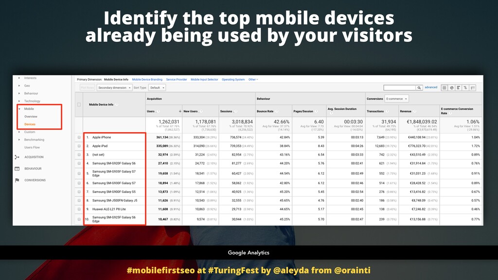
You should go and identify which are the top devices, top mobile devices bringing traffic to your site. In Google Analytics there is a devices report there that you can go check and take a look. What are users using actually? IPhone, iPad, Samsung, all of these different tastes, variations of Samsung's.
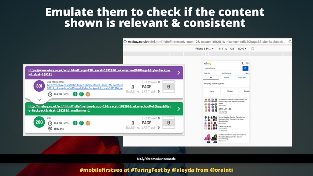
Okay. Now you know which are the devices that you can use to emulate and validate if the behavior is consistent with the one that you saw before with the Google tool, with the Google validator tool, and then when crawling the sites, right? If the SEO crawler said that there are some important money driving or top page views, pages that are not necessarily giving the best best experience, you want to go yourself there.
Go to Chrome, and this is the beauty of it. You you have a really powerful SEO tool in your in your in your browser. Go to Chrome and choose the device mode from the DevTools options. Go to that link and you will see how to go to it. Very easy.
Once that you get it and you can identify and you can emulate whatever whatever device you want. You will emulate the ones that bring more traffic, carry more traffic to your site. Take a look if these pages are really, really showing well or if there are any evident problems with them that will make them to not pass the validation.
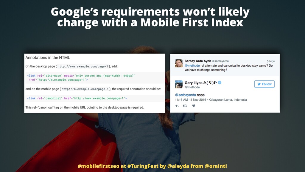
Google has said that we shouldn't go crazy about it. Right? That if we comply and we make sure that our websites follow mobile best practices nowadays, they will likely continue to comply to what they are going to require for a mobile first index scenario in the future.
The configuration won't change even for independent mobile websites, which is very if you see independent mobile websites, what we do with this m subdomains, mobile URLs is that we need to specify in every in every one of them, which is their desktop version and we actually canonicalize point as an original to the desktop version because it's the desktop version that is taken into consideration right now to rank.
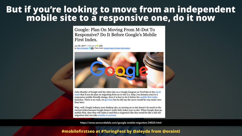
In mobile first, that is going to change, but Google says that we don't need to change anything. They are aware of of it, of course. So we can go ahead and do it. However, if we're looking to move from this independent mobile setting and configuration, we better do it right now.
We don't wait for next year or two years to move towards a responsive web designer or a dynamic serving option because right now, remember, this independent mobile URLs are not are not being accessed because the content, all the content assessment comes from desktop.
So right now it's pretty straightforward. It's pretty trivial. We we shouldn't have any consequences even if we not necessarily do it perfectly. However, if we migrate when mobile index it is in, we will need to make sure that it's really, really good, migration process to not lose traffic, indexation, etcetera, etcetera.
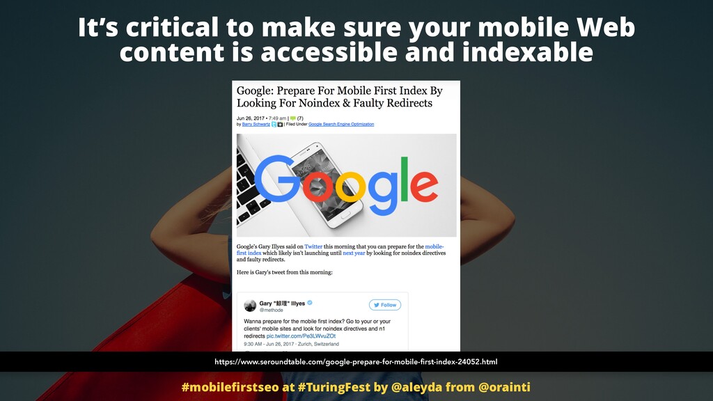
Once that we understand this, it's important to ask the second question. How do mobile search crawlers access to your site? Right? So it's critical to make sure that the crawlers are able to see the content, to access the content on our site. Right?
And a lot of mobile websites, for some reason, they leave no index there. Are complete, they are blocking the whole subdomains. If they have a named subdomain, they are redirecting badly. It's horrible. They are even like that's what I mentioned before, pop ups interstitials that are making it harder for the crawler and the user to access the actual content.
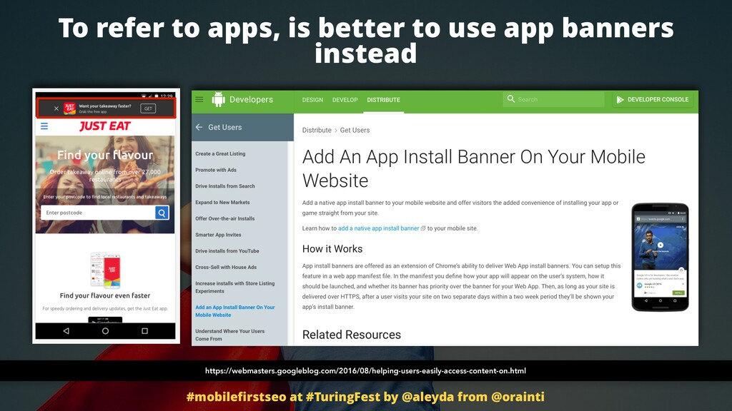
So Google target this type of bad behavior. It's buggy for me as a user, I have to say. And the best way to do it, the good way to do it is to use apps banners instead of interstitial. If you really want to drive and refer your users to your app, do it through app banners.
Then of course like you there are always like different scales and areas of gray going on. I was at this conversion conference a few months ago and they were saying, Oh no, no, you know how you can do it? Just just make sure that the pop up or the interstitial doesn't low as soon as you enter to the to the page.
Just make it that it loads when you click on your scroll or when you pass like the the mouse over a button or certain element and when you are leaving the page and like this, you won't be penalized. I don't know to which point this continue to be a bad experience to your user.
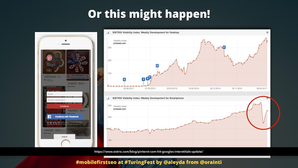
Of course, it's up to you to be mindful about this. But yeah, it's important that you take into consideration if at some point you continue to do this interstitial pop up type of fake bubble, this is what can happen to you. Like it was Pinterest that was doing it and they started to go down, then they reacted and and they eliminated this type of complete pages in interstitials and they started to use smaller banners to incentivize users to go to their app.
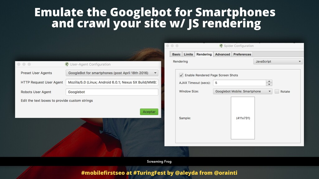
So emulate the Google bot for smartphones and crawl your site using JS rendering because Google more and more has the capacity to identify and use JavaScript and verify what is the actual behavior, like the actual experience that the crawler has. If it is the meant to be experience that a user, that an actual user will have.
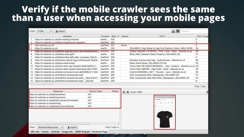
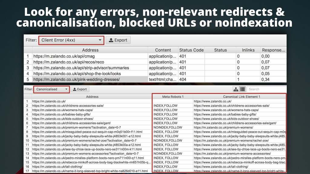
Like for example, like we can see that, yeah, when I crawl Zalando with a mobile user agent, I am redirected to the mobile home page there. Nice. From home page to home page, from desktop to mobile. That's great. There are few resources that are blocked.
However, at least the content is correctly shown. That is why I want to enable the JavaScript rendering to be able to see what the crawler see. For some reason though, when I crawl, I identify that there are some pages showing errors. Ping wedding dresses, that is okay.
Who wants ping wedding dresses? Don't worry about them. They're four zero four. No, but realistically this shouldn't be returning necessarily 404s, right? Errors. Why? Right? Which pages are being non indexed? Are they meant to be non indexed and they are currently canonicalized? These are configurations, technical configuration that we need to make sure that align to Google best practices that I showed you before.
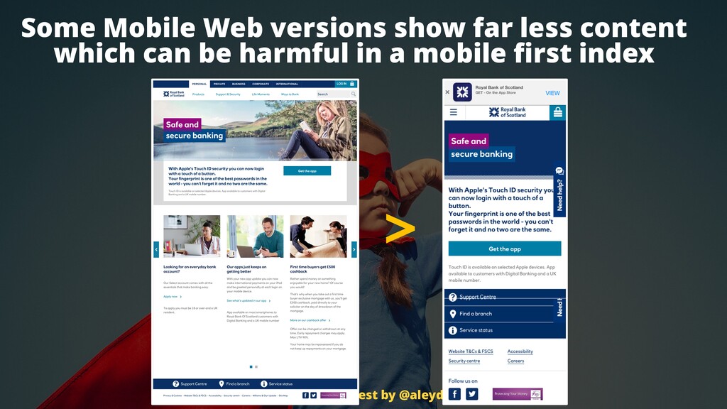
Is your mobile content relevant towards your targeted queries? Some mobile web versions just show minimum viable content to their users. They say, oh, I have less space. What do I do? I just show the first paragraph. I cut all the rest. Sadly, was testing a few Scottish websites and I found the Royal Bank of Scotland doing something like this through a dynamic version.
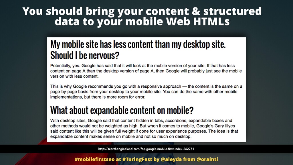
You see, they just the content that they are showing on their homepage on mobile has nothing to do to the one that they show on desktop. They just show a minimum content. So it's important that you bring your content and structured data to your mobile web HTMLs because now Google is going to actually start taking this content into consideration and accessing your relevance and ranking your content based on what they find on your mobile pages.
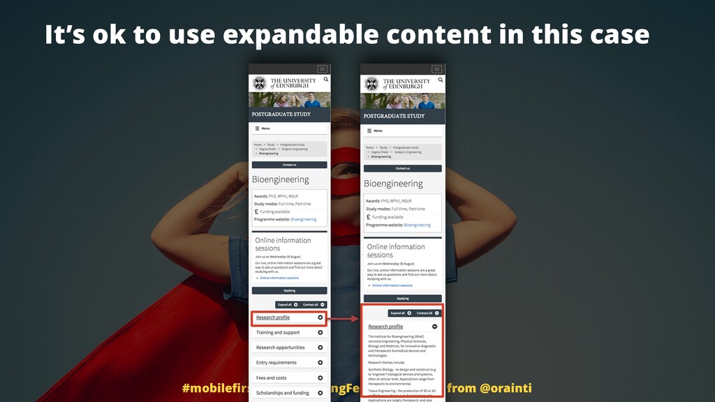
It's okay to use expandable content in this case on desktop right now. It's not very recommended to do it because Google might not take the content that is hidden, that has a display known or visibility hidden, for example, through CSS on desktop into consideration because of course they want to emulate the user.
If it is not shown toward the user, they will likely take an access and consider that content to run your site. However, they understand, they have safe to understand that on mobile there are more restrictions of space and it is okay to use this type of expand old, contract old type of content.
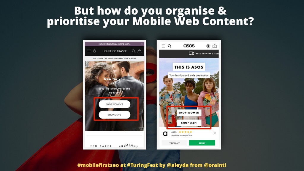
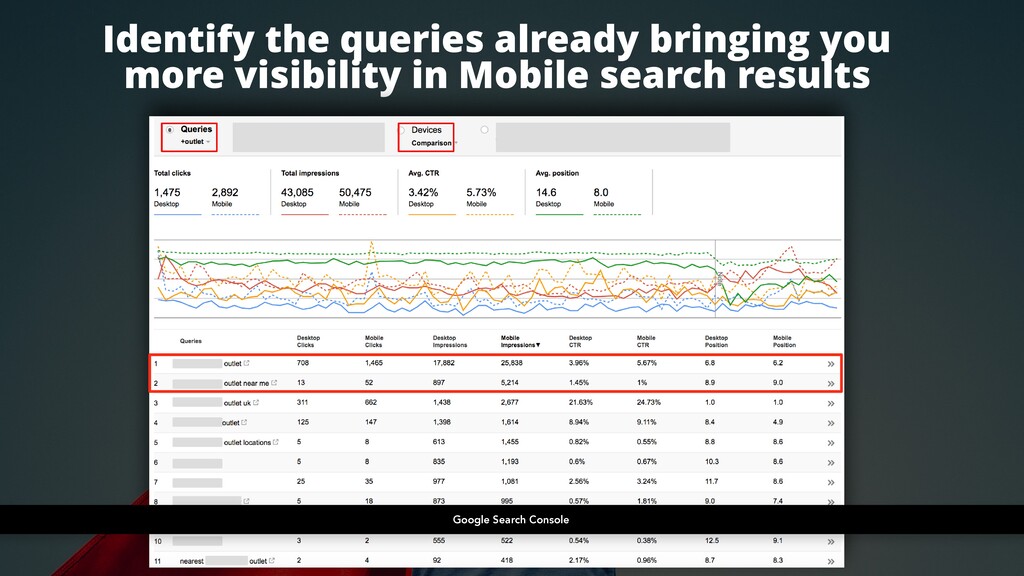
So it's okay. You can do that. How do you organize and prioritize your content on mobile though? How do you do? Do you leave the same options? Well, identify the queries that are already bringing you more visibility and search results. You can go to the Google Search Console.
You can select the devices comparison there and see which are the queries that bring more impressions and clicks from mobile devices than desktop and see if there is a bias towards certain queries. We can see that there are some of them like the near me term that is much more searched from mobile devices than from desktop ones.
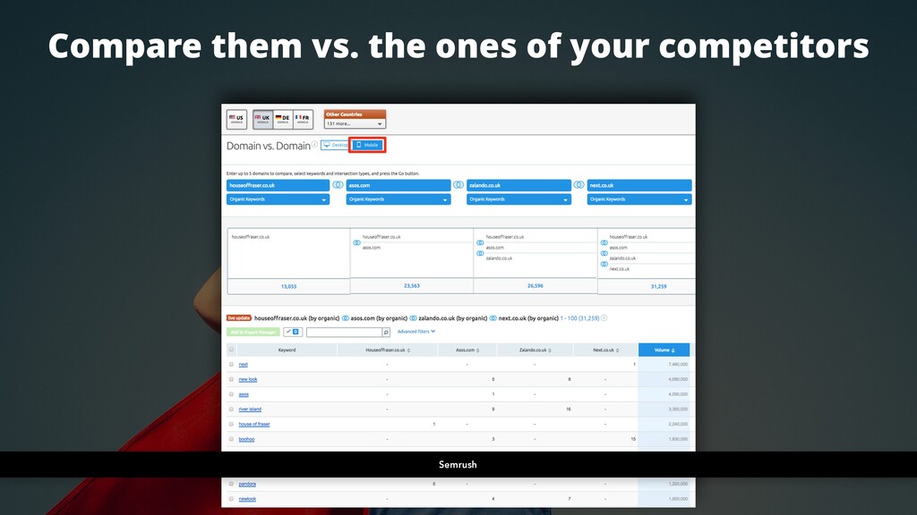
We can also do this with our competitors. Thankfully, more and more keyword tools support mobile and they have mobile segmentation. So for example, we can go to the comparison feature of SEMrush, select the mobile database and take a look of which are the additional queries our competitors are using to target their mobile audience.
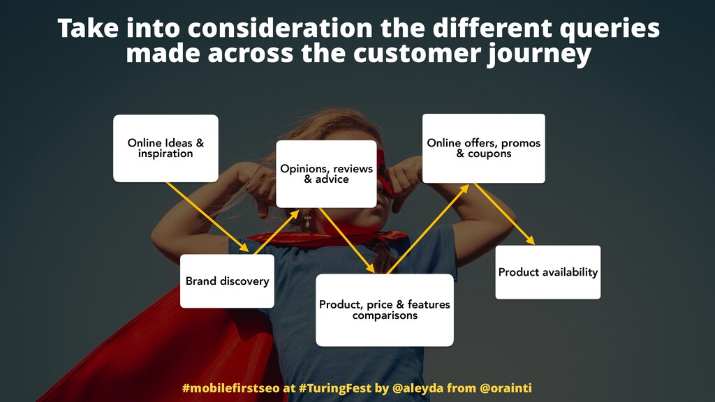
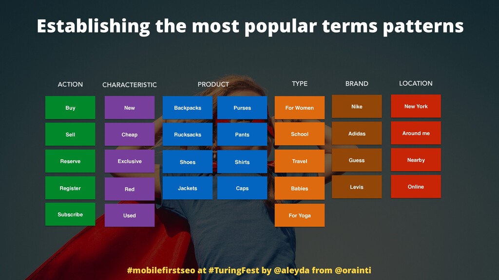
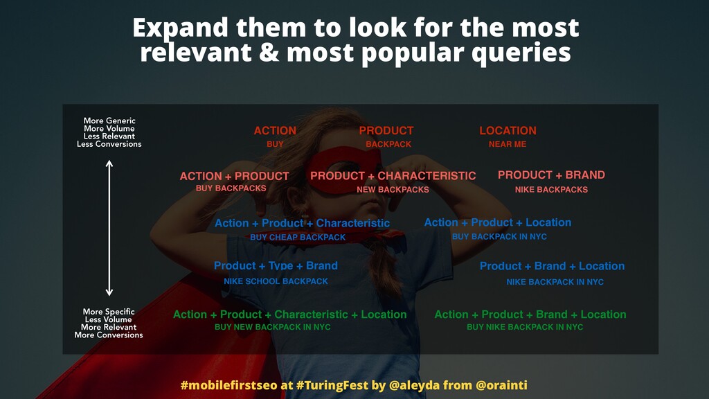
And of course, we can expand them and we just should we should take into consideration all the queries that are that are being done through the customer journey from mobile devices. We should establish the most popular patterns for actions, characteristics, products, types, brands, locations, and combine them to obtain the most popular queries in general.
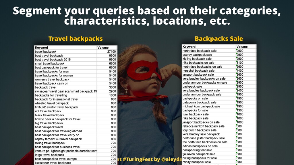
Right? But how do we make sure that we take the right ones into consideration and prioritize those that are more popular for mobile because we can end up having this type of situation, right? Travel backpacks, very, very popular. More search volume that backpack sales related queries.
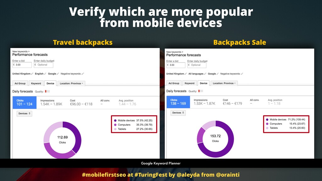
So which category should I prioritize On the backpack section of my site on mobile? Easy. Go and use the Google keyword planner and just take the the different groups of terms per per categories or subcategories as if you are going to do a campaign, just that you won't do a campaign, just just going to validate the amount of searches, queries that come from mobile devices through the devices filter there.
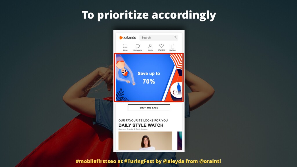
And then what we can see that despite having an overall less lower volume, the backpack sales one, the mobile activity and share is huge. It's much larger, right? So what do you do? You prioritise those accordingly. Last question. Is your mobile website fast enough? What is fast enough?
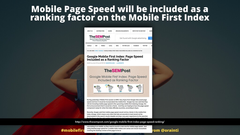
Well, this is the one thing and a lot of people say, Oh, Leida, stop talking about fast performance, whatever. This is not yet mobile speed. It's not yet a ranking factor. It will become on a mobile first index. So should we worry about it? Yes, because of this.
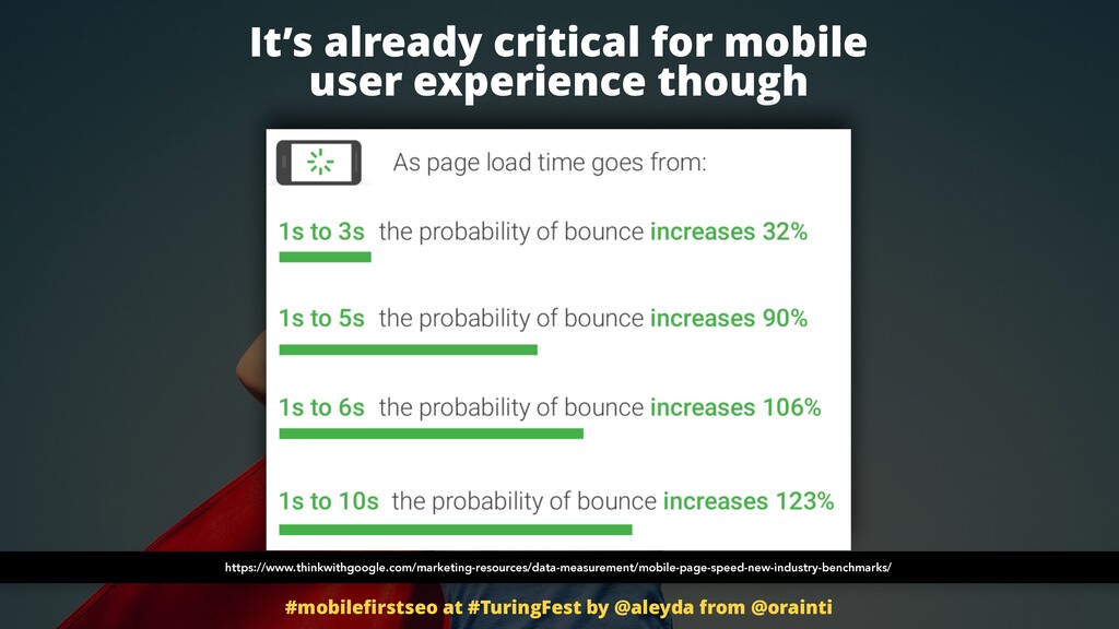
We don't want to have this type of bounce rates on our side. It's really bad user experience. You don't want that your users throw their fonts while waiting for your content to load for sure. And it's very easy for you to check out how much does it, you know, does it take to load.
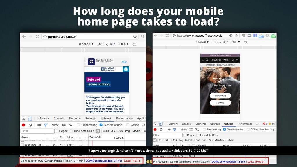
Again, is this is actually an article that I wrote in search engine land, how how you can use Chrome DevTools as an SEO tool. And for example, you can actually select here the network view to see how much does a mobile emulation takes to load here.
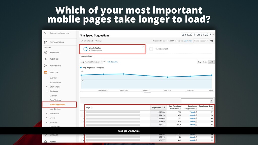
Four seconds, not bad. The Bank of Scotland, but here nineteen seconds. House of Fraser. Dear Lord, like what they are loading there? Not good, right? I will live like after five seconds. Which of your most important mobile pages take longer to load? You can use Google Analytics for that too.
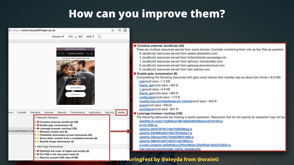
Go to speed suggestions, go to the URLs that have more page views that are more meaningful through the conversion journey. Take a look if these are the ones that take much more time. Go and verify those specifically. Again, and this is amazing, Chrome DevTools, they don't only allow you to identify how much does it take to load load, but actually to audit and see which are the problems.
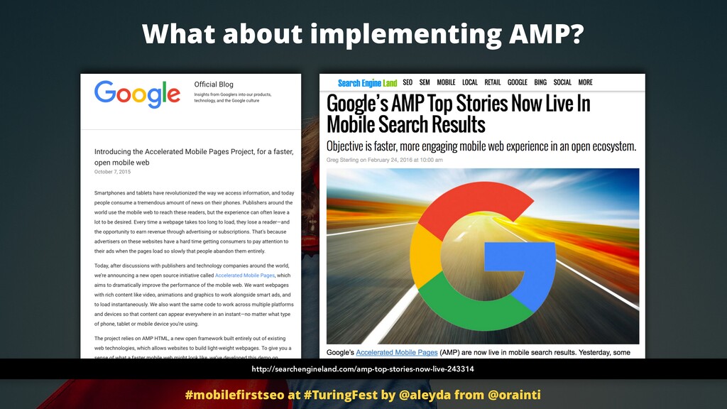
JavaScript rendering is not good. The the the they are blocking JavaScript blocking the other content. So you need to reorder the browser cache in, minifying resources, CSS, images, etcetera, etcetera. It's very straightforward. And what about implemented AMP? I'm pretty sure that you have heard about AMP. Right?
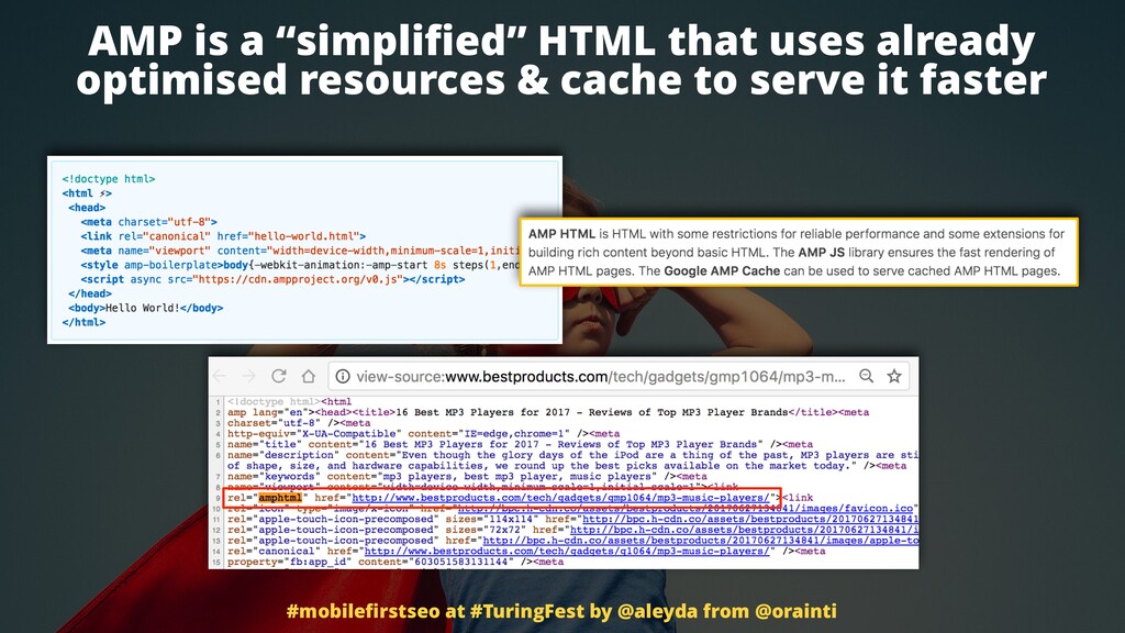
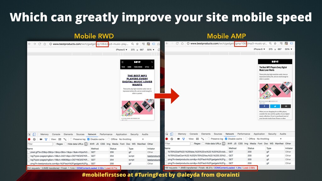
AMP is a simplified HTML that uses already optimized resources and cache to serve them faster. And the reality is that it is faster. Take a look at this website that is already optimized with our responsive web design. Six seconds. Their AMP alternative, two point nine two seconds.
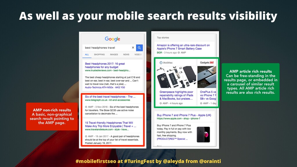
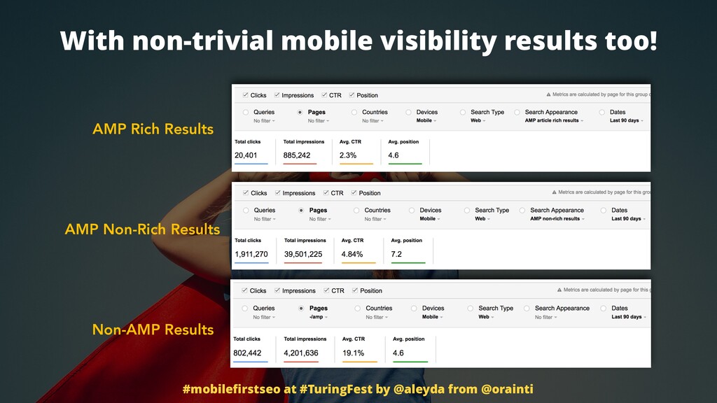
Impressive, right? You will likely also get more visibility in mobile search results because you will be able to be included in the news carousel if you are a news, a media outlet, and of course your results can be shown also with the AMP icon in organic too.
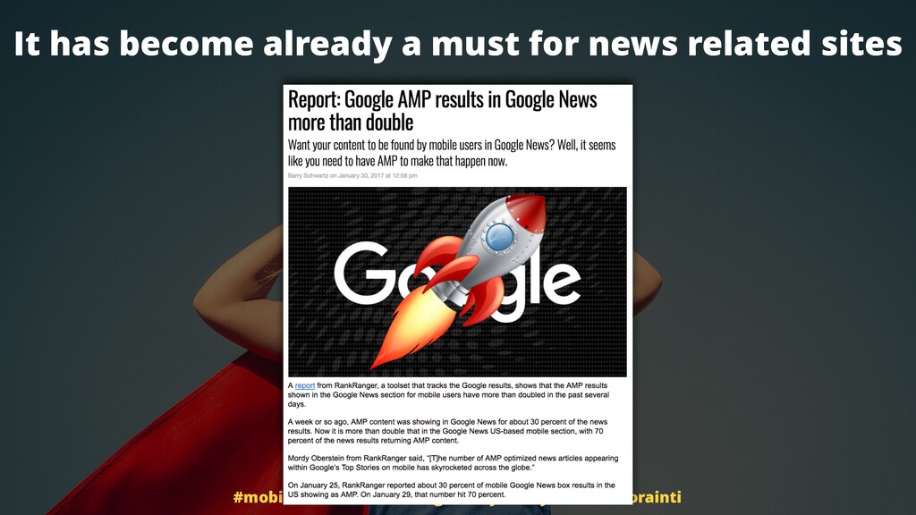
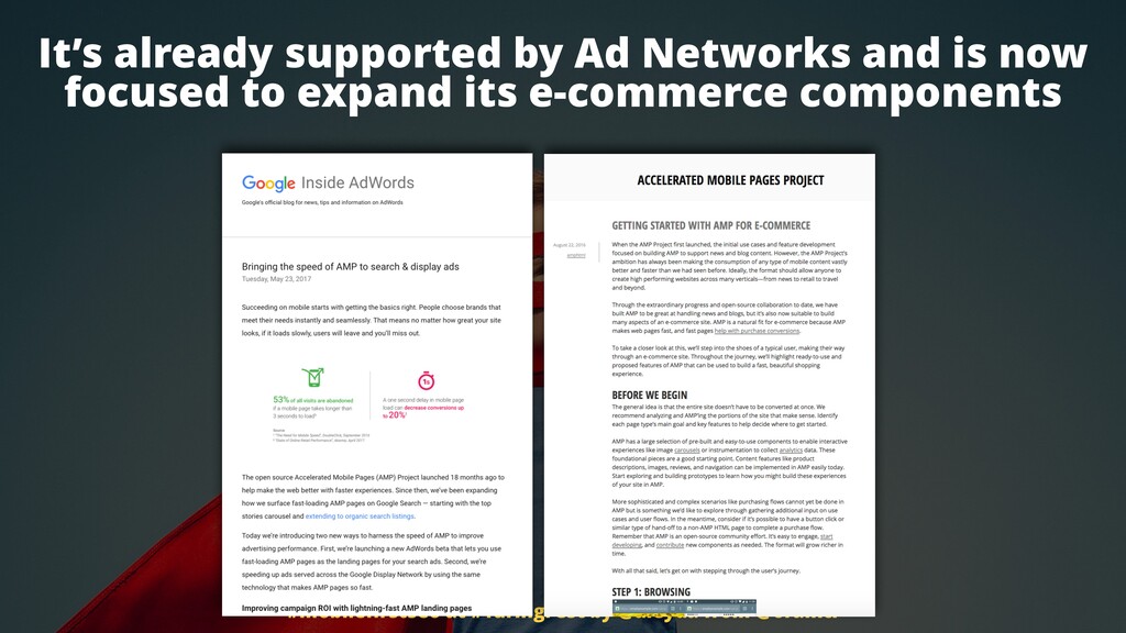
It has become already a must for news related sites because Google is not showing non AMP pages in the news carousel. So AMP is required for news carousel. It's already supported by ad networks. Of course, you don't want to wait for the ads to load while you have already the content display on mobile.
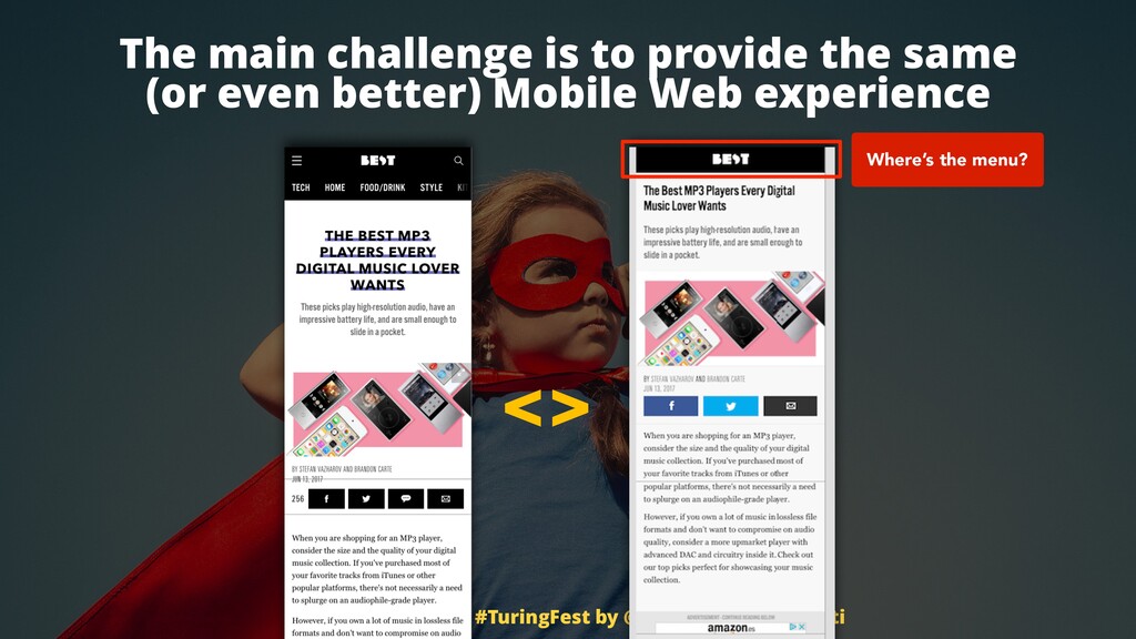
And now it's much more focused on expanding their e commerce component to support e commerce websites. But the main challenge here is again user experience. You can see that I had a client with this is not my client, but I had a client with the exact same issue here.
They didn't have a menu on their AMP page on mobile. They're like, why? Oh, because we were some of the early adopters and they were not yet supporting the hamburger menu. Thank you very much and you haven't done this after six months already.
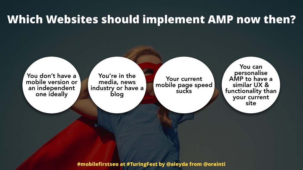
It's like wonderful. So of course your bounce rate is so high. So which website should implement AMP then? Well, those that don't have a mobile version at all or they don't have an independent, otherwise you will end up with too many independent URLs, right?
You're in the media news or in during the news industry, you have a blog, you're you have a media site that will really profit from this extra visibility in the carousel. Your current mobile page speed sucks. That that's very good reason. And then you have resources to personalize the component to really not necessarily just have the capacity to install an extension and that's it because then you will likely have issues to really provide a really good mobile experience.
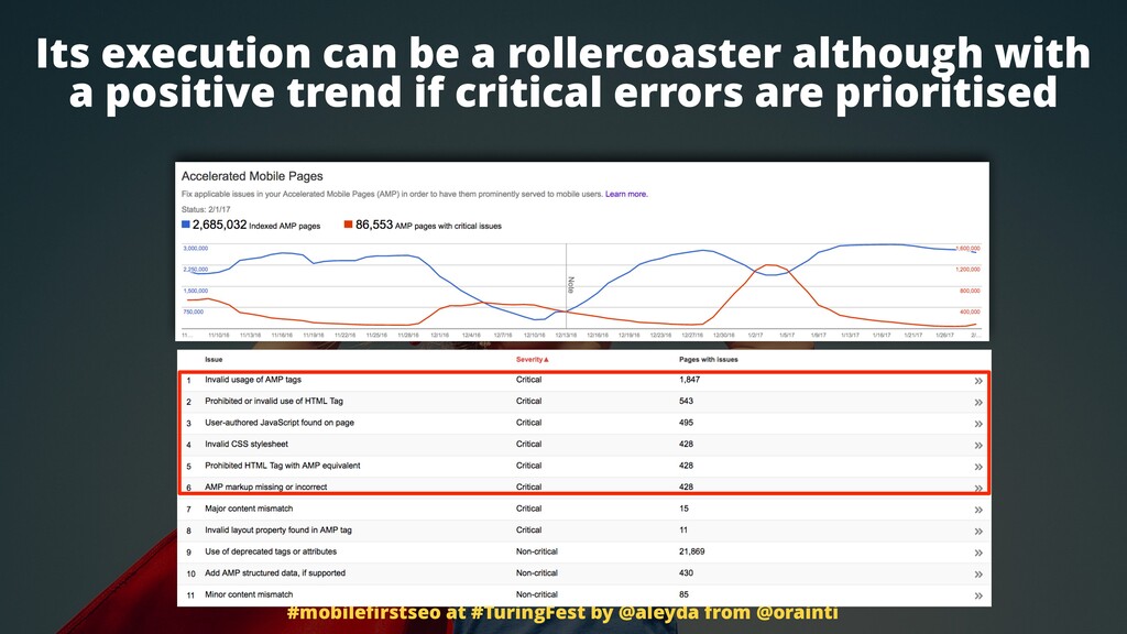
Its execution can be a roller coaster, but it's about focusing on the critical issues and fix the critical issues to really make it go up and be able to have this type of results. Non trivial type of extra visibility that you can get with these pages.
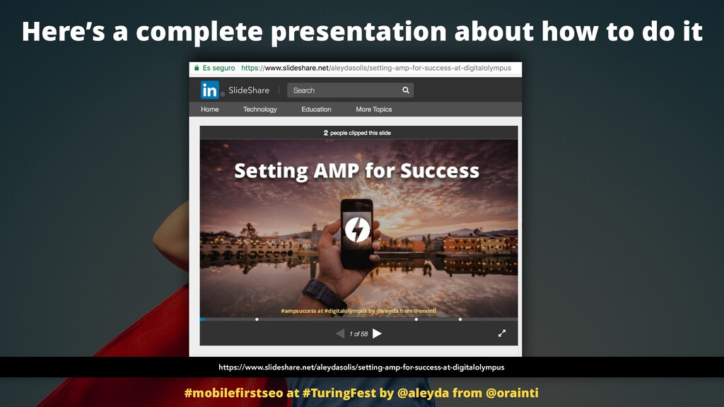
Right? So it's nice. This can be a very, very in-depth topic, much more longer than this. You can take a look. I did this presentation about only AMP so you can see like tips, checklists, resources, again, tools, whatever to implement it. And time is suddenly almost up.
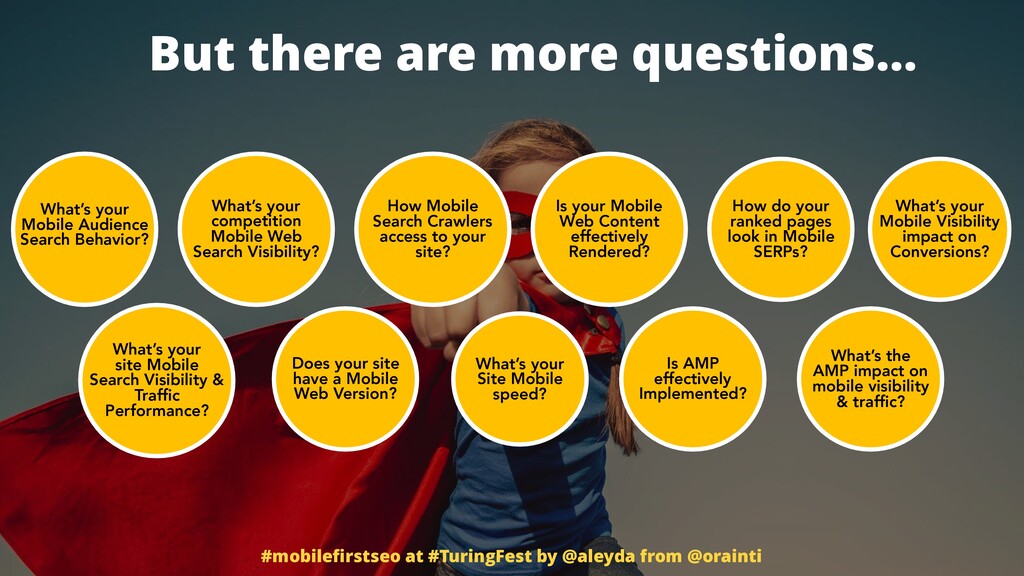
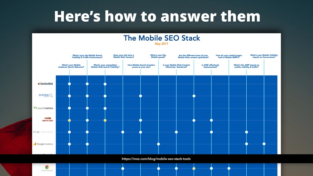
I have many more questions, but don't worry, you can answer them very easily. I posted on Moz a few months ago this checklist with all of the questions that are meaningful through a mobile first SEO process and how to answer them through tools that already exist and already support, thankfully, mobile devices.
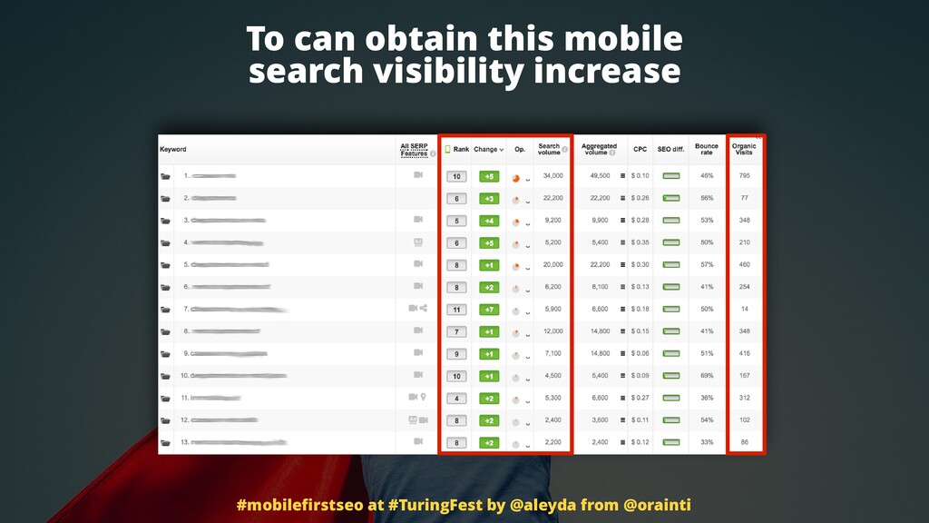
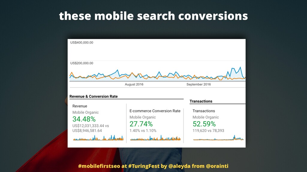
It's time now for you to start saving and growing your mobile activity, your mobile SEO presence. Take a look. You don't need to wait mobile first to happen to have this type of visibility increase, this type of profit increase, this what a lot of are looking to, this is like traffic.
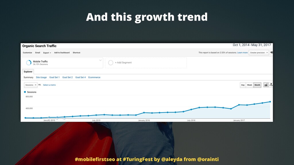
It's just a vanity metric. Show me the money. Here it is, the money. On mobile, organic only. And of course, a trend, a growth trend that is positive over time, that is consistent, that is online from a business perspective. Thank you.